One Page Resume Templates
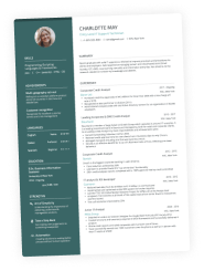
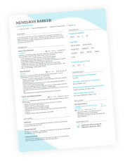
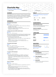
No matter what level of experience you have, you can easily craft a one-page resume using one of our pre-made templates below. Just click on your favorite and replace the info with your own.
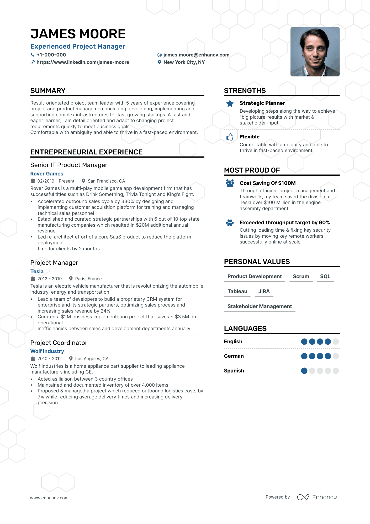
Double Column
Single-page resume template. Bold heading fonts point the recruiter straight to what’s important on your resume.
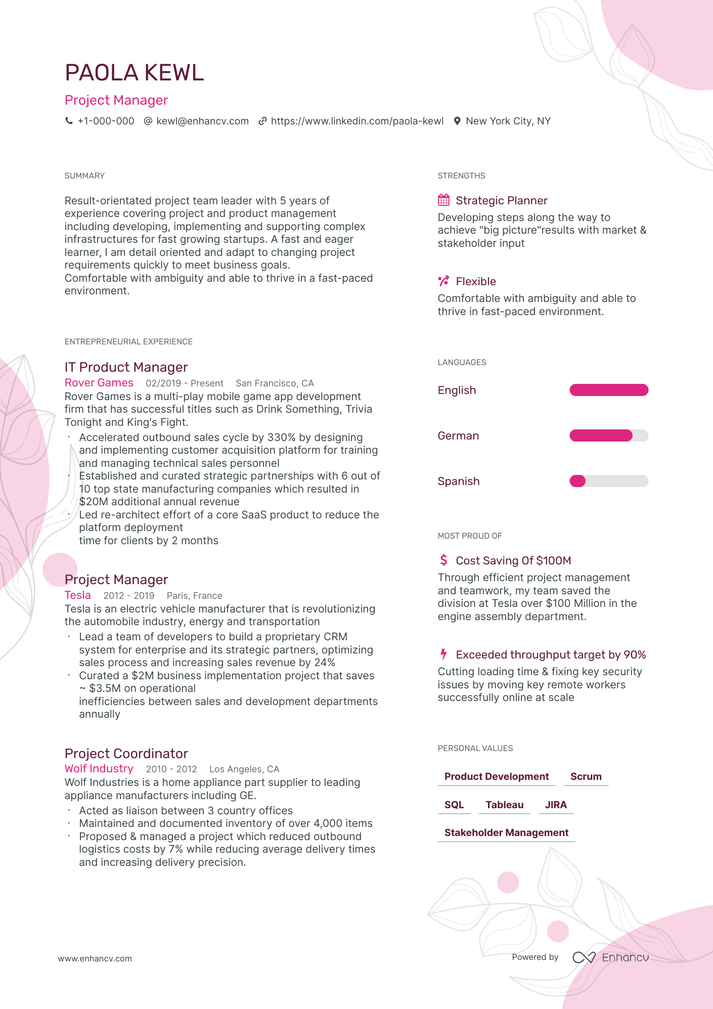
Compact
One-page resume template. Perfect for experienced candidates who can fit more experience without compromising length.
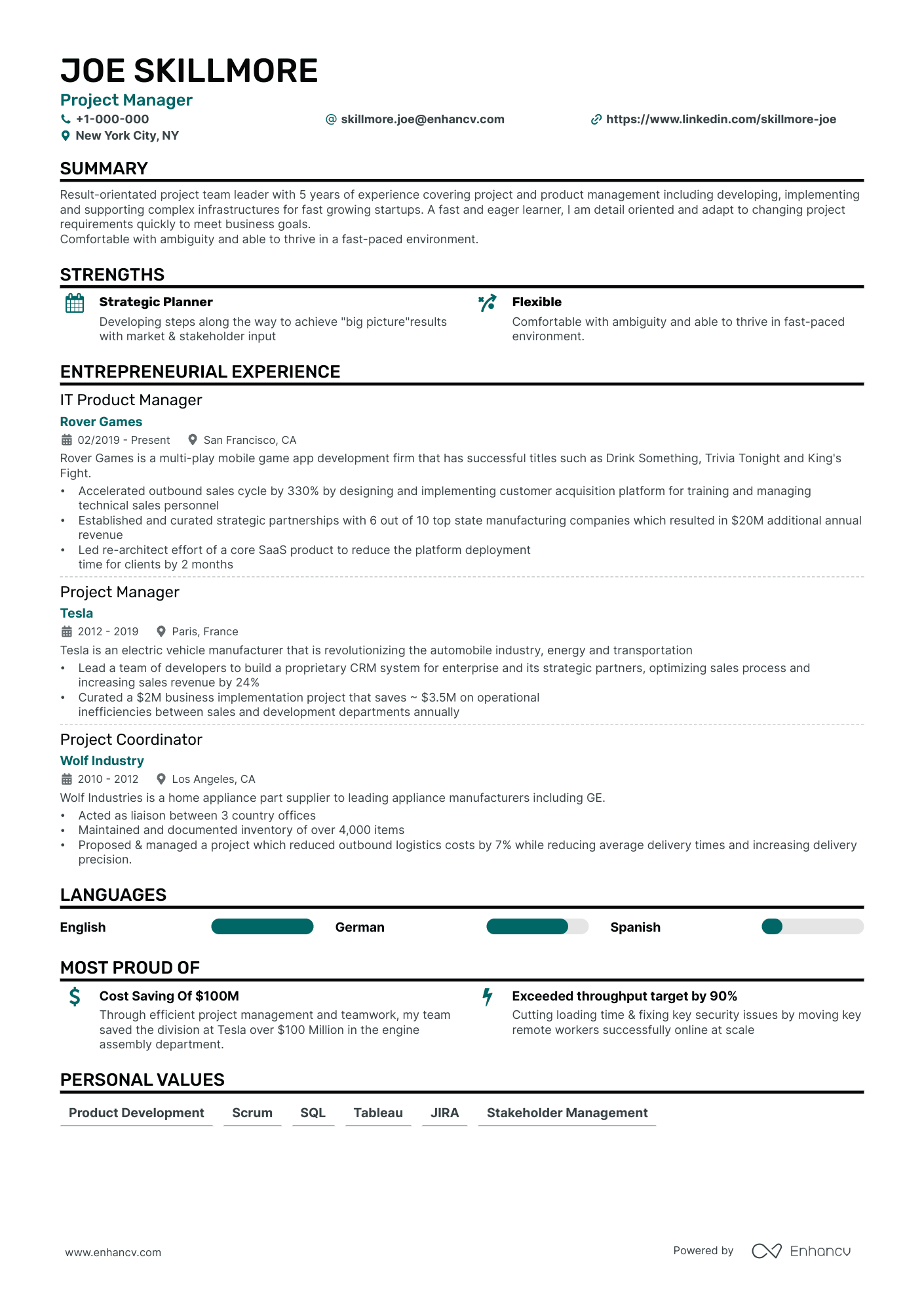
Single Column
One-page resume template. For job-seekers who prefer a classic one-column layout.
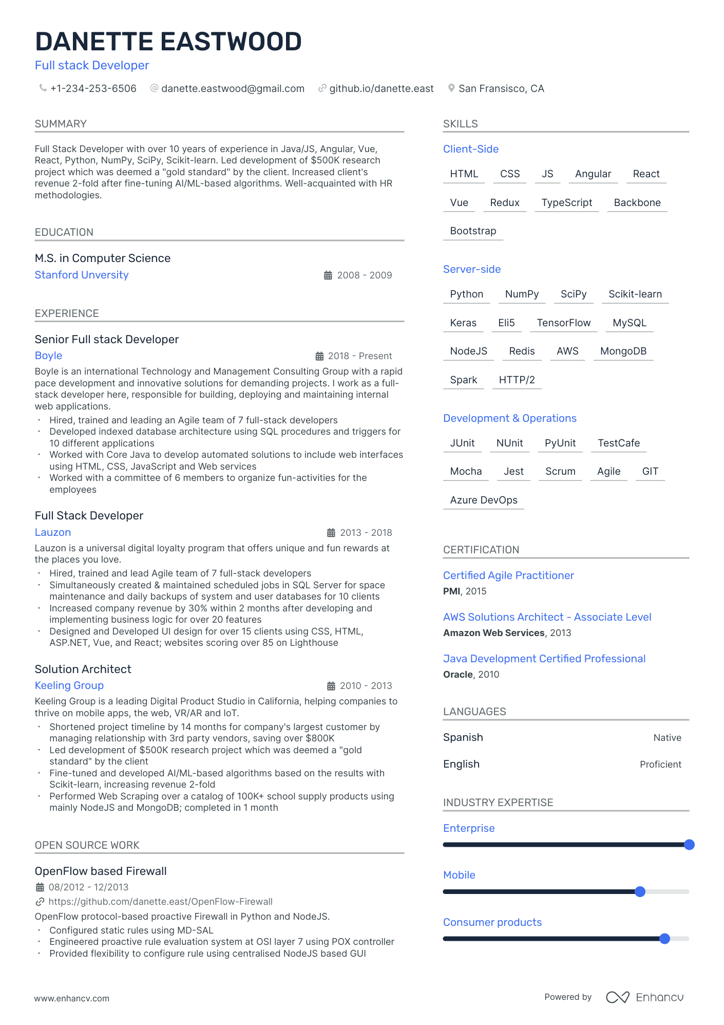
Modern
Two-column resume template. Organize your information into two columns for a well-structured and easy-to-follow format.
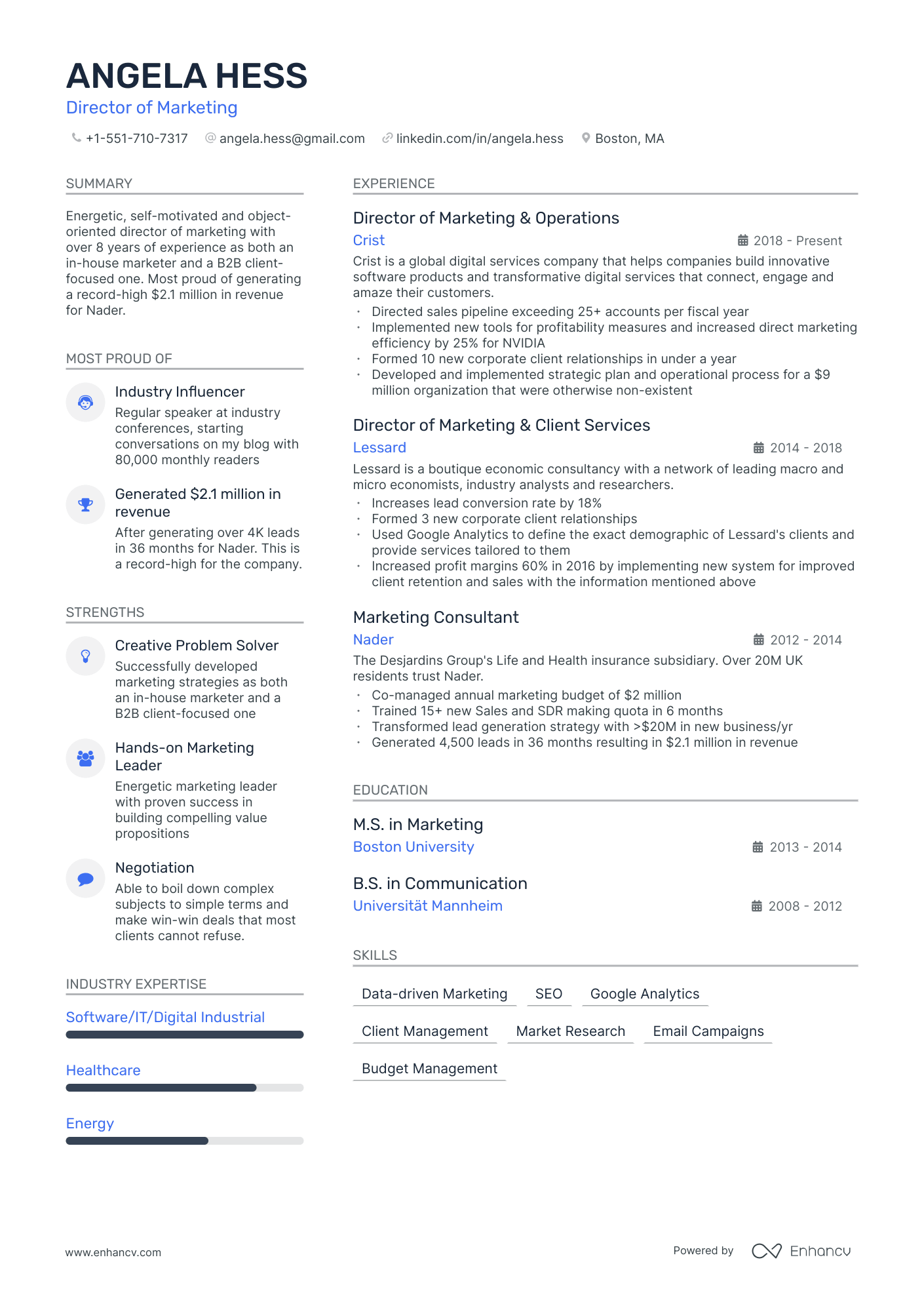
Stylish
Space-saving resume template. Optimize the space on your resume to maximize the impact of your information with a space-saving design.
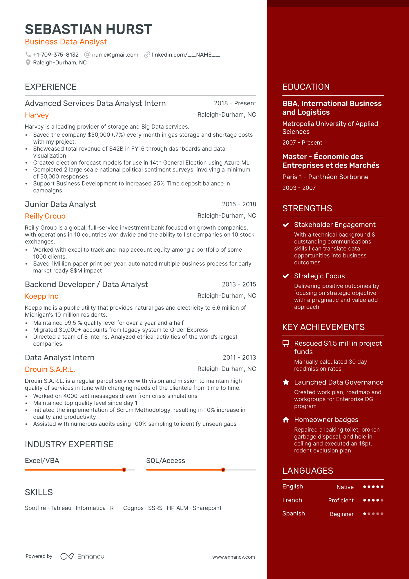
Elegant
Text-focused resume template. Convey your information in a clear and straightforward manner with a text-focused design that's simple and easy to read.
What is a one-page resume template?
The one-page resume template has a layout designed to present the most relevant information about the applicant. It contains summarized text that's easy to read and scan.
This type of resume is born out of understanding the two key principles of application processing. The first one is that the most important information is expected to be in the first one-third of the document. The second principle is that the HR officer only has a few seconds to decide if your resume goes in the garbage or not.
A well-prepared single-page resume demonstrates that you're a very organized person who knows how to prioritize and who values the time of the recruiter. It also demonstrates that vanity isn't one of your disadvantages.
Pro tip
When to use a one-page resume template?
- Personality: If you're a well-organized individual who can prioritize what's important and what isn't, then the one-page resume format is for you. To use this format, you need to understand what the employer is looking for. You also need to have well-organized thoughts because if they invite you for an interview, there'll be a lot of clarifying questions.
- The professional field: A one-page resume is accepted in all professional fields. Still, you might find it a bit hard to use a one-page resume template if you're in a creative field. If your dream job is in a more conservative or traditional field, the one-page resume template is a format that'll be well received.
- Company: The one-page resume is universal and any company’s recruiters would highly appreciate it. In bigger companies such as Apple, Microsoft, or Tesla, there's an influx of applicants and the HR officers need to sort through tons of resumes. In this case, the one-page resume can give you an advantage in demonstrating your skills in a condensed form.
- Background and education: A one-page resume template can benefit candidates from any educational or professional background. The main exception is for those with advanced degrees—such as a Ph.D.—who may need to list multiple credentials, especially when pursuing an academic career. In such cases, including your bachelor’s, master’s, and even relevant high school degrees may be appropriate. For most other roles, your most recent degree is sufficient.
- Position: The single-page resume template works for any role, but it’s especially valuable for entry-level candidates with limited experience. These positions often attract a high volume of applicants, so keeping your resume concise helps it stand out and get read. For senior-level roles with more extensive experience, a two-page (or longer) format may be more appropriate.
Tips for building the best one-page resume template
Design
Using infographics, icons, and bullet points on one-page resumes can help present information compactly. Still, you need to have a rather minimalist approach to make sure the document is easy to read.
Narrower space between sections and reduced resume margins are tricks that'll allow you to fit more content on one page. Nevertheless, keep enough white space so that the document looks organized.
With a one-page resume, the best background is white. If you have two columns, infographics, icons, bullet points, and a lot of information presented in a smaller font don't add more complexity.
Font
We recommend minimalist and compact fonts such as Oswald, Bitter, or Volkhov. With these fonts, you'll be able to fit more information on a single page.
Colors
With one-page resumes, you need to adopt a minimalist approach regarding colors. You can use one color to highlight your sections’ headings. Use the same color for your bullet points and icons. If you have infographics such as pie charts, they'll add a few more colors, but this is acceptable.
Layout
Studies show recruiters spend just six to ten seconds scanning a resume before deciding whether to move forward or discard it. That’s why a clear, well-structured layout is just as important as the content itself.
The layout needs to present as much information as possible on the first one-third of the page. The challenge is that the information also has to be easy to read and understand.
Your resume header is prime real estate for essential contact details—name, phone, and email—plus your city and state if you wish. Skip the full street address—it’s unnecessary. On a one-page resume, including a photo is optional, but adding a LinkedIn link is highly recommended. Recruiters can find your picture there if they choose.
The header is also the place where you can add your headline. Be short. Think of something catchy that'll represent you, just with one phrase.
Next comes the summary section. In two to three sentences, you must highlight your greatest achievements, skills, education, and work experience. This is the place where you need to shine and basically demonstrate to the recruiters why hiring you would be a good idea.
The work experience section is placed under the summary, aligned left. Use bullet points and list out your positions in reverse chronological order. If the position is irrelevant to the current job ad, don't go into details. If it is, you can explain in one or two sentences what your duties were. Try to use action verbs and be short.
Next comes the education section. It's also left-aligned. With a one-page resume, you don't have a lot of space, so you must only list your most recent degree. Of course, if your previous degrees are relevant or required, include them as well.
A two-column format will allow you to utilize the available space on the page more effectively. In case you decide to choose it, you can position your achievements and skills aligned right just opposite your job experience and the education sections. This is very important because the information in both sections is presented only by keywords or phrases. It needs to be supported with more details in the experience and education.
With a one-page resume, the space for any additional sections is limited. In case it's relevant, you can add languages, hobbies, projects, or an interests section. If you have to decide what to include and what not, make sure you leave sections that help you make an impression as a suitable job candidate.
Number of pages
One-page resumes are much more appreciated by HR officers for practical reasons. However, as per industry standards, feel free to add another page for every ten years of job experience you have.
Pro tip
One-page resume template pros and cons
Pros
- The one-page resume is preferred by recruiters because it is easier and faster to work with.
- Sometimes if the resume is printed out or even reviewed on a computer screen, the recruiter could forget to look at the second page. With a one-page resume, there's no such risk
- A one-page resume is much easier to improve, correct, and redact. All the information is on one screen, and you can control it better.
Cons
- A one-page resume is not the best choice for creative personalities and positions.
- If you have 20 to 30 years of job experience, it'll be very hard to fit all the information into one page
- With a one-page resume, you risk missing important information in the case you don't prioritize what to include properly.

