In today’s job market, a resume needs to do more than just list your experience—it has to engage. Enter resume icons: the little symbols that, when used right, can make your skills and experience pop off the page. Think of them as the “emoji” of the professional world–minus the party hats and heart eyes.
Research indicates that visuals can enhance memory retention and comprehension. Therefore, adding icons can help your resume be more memorable to hiring managers. However, it's important to use them sparingly–the right icons can add flair and readability, but overuse might make your resume look more cartoonish than career-ready.
What Are Resume Icons?
Resume icons are small graphic symbols that represent key resume sections, skills, or contact details on resumes. Their primary purpose is to visually highlight important information, helping readers quickly locate sections like experience, education, or email address. When strategically placed, icons can add structure, improve aesthetics, and enhance the overall appeal of a resume.
As straightforward as you think they look, keep in mind the icons you choose might not be transparent to everyone. Avoid incorporating ambiguous symbols.
PRO TIP
Search for icons and logos that match a resume’s theme or profession (e.g., sleek and minimalist icons for tech roles, colorful icons for creative roles).
Keep in mind icons should complement, not replace, the text. They should guide the reader’s eye, supporting readability without distracting from the content. When used thoughtfully, icons add a modern, professional touch to your resume.
Where to find free icons
For your convenience, we’ve gathered a few websites where you can find free, high-quality icons you can use without attribution–convenient for putting them on your resume.
- Flaticon: Offers a vast collection of free icons in various styles, covering almost every category imaginable. Flaticon provides high-quality, professional-looking icons available for download in multiple formats, making them versatile and easy to customize.
- Icons8: Known for its comprehensive library of free icons with a modern aesthetic, Icons8 also allows downloads in different formats and resolutions. It’s an excellent choice for resumes because it offers cohesive icon sets, helping you keep a consistent design style. They're a good resource for finding everything you need, from check mark icons for bullet points to call symbols for contact data.
- IcoMoon: Specializes in vector icons and provides a unique “Icon Font” feature, letting users create a custom icon font from selected icons. Its clean, minimalist icons can add subtle yet effective visual cues to your resume.
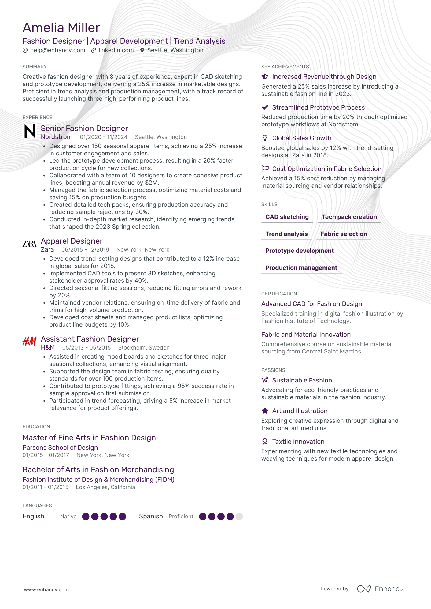
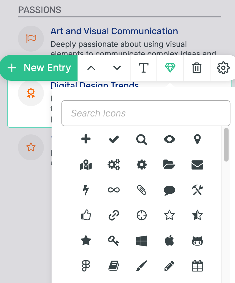
One simple way to add icons and logos to your resume is by using Enhancv’s resume builder. Many sections—such as Awards, Achievements, Passions, and Strengths—can be visually enhanced with icons from our extensive library of over 150 options. Each icon is carefully selected to help you clearly express yourself without worrying about formatting or resizing, making it easier than ever to create a standout resume.
When to Use Icons on a Resume
The purpose of resume elements like icons, logos, and lines is to enhance readability by drawing attention and making your application easier to scan with its visual appeal.
Here are some benefits of using icons on a resume:
- They guide the reader’s eye, helping them locate sections like Experience, Education, or Skills faster.
- A few well-placed icons can elevate the resume’s design, making it look more engaging—especially useful for creative roles.
- Icons for contact information (email address, phone number, LinkedIn profile) replace words, making these details clearer and saving room for more content.
- People tend to respond to visuals more readily than text alone, which may help a recruiter remember your resume.
Tips for using icons effectively
- Be minimalistic: Use icons sparingly to avoid overwhelming the layout.
- Maintain consistency: Stick to one icon style for a cohesive look.
- Prioritize legibility: Icons should enhance readability.
- Consider PDF format: Save your resume as a PDF to ensure icons render correctly on any platform.
Job sectors where icons are welcomed
Certain sectors will value using visual and creative elements more than others. While not all industries welcome icons, the ones in our list below often appreciate the added design elements:
- Creative fields: Roles in graphic design, illustration, and animation often expect candidates to express their creativity directly on the resume, making icons a natural fit.
- User experience (UX) and user interface (UI) design: For positions in UX/UI, icons can subtly reflect an understanding of design principles and attention to detail.
- Fashion and media: In highly visual industries like fashion, media, and publishing, icons add a modern touch that can resonate with recruiters.
- Technology and web development: Tech roles, especially those related to front-end design, may appreciate the added clarity and organization icons bring.
- Marketing and advertising: These sectors value visual appeal, so icons can help demonstrate a flair for design and innovation.
Here’s how to use icons in our builder:
Still, visual elements can often be perceived as distracting or even unprofessional. Let’s explore this scenario.
When NOT to use icons on a resume
While people generally react positively to visual data, for some recruiters, resume icons are an unnecessary addition. Certain sectors and situations call for a more traditional, content-focused approach, so icons can be seen as distracting from what’s truly important.
Here are some instances when icons might be a drawback:
- Applying to traditional fields: Industries like law, finance, and academia often expect a straightforward, text-based resume. Here, icons might be seen as unprofessional or interruptive.
- ATS compatibility: Applicant tracking systems may misinterpret or skip over resumes with heavy formatting or graphics, potentially leaving out important information.
- Risk of overuse: Excessive or prominent icons can make a resume feel cluttered. Icons should complement, not overshadow, your skills and achievements.
- Recruiter preferences: Some recruiters feel icons for resumes are unnecessary and prefer to focus solely on the content. In a quick scan, they’ll prioritize relevant experience over design elements.
How to Place Icons Properly on a Resume
If you choose to include icons on your resume, here are some quick tips to make sure they enhance the design without overwhelming it:
- Aligning icons: Make sure icons are consistently aligned with surrounding text and elements for a polished, professional look. Proper alignment helps the layout feel balanced and visually appealing.
- Sizing and spacing: Keep icons small—typically around 16x16 pixels—to avoid overpowering your text. Consistent spacing is key to ensure icons integrate smoothly without distracting from the content.
- Using a uniform style: Stick to icons from the same set or style, such as outline or filled designs, to maintain a cohesive visual theme. This creates harmony across your resume and keeps it looking sharp.
- Limiting to key areas: Use icons strategically in sections like contact information or headers to add emphasis. This focused placement makes icons feel purposeful and enhances readability.
- Avoiding clutter: To keep your resume clean and professional, limit icons to four to five on a single page. Less is more, ensuring icons serve as helpful accents rather than visual noise.
Logos on a Resume
You can further increase your resume's appeal by adding the logos of companies you’ve worked for—or aspire to work for—and the educational institutions you've attended. These will allow the reader to quickly recognize reputable brands and credentials, adding a touch of visual interest and credibility.
As with icons, logos should be used sparingly to avoid clutter. Ensure they’re high-quality for a professional appearance, with consistent sizing and alignment for a clean, polished look. Remember, logos should complement—not overshadow—the main focus: your skills and achievements.
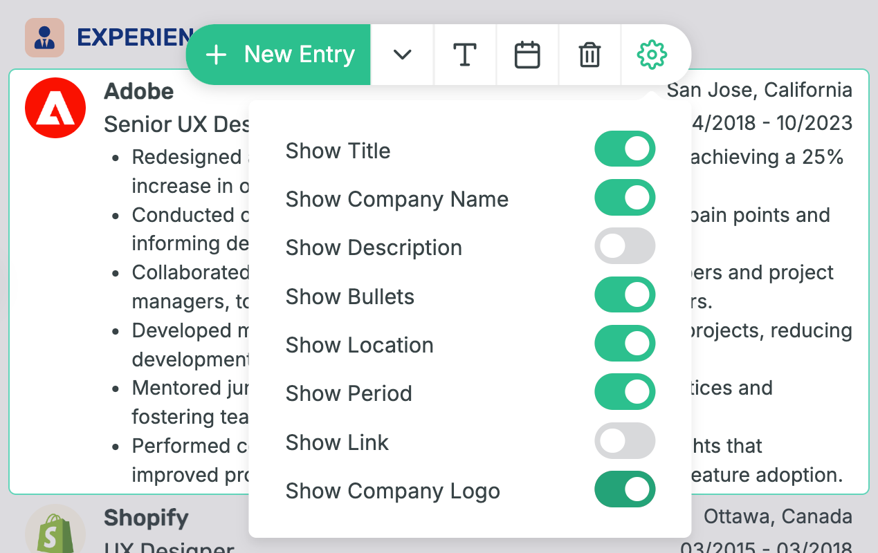
Our resume builder simplifies this process. Just click “Show Company Logo” when editing your experience or education sections, and the relevant logos will appear instantly. No need to resize or adapt the image–we handle that for you.
This is how to activate company logos in Enhancv’s builder:
Frequently asked questions about icons on a resume
Are icons ATS-friendly?
Most ATS systems struggle with non-text elements like icons. To ensure ATS compatibility, it’s best to use a minimal amount or avoid icons unless you’ve tested the resume. The documents you create with the Enhancv resume builder pass ATS without a problem.
Is it OK to use symbols on a resume?
Yes, simple symbols (like phone or email icons) are fine, especially for contact info. Place them sparingly, ensure they’re professional, and avoid symbols in text-heavy areas to keep your resume ATS-friendly.
Can icons be used in a digital resume versus a printed one?
Icons are more effective and safer in digital resumes, where color and resolution can be controlled. In printed resumes, they may lose quality or appear distracting.
Conclusion
Icons and logos can enhance a resume’s appeal when used sparingly and strategically, making sections easy to find and adding a professional touch. Tailoring icons to fit the job role and industry ensures they complement, rather than distract from, your qualifications—so explore the recommended resources and try adding icons to boost your resume’s impact.
Make one that's truly you.

