Minimalist Resume Templates
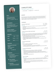
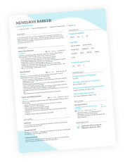
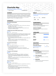
Minimalist resume templates feature a clean, sleek design that reflects the latest industry trends. Select a template to build your own minimalist resume.
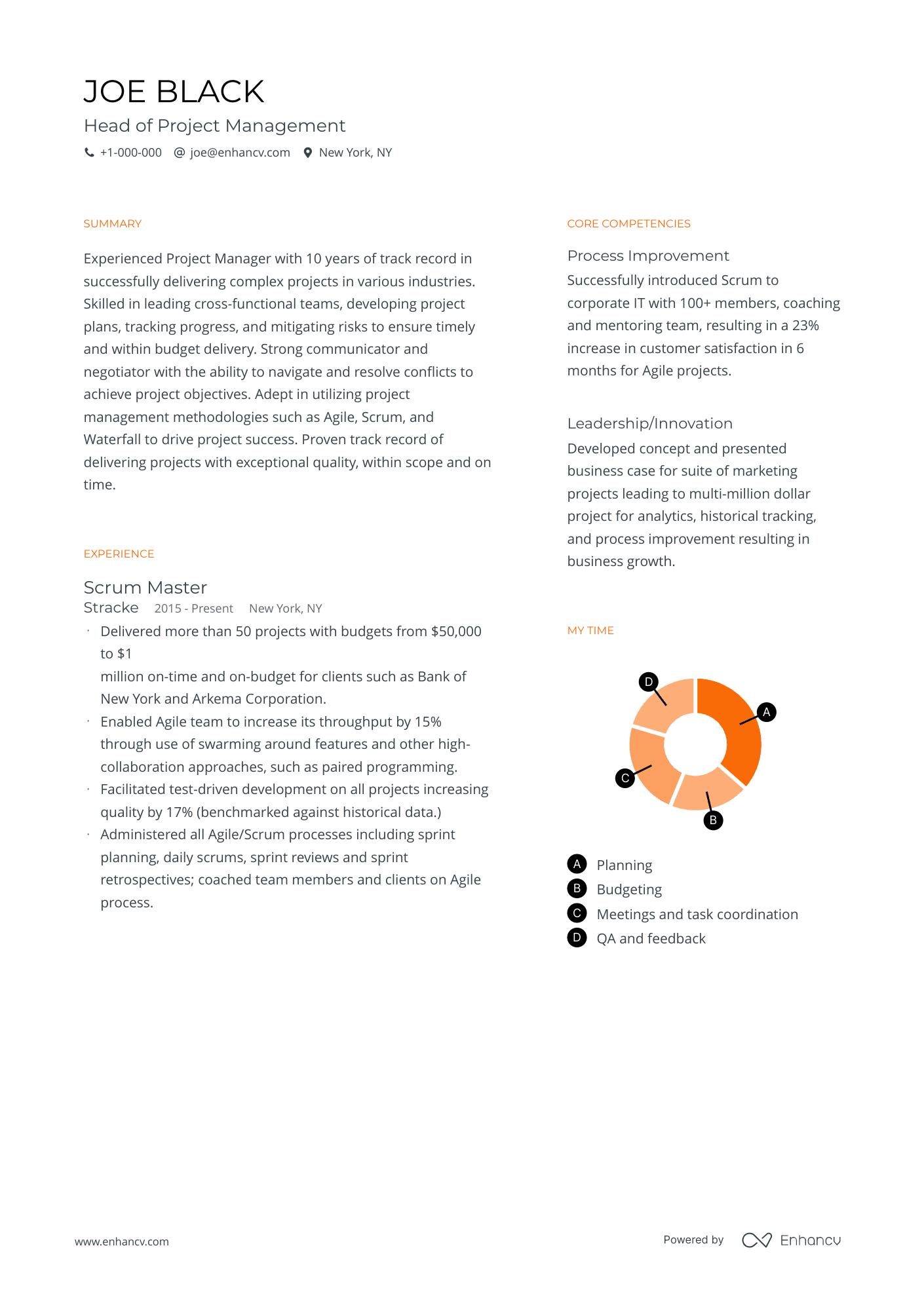
Minimal
A plain resume template fit for creative roles in any industry.
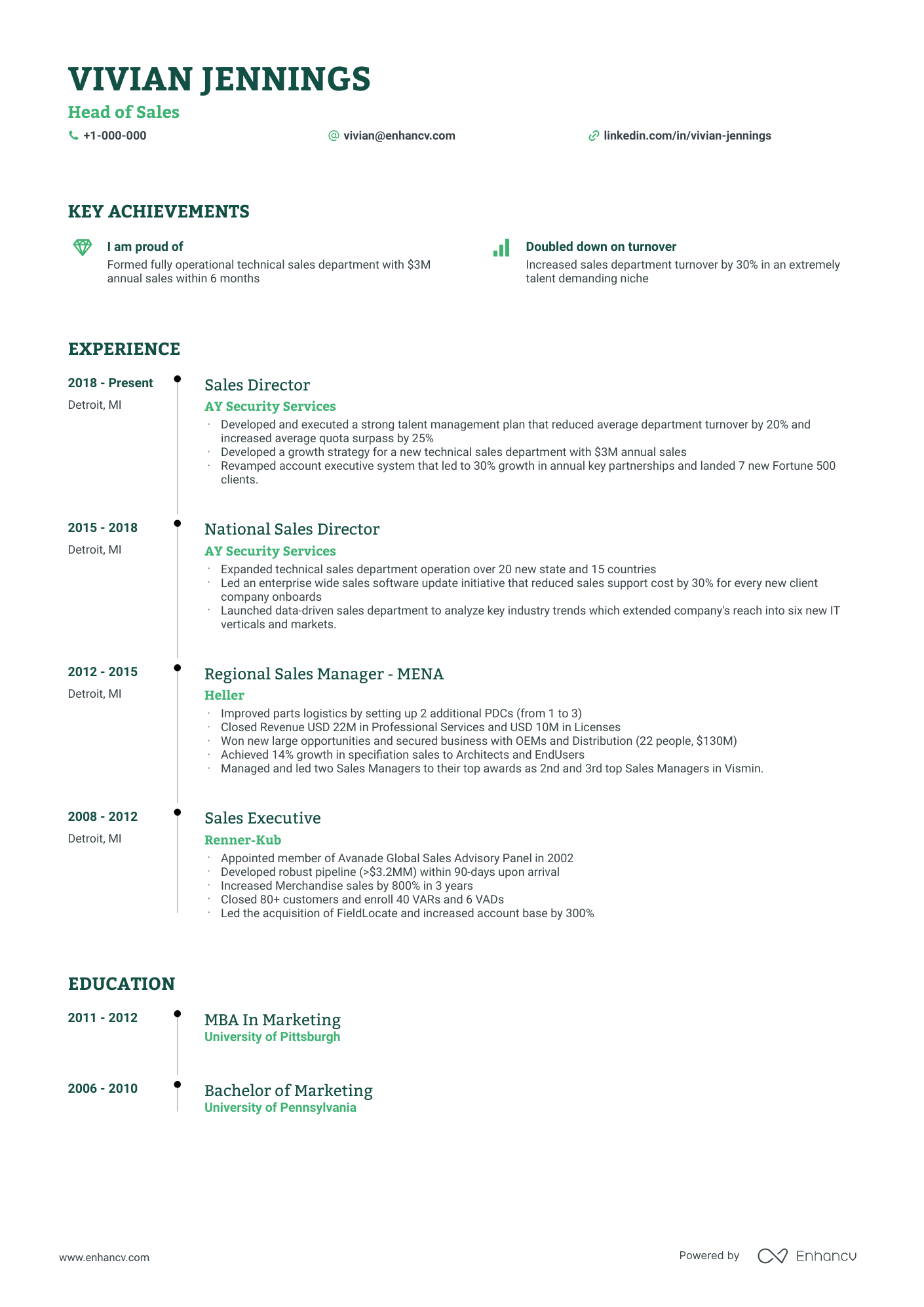
Timeline
Uncluttered resume template for experienced applicants.
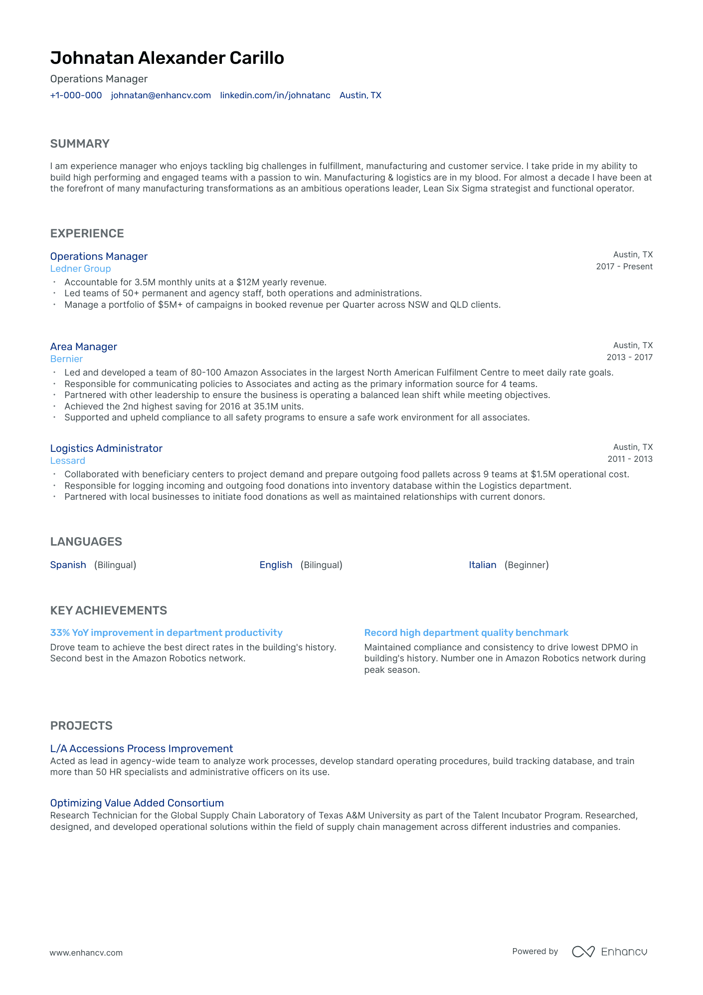
Classic
Conservative resume template. For executives, or senior job-seekers in traditional industries.
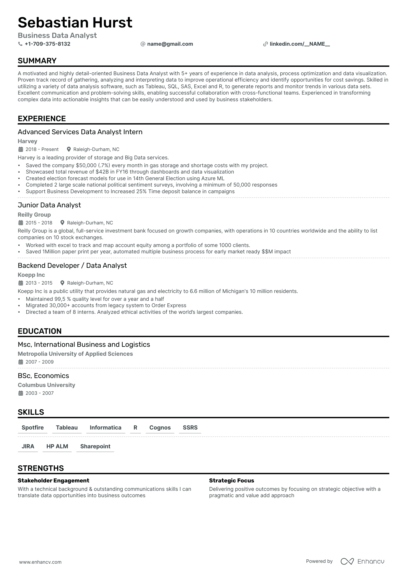
Single Column
Streamlined resume template. Focuses on key information, ideal for fast-paced roles in sales, customer service, and project management. Suitable for entry to mid-level professionals.
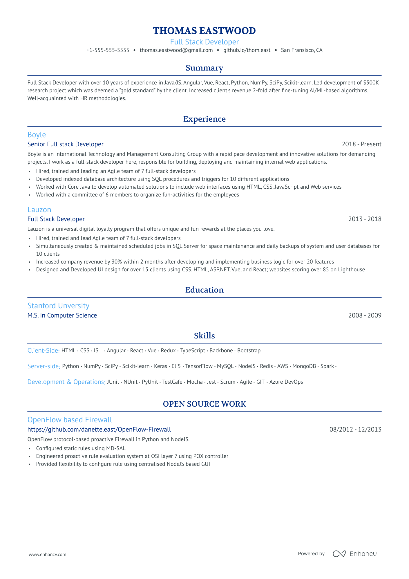
Ivy League
Clean resume template. A crisp and professional design that's free of distractions and focuses on your content. Appropriate for roles in finance, consulting, and law. Suitable for mid- to senior-level professionals.
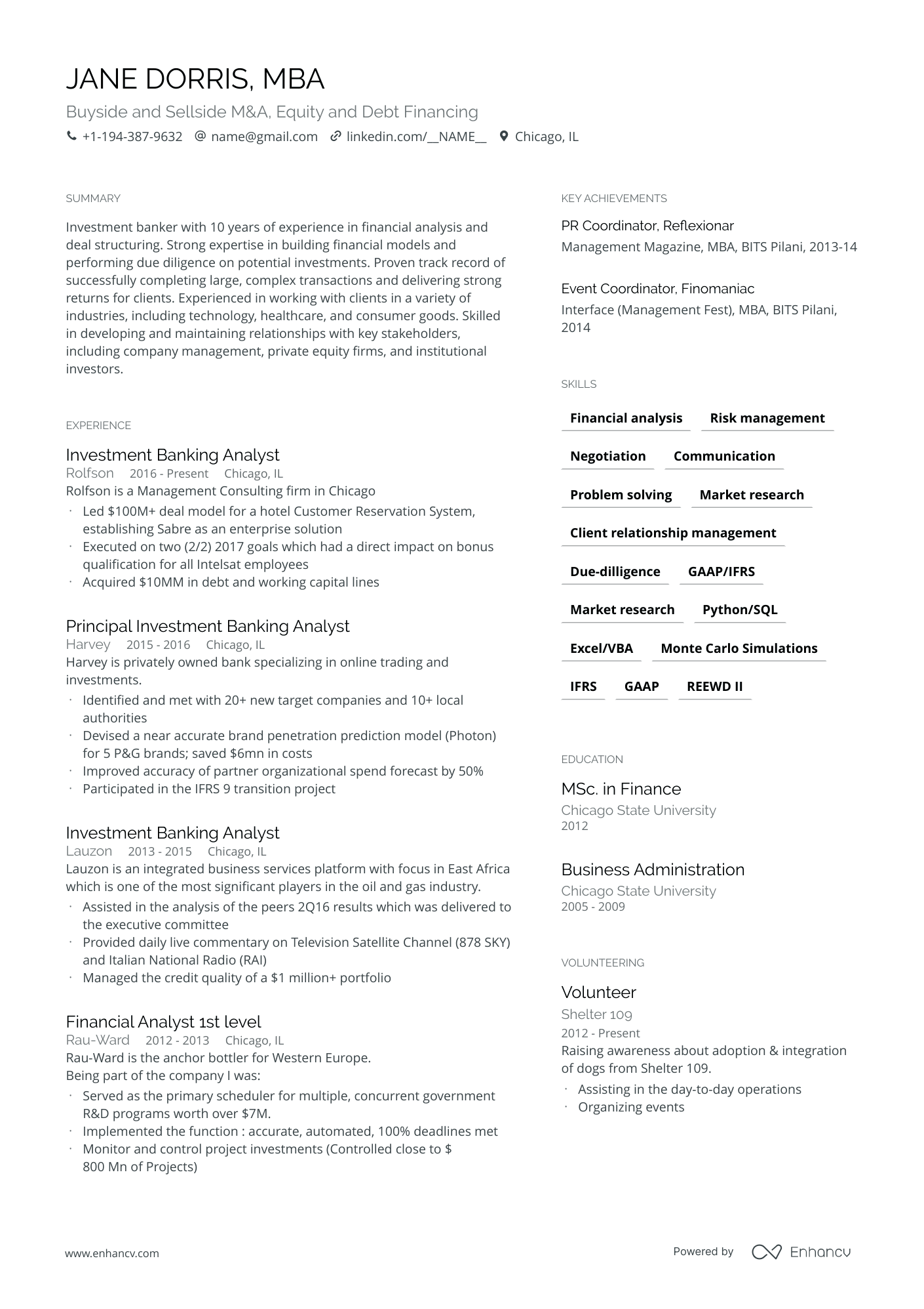
Compact
Sleek and modern resume template design, ideal for creative tech roles in design, tech, and advertising. Fit for mid- to senior-level professionals.
What is a minimalist resume template?
A minimalist resume is usually a one-page resume with a sleek look that contains only the most relevant information about the applicant. This document contains relevant and essential details in a condensed form. The content in a clean resume should be laser-focused.
Minimalist resumes are a good choice for applicants who have a lot of experience and achievements, but acknowledge that the recruiter has seconds to make a decision. They want to play it safe and put all they have on display.
With a minimalist resume, you can break down complex information into more digestible segments. It's universal and well-received across industries and recruiters.
A plain minimalist design without fluff is like an insurance policy. It speaks of confidence and shows the recruiter that you don't need to compensate for a lack of skills or experience.
Pro tip
When to use minimalist resume templates?
- Personality: This type of resume is recommended if you want to make an impression as a formal, reserved person that gets right to the point. A minimalist resume is a sign of someone with a clear focus who knows what to do—a serious person who will do the job.
- Professional field: We recommend using this type of resume template in case you chase a position in a traditional and conservative industry such as legal services, finances, banking, medical services, etc.
- Company: A minimalist resume template is suitable if you apply for a job in companies such as KPMG, Deloitte, PwC, EY, JPMorgan Chase & Co, BofA, Kirkland & Ellis LLP, etc. If you have to wear a suit, white coat, scrub, or black robe, the minimalist resume template is more than suitable.
- Position: This type of template is good for any position, but the higher in the hierarchy you go, the more it becomes the norm. This is logical because if you have a high position, you probably have a lot of work experience that needs to be presented in the simplest way possible. This is due to space and time limitations.
- Work background and education: Minimalist resume templates are very useful if you have a degree in law, medicine, or finance. They focus on content rather than design. If you have great work experience or education from a well-respected institution, the choice of a minimalist temple shows good taste. After all, a medical degree doesn't need fluff to make an impression.
Tips for building the best minimalist resume
Design
To add some individuality, using a repeating graphical element is acceptable in a minimalist resume. As a rule of thumb, try to avoid heavy elements and graphics. The concept should be aesthetic and clean.
The minimalist resume uses a lot of white space to make the text and titles easier to read. Avoid using long blocks of text.
Simplify, rewrite, and exclude information that isn't essential for the job openings you're applying for. Enhancv’s AI resume builder handles that trimming automatically. Although you should be careful and maintain a proper chronology because recruiters grow suspicious if they see gaps in the timeline.
Avoid icons in the skills and achievements sections. Use bullet points instead.
Font
Try to use only one sans-serif font such as Lato, Montserrat, or Volkhov. You can bold the letters of your name, contact details, and section headings.
Colors
Black and white are your best choice. They're the classiest colors. You could also try to mimic the color palette of the company you're applying for. It's a nice touch that shows respect. Know that if the industry is very conservative, they may print out your resume in black and white, so consider how it looks if this happens.
Layout
The header is where you add your contact details such as name, phone, and address. Make sure your email is professional and use your name instead of a nickname. Don't write down your full address—city and state are enough. If you have a personal website, you should include it, allowing the recruiter to find out more about you if they're interested.
With a minimalist resume, headshots aren't recommended. However, you could provide a LinkedIn profile that has your picture.
You may include a headline instead of a resume objective, but limit it to a few words that best describe who you are.
The summary is one of the most important sections of your minimalist resume. It's one of the first things the HR officer will read. This is where you have the chance to show that you mean business.
Write two to three sentences packed with action verbs and keywords describing the most important things about your job experience, education, skills, and achievements. Don't worry about details—you'll have the chance to expand on those in the next sections.
The job experience section is one of the most important of the resume. It's positioned just below the summary.
List your experience in reverse-chronological order. Use action verbs and short sentences—avoiding large blocks of text.
Don't exclude irrelevant job positions that you held as HR officers hate spaces in the chronology. Just don't get into too many details about them.
The education section comes after your work experience. The same rules apply here as well. Start with your last educational course and arrange them in a reverse chronology.
If you completed college or university, you don't need to add high school information unless it's somehow related to the job position. If you're a recent graduate with limited work experience, you may consider changing the places of your education with your job experience.
The achievements section highlights important information from your work and education sections. It gets the attention of the recruiter because it lists everything you're proud of. Use bullets and short phrases. If you use a two-column format, you can place it opposite the job experience section.
You could also add a skills section. This is the place where you highlight relevant skills acquired through education or experience. This section is usually positioned below the achievements one.
What about additional sections? A minimalist resume means simplicity. Don't include anything irrelevant. You could add languages, hobbies, projects, interests, and other sections, but only if they're relevant to the job posting or if you have limited to no work experience to show.
Number of columns
The most common minimalist resume template utilizes a one-column layout, but using two columns isn't unusual. In case you want to keep it to one page but also include all important information, you might want to use a two-column format. Keep in mind that the first one-third of the resume should contain all the information the recruiter needs to make a decision.
Number of pages
Try to keep it just one page long. Not only the design but also the quantity should reflect the minimalist concept. Still, if you have 20 to 30 years of work experience, it's normal to expect a new page for every ten years of experience.
Pro tip
Minimalist resume templates pros and cons
Pros
- It'll pass most automated HR filtering systems and get your resume in front of human eyes. It's ATS-compliant.
- Most HRs and managers appreciate short and simple resumes that are easy to read
- The minimalist resume speaks of the confidence of the applicant, demonstrating that they don't need any fluff to be considered a worthy candidate
Cons
- There's a risk you might not include important information
- A minimalist resume isn't suitable for creative industries where you want to show your individuality and personality
- A minimalist resume is at risk of being perceived as just one of many. You risk not being noticed.

