Quick Answer:
The best fonts to use in a professional resume are Lato, Arial, Rubik, Calibri, Bitter, and PT Serif. Choosing the right font can help you grab attention, increase readability, and leave a positive impression on recruiters. It's important to choose a font size and weight that are readable and combine two complementary fonts for a clear visual hierarchy on the page.
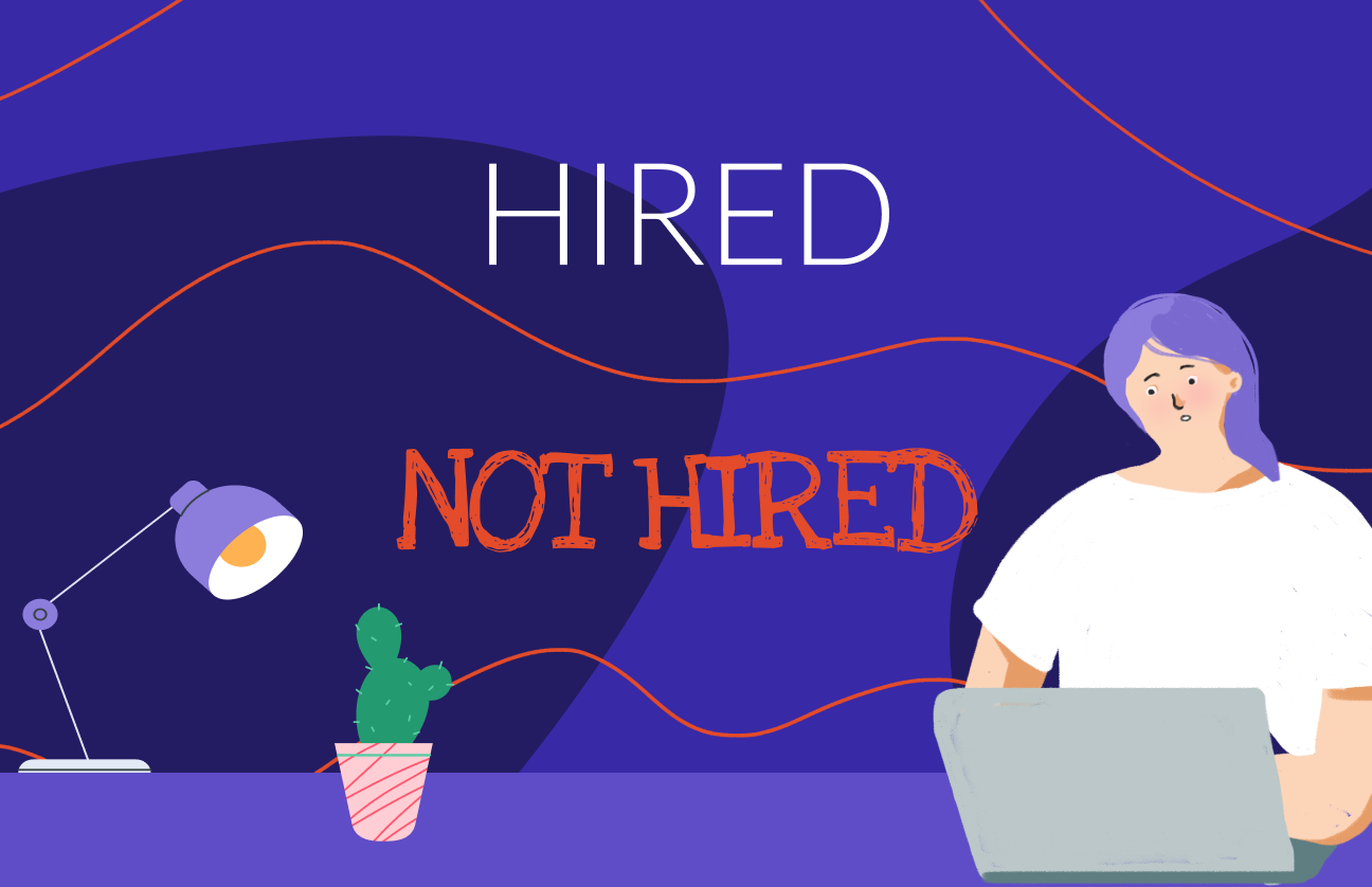
Looking for a resume writing trick that puts you ahead of the competition?
Use a better font when making your resume.
Professional fonts that meet industry standards will appeal to applicant tracking systems (ATS) and help you get past the screening phase. But they're also key for capturing hiring managers' interest and keeping them excited to learn more about you.
In this guide we'll share with you the best resume fonts to use and why font choice matters. You'll also learn how wrong font size can affect readability, along with other mistakes that you must avoid.
So let's jump right in…
How to choose a font for your resume
That’s the big question, right?
Finding the right answer involves considering several factors like readability, consistency, and what's suitable for your specific industry and role. Making a positive impression on potential employers is crucial, so choosing the right font can make your resume pop.
Go for typefaces that are simple, elegant, and commonly used, such as Arial, Calibri, Times New Roman, or Rubik. They help you organize and present information neatly and clearly. Traditional fonts like Times New Roman are ideal for conservative fields, while modern fonts like Arial or Rubik are better suited for creative industries.
Ensure the font is easy to read, both on screen and in print, and stick to a size between 10 and 12 points for legibility. Also, maintain the same font throughout your resume to keep it looking professional.
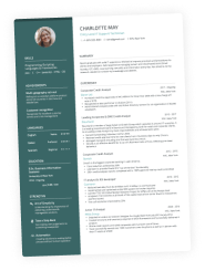
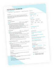
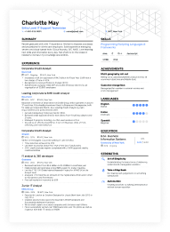
The best professional resume fonts in 2024 (visual examples and download links included)
The right typeface can take your resume from bad to great. And that's more than enough to help you get an interview and land a job at your dream company.
After all, the best resume fonts are designed to maximize your chances of getting noticed. They'll help you stand out by simply not making the recruiter squint.
Here are our top 6 picks for professional fonts to use in a resume:
Lato
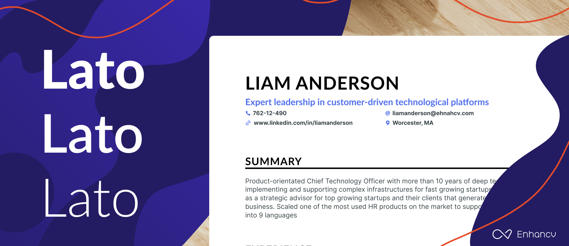
Lato is a typeface created in 2010 that has a sleek, sans-serif look. It doesn't follow much of the current trends. But, it’s still one of the best fonts as it has a modern look that can make a strong impression.
With all its original traits, Lato does an amazing job conveying harmony and elegance. It's a professional font that works across our resume templates, which makes it the perfect design option for your next CV.
If you're looking for a serious but friendly typeface that works for body texts and headlines in uppercase and lowercase, Lato is your best bet.
- Download Lato for free.
- Want another font similar to Lato? Roboto might be a good option.
Arial
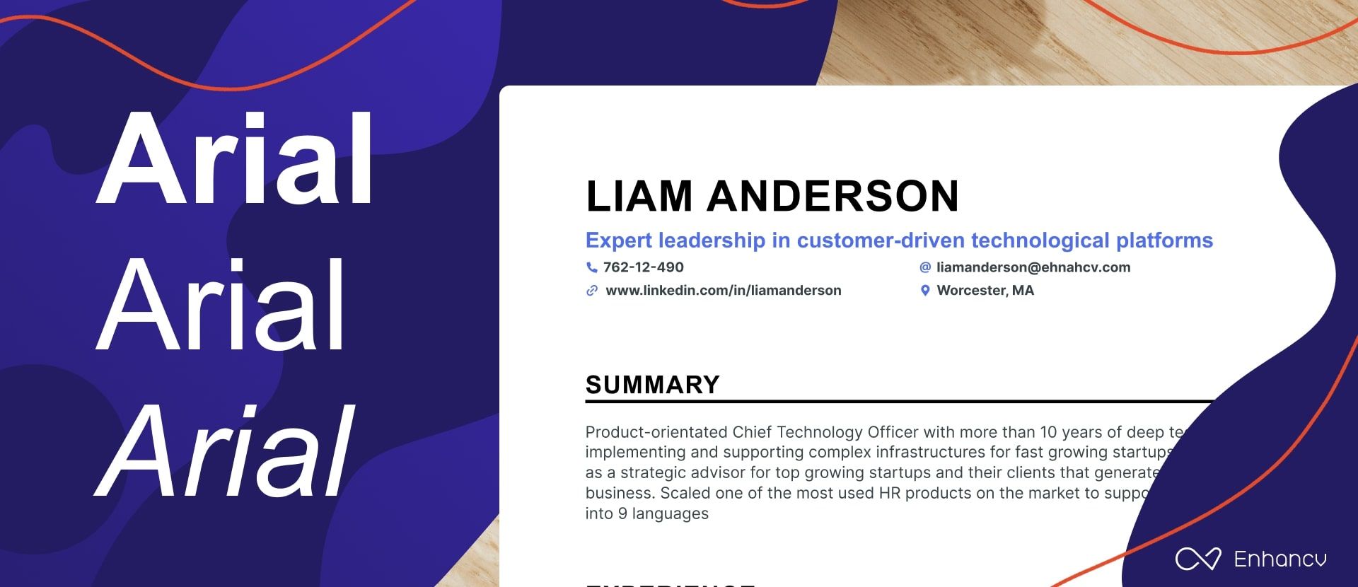
Arial is a sans-serif font that’s neat, clean, and easy to read. It’s a professional typeface that gets the job done by making you look like a serious candidate.
However…
The problem with Arial is that it's an old font that was designed in the early 1980s. So, recruiters might find it tedious and repetitive since many other applicants will probably be using it too.
- Download Arial for free.
- Looking for a modern alternative to Arial? You may also try Poppins for free.
Rubik
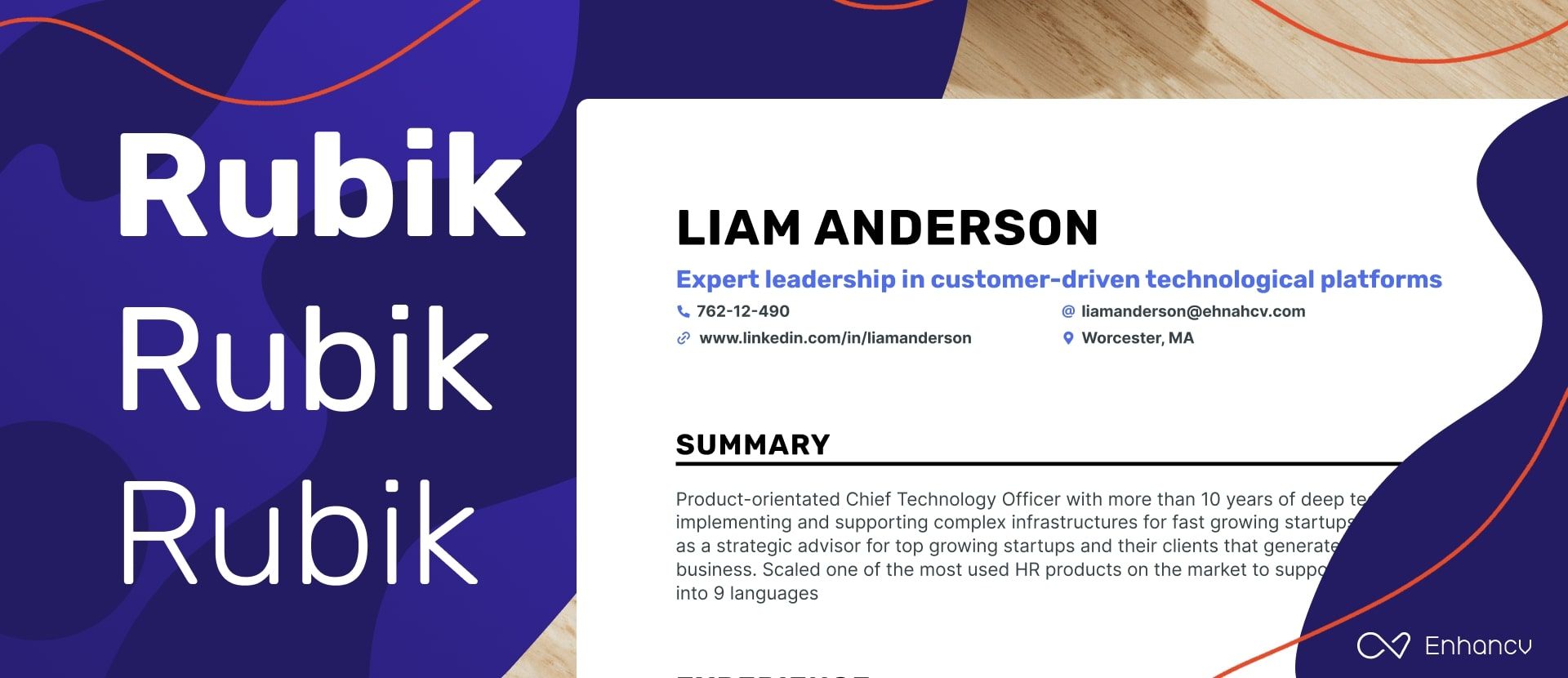
Rubik is a free sans-serif font family designed in 2015. The variety of font weights with bold and italics that it comes with has made it one of the most downloaded typefaces on the internet.
With its slightly rounded corners, Rubik finds the perfect balance between professionalism and friendliness. It works well both for long paragraphs and subheadings, which makes it the ideal choice if you want to stick to only one font in your resume.
- Download Rubik for free.
- Would you like to add a bit of personality to your resume? Try pairing this font with Merriweather.
Calibri
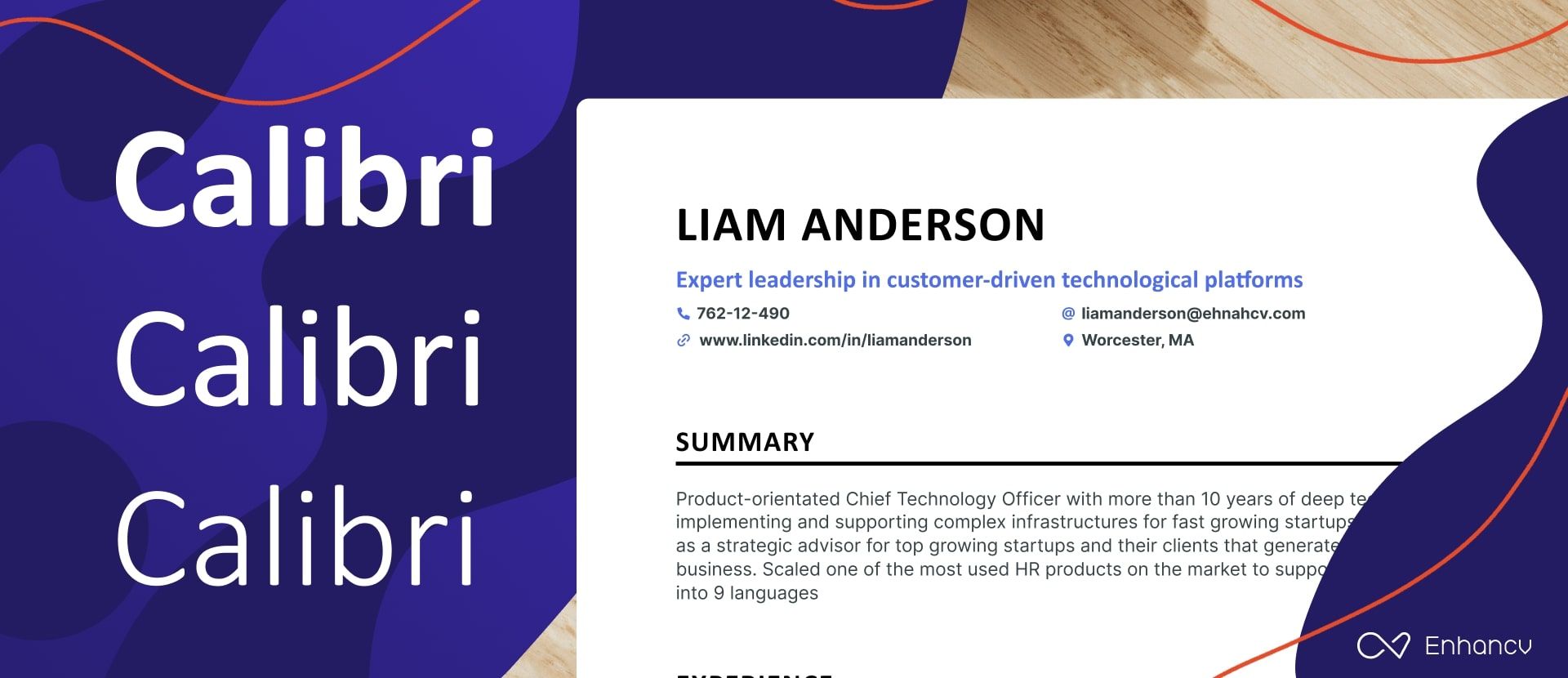
Calibri is a relatively modern sans serif typeface released by Microsoft in 2007. It's the default typeface for Microsoft Word with a font family that consists of thin, regular, and bold.
On one end, this resume font is a safe option because it's new and was developed by a large corporation. But on the other, it might have an overused font style that can turn headhunters off before they start reading.
- Download Calibri for free.
- Need an expressive font that reflects both friendliness and proficiency simultaneously? Open Sans was designed just for that.
Bitter
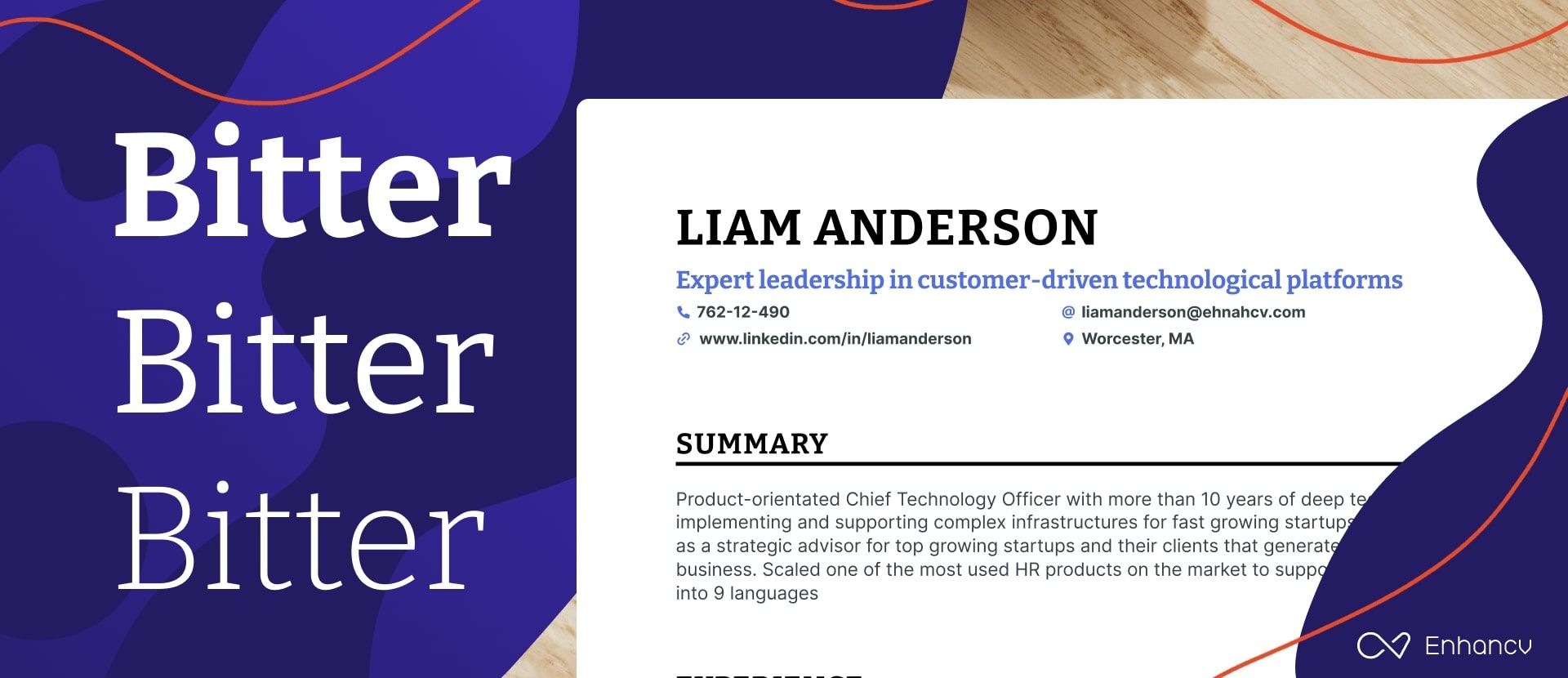
Bitter is yet another free typeface you can use in your resume design. It's a slab serif font that prioritizes on-screen legibility and can work on any computer or device.
The robust letter design guarantees a maximum level of readability. The font family offers a wide range of weights from thin to black, in addition to other formatting options including normal, italic, and bold.
Planning on printing physical copies of your resume?
Use Bitter for headlines and another sans-serif font for long texts. This can be an excellent way to embellish your CV and make it more captivating.
- Download Bitter for free.
- Want a lookalike typeface that improves your resume? Oswald will surely add a dash of creativity to your resume.
Times New Roman
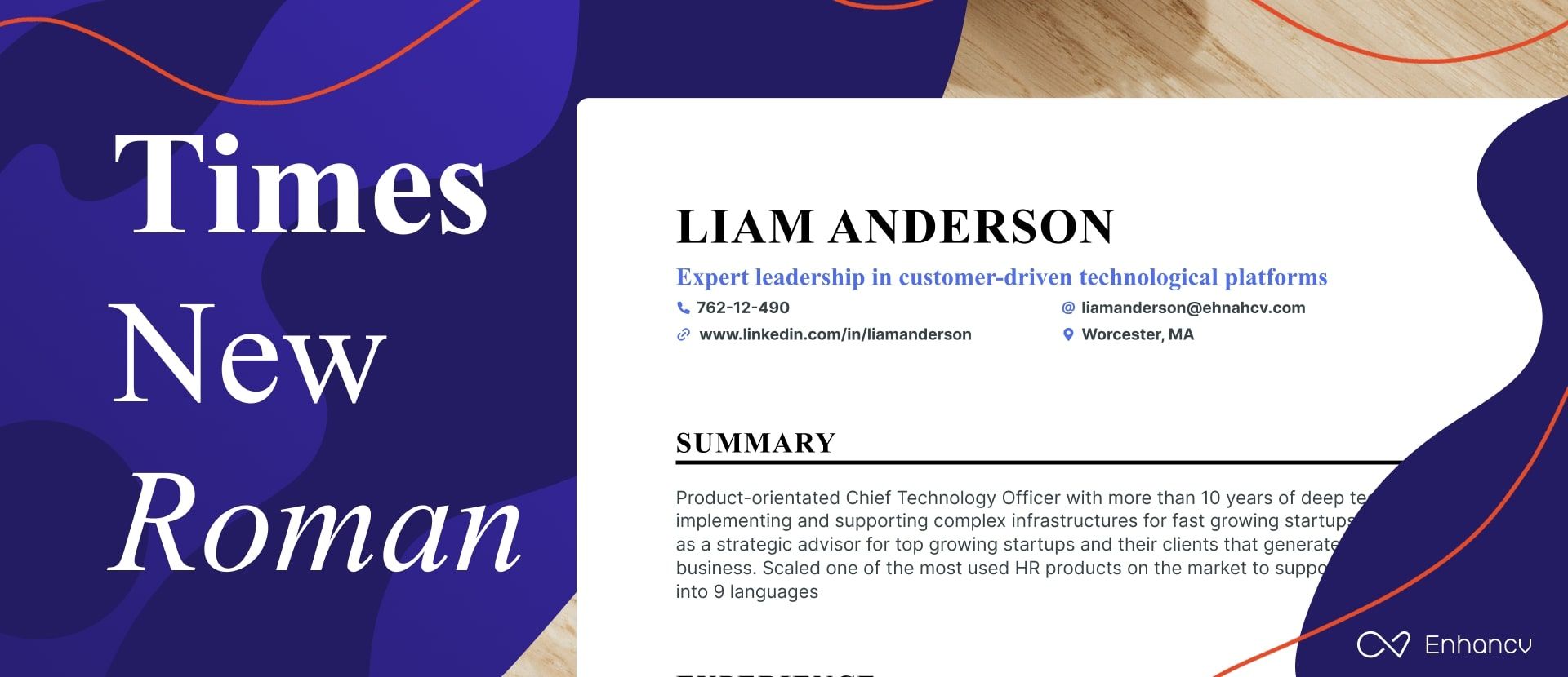
Times New Roman is the oldest font family in this list as it was created in the early 1930s. Due to the exceptional readability it offers, this typeface was used for print magazines and newspapers by the most popular publications around the world.
The truth is…
Despite its popularity, this may not be the best resume font for you. As an old-fashioned serif typeface, Times New Roman makes your resume look like it was designed using an old template on MS Word.
Besides, there is always the possibility that other candidates with similar layouts may be using Times New Roman too. So that makes it impossible for you to grab attention and leave a lasting impression.
- Download Times New Roman for free.
- Want a newer typeface to use instead of Times New Roman? PT Serif is great for section headings and subheadings.

Pro Tip
You can easily download the fonts featured in this article and use them to build a resume. As long as you have these typefaces installed on your computer, you can use them with any software.
Here’s a short guide by Microsoft on how to add fonts to Windows in a few simple steps. For Mac users, here’s a different guide that will teach you how to install and validate fonts on Font Book.
Less popular, but still great resume font options
If you're thinking about trying different fonts for your resume, we've got some interesting serif and sans-serif options for you. First, let's look at the serif fonts.
Serif fonts are easily recognizable by the small lines or extra strokes at the ends of their letters, giving them a classic and professional look. Because of their excellent readability and formal appearance, they are often chosen for resumes, especially in fields that value tradition and neat presentation like law, research, academia.
Our first suggestion is Garamond. It’s famous for its elegant and timeless appearance, conveying a sense of sophistication and professionalism that makes it a classic choice.
In case you’re looking for a typeface that is easy to read on screens, Georgia is the best option for you, because it features sturdy structures and enough letter spacing.
Another great option for digital readability is Cambria, part of Microsoft’s ClearType Font Collection, optimized for clarity on computer monitors, whether on-screen or in print. Next up is Palatino, a font that stands out with its big x-height and wide proportions. It's both friendly and authoritative, making it perfect for corporate and creative environments.
For those in creative industries, Didot might be perfect, frequently used in fashion magazines. Characterized by its dramatic transitions between thin and thick strokes and distinctive hairlines, it embodies elegance and style.
Meanwhile, Merriweather is a font that balances traditional readability with a modern, open appearance, making it suitable for both web and print.
Lastly, if you're involved in screen-writing, consider Courier, designed to mimic typewritten text with monospaced, clear-cut letterforms, providing a unique retro feel.
Now let's explore some popular sans-serif fonts ideal for resumes.
Starting with Helvetica, this font is chosen for its clean and straightforward style, making it extremely flexible for any type of text.
Verdana is excellent for ensuring your resume is easy to read, with its wide letters and clear layout, especially on digital screens when submitting online applications. Tahoma, similar to Verdana, has tighter letter spacing which works well for creating compact and professional-looking documents such as cover letters and resumes.
Trebuchet MS, another font with a robust feel to it, adds a bit of personality with its slight quirks, while still maintaining an authoritative tone, ideal for both print and digital.
Moving on to Avenir Next, its sleek, modern look is perfect for giving your resume a contemporary edge, suitable for modern industries. For a warmer and more personable approach, Fira Sans is ideal for creative fields that value a friendly tone.
If you're looking to give your resume a modern edge, consider Montserrat. Its sleek, geometric lines ensure it stands out from the crowd. Meanwhile, Open Sans focuses on clarity and subtlety, keeping the attention on your achievements. For tech resumes, Roboto is a great choice as it combines a clean look with just the right amount of friendliness.
Lastly, Impact, true to its name, is best used for headings and titles to draw attention to key sections within your resume. Consider pairing it with some of the fonts mentioned earlier to create a dynamic and interesting layout that makes a strong impression.
Why do fonts matter when building a job resume?
Everything you put in your resume affects your application in one way or another, from the layout you choose to the colors and fonts you use.
Now don't get this wrong…
Font choice won't prove that you are experienced or well-qualified for the job. But it does have a huge effect on how recruiters see your resume and interact with it.
Here's why choosing a great resume font for your resume is vital:
A good font helps grab the recruiters’ attention
Six seconds is what it takes recruiters to decide whether or not they should read your resume.
Now let's face it – the font you choose will take up most of the page compared to other design elements. So it's usually the first thing that recruiters notice as soon as they pick up your resume. That's why even color and layout don't affect first impressions as much as font does.
Your resume typeface mainly impacts your personal brand. Resumes with well-chosen fonts are more attractive to headhunters because they're unique. On the contrary, an old typeface can push away recruiters just because it's overused and outdated.
A good font increases the readability of your resume
Using unique fonts to get hiring managers to notice you is one thing — but keeping them glued to your resume is another. After all, recruiters won't hire you just because your resume is beautiful but because you're qualified for the job.
Thankfully, professional fonts are all about clarity and maximum readability. If you take a close look at how typefaces have evolved over the years, you'll notice that the most popular fonts today are simple and easy to read.
To put it in simple terms – a good font will make it easier for headhunters to keep reading even if your sentences or paragraphs are long.
Fonts can help you leave a good first impression
Font choice also has a huge effect on what recruiters think about you after reading your resume.
When the competition is tough, a bad font can get you ignored…
No headhunter is willing to waste ten minutes on an illegible resume while they have 200 other ones waiting in their inbox. But even if they do, they'll be less likely to give you a fair chance after the negative experience they just had.
On the contrary, the outstanding resume font you used will be a way to leave a memorable impression after you're shortlisted. A beautiful resume can keep you on top of the recruiter's mind and get them excited about your application.
Additional resume formatting tips
First you need to know that font choice can significantly impact how much information you fit on a page. For instance, serif fonts like Times New Roman are usually more compact, allowing you to squeeze more words per line compared to wider sans-serif fonts like Arial.
Plus, you can't forget about the x-height. Higher x-heights, like those in Verdana, allow you to reduce the font size a bit while keeping everything readable, so you can pack more into your resume without it feeling squeezed.
However, fitting more words on the page is just part of the story. The clarity of the font at these smaller sizes is crucial. For instance, fonts like Calibri are designed to be clear even at smaller sizes, which means your resume remains easy to read and doesn't look overcrowded.
This brings us to an important choice regarding whether to use serif or sans serif typefaces in your resume.
Serif vs. sans serif – which typeface should you use in your resume?
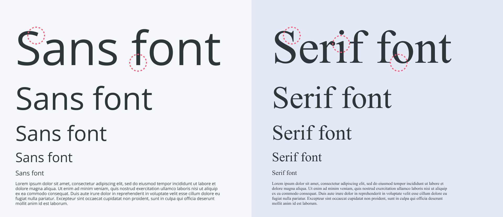
A typeface can either be serif or sans serif. Both styles are professional and popular, and there are pros and cons on each end. The main difference between the two is the decorative strokes at the end of each letterform for serif fonts.
Serif is a classic type of font that gives off a traditional vibe because it was the main typeface in the past century. Due to the decreased eligibility, however, serif fonts are better used mainly for headlines or short sentences to further embellish your resume.
On the flip side – sans serif is all about practicality as it puts readability first by being minimalistic and modern. That makes it the perfect choice for anyone designing a resume that they want to print and use online at the same time.
It's important to remember that choosing to use serif or sans-serif in your resume also depends on your industry.
For example, you might want to use a serif font if you're applying for a job in traditional industries such as law, finance, and education. In more innovative fields, however, you have to build a modern resume that shows creativity and personality. Thus, using sans-serif fonts becomes your best choice.
Can you use a script font in a resume?
Using a script font in a resume is not recommended. It looks beautiful with its flowing, cursive-like design, but it can be a real headache for recruiters who need to quickly scan through resumes to pick out important details. Also, it may not be processed accurately by Applicant Tracking Systems that many companies use to filter resumes. These systems scan your resume for key information, but if they can’t decipher the letters due to the fancy script, important details might not get recorded. This could lead to your resume being overlooked right from the start, regardless of your qualifications.
When creating your resume, pick fonts that are easy to read so employers can quickly find important information. Opting for traditional serif fonts like Times New Roman, or clean sans-serif fonts such as Rubik or Lato, is a smart decision. These fonts guarantee a professional appearance no matter the industry.
Combine two fonts in your resume for a more custom look
Pro Tip
The two fonts will only work if they're well fit to complete each other. Having two dominant typefaces on the same page will create so much conflict as they'll fight each other for attention.
One of the best ways to improve how your resume looks is to use two complementary fonts. This allows you to lead the reader's eye more easily and establish a clear visual hierarchy on the page. To achieve this, choose modern yet professional typefaces that complement each other without being too similar.
Pro tip
Choose both a primary and secondary font that are modern-looking for your resume. And remember, it’s best to avoid overly fancy fonts that might turn recruiters away.
It's a good idea to pick resume fonts that differ in style, making them easy to tell apart at a glance. Using fonts that are too similar can lead to confusion and make your resume harder to follow.
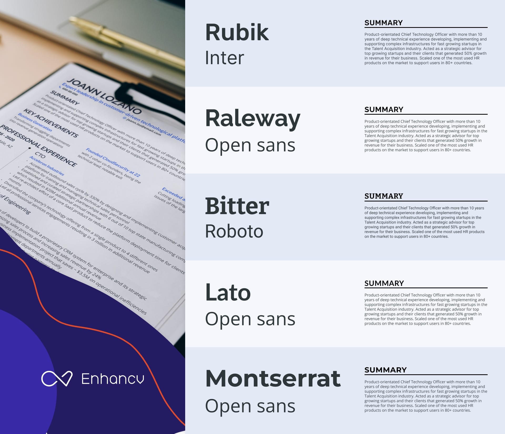
Now let's discuss why the font pairs shown above are effective at capturing recruiters' attention on your resume.
- Rubik & Inter: A great mix where Rubik brings a friendly, rounded feel, and Inter ensures clarity on screens. This duo makes your resume inviting yet professional—perfect for both print and digital.
- Raleway & Open Sans: Elegant and clear, Raleway offers modern, distinctive style, while Open Sans keeps things straightforward and readable. This pairing adds a subtle flair, making your resume stylish yet focused.
- Bitter & Roboto: Ideal for a balanced resume, Bitter adds formality with its condensed serif look, great for headings. Roboto complements this by simplifying the body text, combining professionalism with a welcoming tone.
- Lato & Open Sans: Lato's semi-rounded design emits warmth, suited for approachable headers, while Open Sans maintains simplicity and readability. Together, they craft a resume that’s friendly, professional, and clear.
- Montserrat & Open Sans: Montserrat's geometric style stands out in headers, with Open Sans providing clear readability for the main text. This combination ensures your resume is modern, appealing, and easy to navigate.
Ready to make an impressive resume with these font pairings? Start now with Enhancv's intuitive resume builder and bring your dream job to life! 👇
Get your resume score!
Drop your resume here or choose a file. PDF & DOCX only. Max 2MB file size.
Adjust the font size of your resume
The ideal font height differs based on the length of your resume and the content you're adding.
The standard font size for resumes is 12pt, but it can go slightly up or down to allow you to fit all sections into a single page. Now be careful as anything below 10pt becomes impossible to read — whereas a text size larger than 14pt may be annoying as it slows down the reading speed.
It's essential to have a different resume font size for each element depending on its importance on the page. And you have to be consistent with these choices throughout your whole resume.
For the resume header, your full name should come in the largest font. Your job title follows with a lower size as it is the second most important element. The rest of the contact details should match the default font size in other sections.
Pro tip
Your resume headings must be slightly larger and thicker so that they can stand out easily. The remainder of your resume sections, paragraphs, and sentences should come in a fixed size of around 12pt.
Choose a readable font weight
Size isn't the only thing affecting readability when it comes to typefaces. The weight of your resume font can also make or break your job application.
How is that possible?
Recruiters will struggle to read any resume that comes in a light font weight even when the size is perfect. By the same token, using a bold font weight for paragraphs will only make your page look dense and decrease legibility.
Here's a much better solution…
If you're looking to make certain elements on the page stand out, you're better off using a regular font weight. You'll then be able to create contrast by bolding specific words on the page or using a different color to draw attention.
Key takeaways
Font plays an important role when it comes to building a resume that can help you land your dream job. Because of the huge effect it has on first impressions and readability, picking the wrong typeface can be a sure way to get yourself ignored.
This article features the best serif and sans-serif fonts you can use to build a job-winning CV. Combine that with additional tips shared at the end, and you'll create a stellar CV that's guaranteed to make you the center of attention.
Having a hard time creating a resume using the right fonts?
Enhancv builder is here to put your mind at ease… You no longer have to worry about font size, color, page layout, or any other technical details. Our CV builder is an easy-to-use tool that will save you time and help you get hired.
Are there any other fonts you like to use for your resume that we haven’t mentioned? Let us know in the comments below!
Make one that's truly you.