


Infographic Resume Templates
We created the best infographic resume templates to help you wow your future employer before they even hire you. To get started, click on your favorite template below and replace any text with your own content.
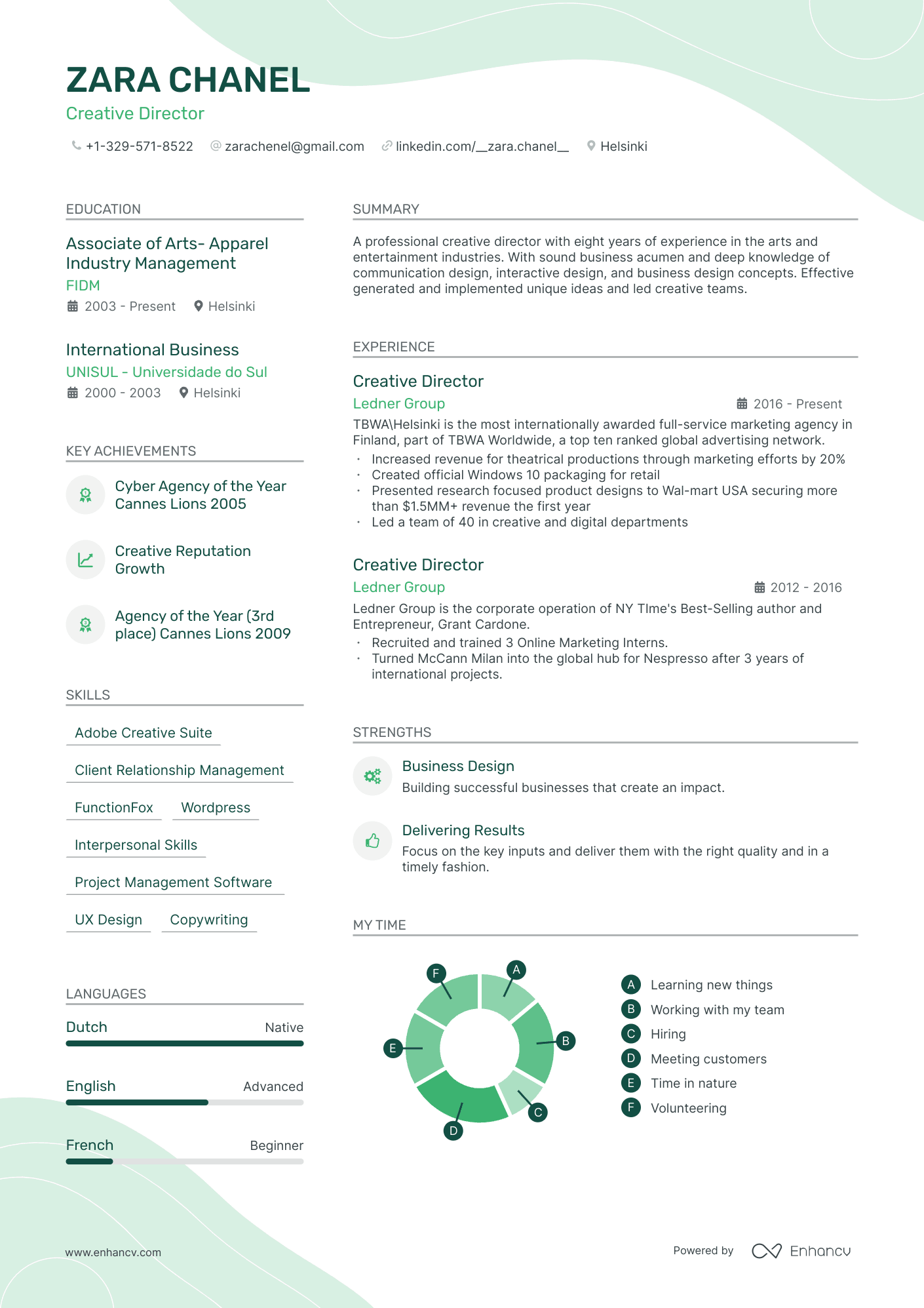
Creative
Creative resume template. For every kind of applicant looking to stand out.
Compact
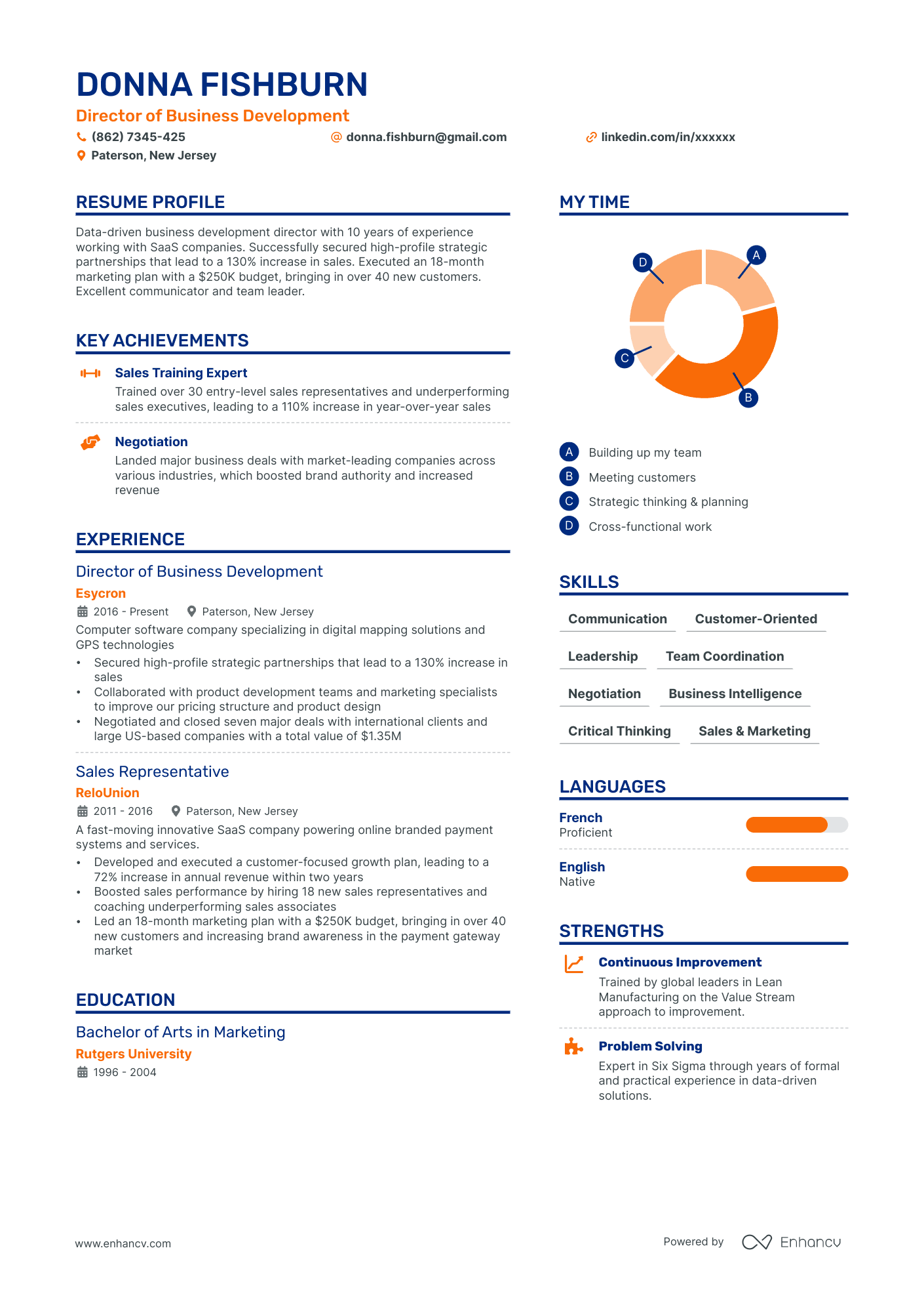
Space-saving resume template. Great for senior job-seekers in Modern industries.
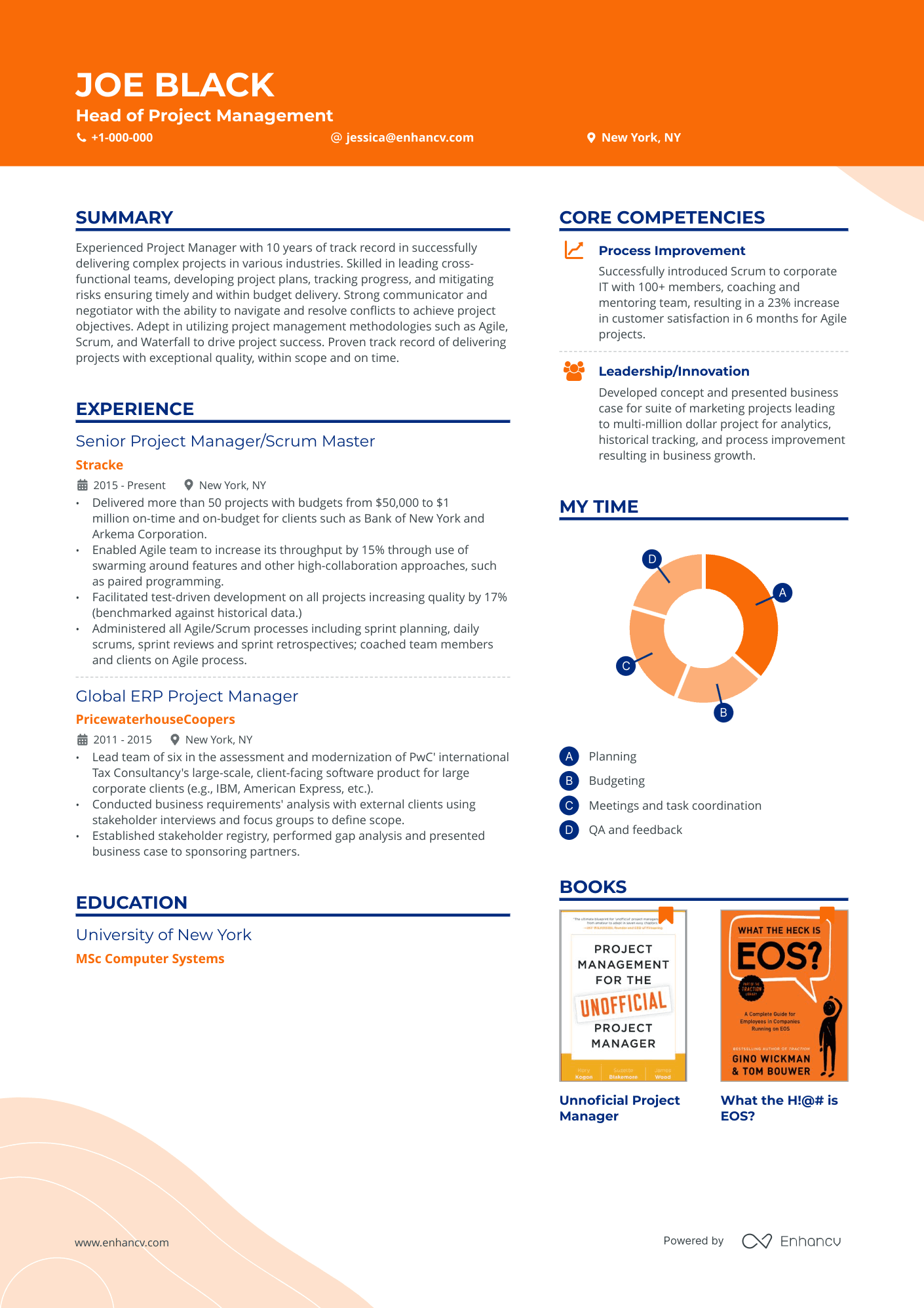
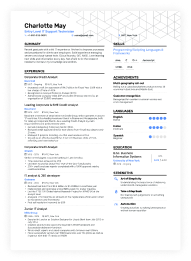
Modern
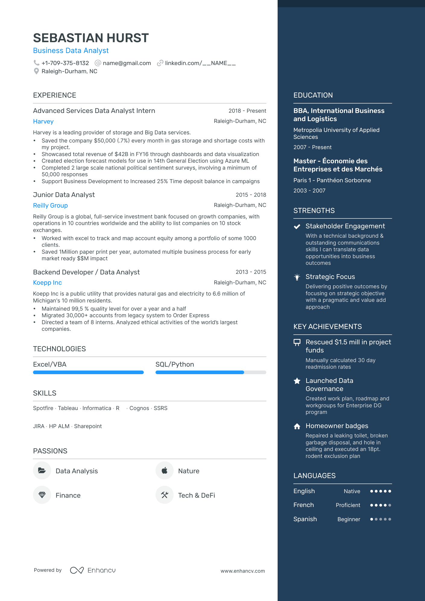
Visual resume template. Perfect for mid-level candidates with 3-10 years of experience.
Stylish
Colorful resume template. Make a bold statement with a bright and vibrant design that captures attention.
Elegant
Flat design resume template. Keep it simple and stylish with a flat design that is both modern and functional.
Double Column
Graphic design resume template. Showcase your design skills with a visually appealing template that demonstrates your creativity.
What is an infographic resume template?
The rapid development of consumer and professional graphic programs made infographic resumes very popular in recent years.
What exactly is an infographic resume and when to use it?
In simple words, this resume template is a visually enhanced version of the classical resume, using more graphical elements to display information. In many cases, the information is presented by icons, charts, and graphs.

Pro tip
When to use an infographic resume template?
The traditional resume is with a simple layout and follows a strict format, generally beginning with a header, title, and contact details. The document continues with your summary, followed by your professional work history, and finishes with your educational information and relevant skill sets.
- Personality: There is no limit as to who can use this type of template. The consensus is that people with a more creative nature will use it—mainly graphic designers. Just because they have the skills to make such a resume. Professionals from the sales and marketing industry can also take advantage of infographics as a means to display their financial results and achievements.
- Professional field: The top three industries known for infographics resumes are Graphic design, Sales and Marketing, and PR. Of course, the use isn't limited to these industries, and you could assess the situation on a case-by-case basis. You can also prepare a resume that only has one or two infographics, so in this case, you don't have to worry if it's appropriate or not.
- Company: If you want to work for a top graphic design company such as Sociallyin, Clay, Neuron, Xhilarate, Sagmeister & Walsh, or other world-famous names, the infographic resume template is a reasonable first step.
- Background and education: People with the skills to create such a resume from scratch have a background and/or education in graphic design. The rest of the applicants who wish to display any information as an infographic could hire a designer or use resume builders.
- Hierarchy: There's no clear correlation between seniority and the use of graphic resumes in the graphic design industry.
The situation is different in the Sales and Marketing, PR, or Management departments. The applicants using infographics are at least at entry management positions or have solid experience. The reason for this is that these applicants use infographics to display results such as sales, customer acquisitions, economics, etc. If you're at the beginning of your career, you seldom have numbers to show.
Infographics could also be applied in any industry to display skills, achievements, or other things. Applicants use them to make their resumes colorful and attractive. This is usually done by entry position applicants.
Tips for building the best infographic resume
Design
The design of the infographic resume should be innovative and creative. This is something that's a bit risky and there are no rules. The only thing you have to remember is that this is still a resume and its number one objective is to display information.
If you aren't in a creative industry, you can still benefit from the moderate use of a few infographics, such as charts or graphs. This is a much safer approach.
Enhance your sections’ headings with color and use creative icons to bring character to the resume. Depending on the impression you want to make, you can use a bold and impressive color palette or a monochromatic one.
Use backgrounds for the header and the rest of the resume, but make sure that the texts are easy to read. The background must convey a message or be part of the overall concept of the resume.
Font
You can get creative with your header font, but use a simple and readable one for the rest.
Don't use more than 2 to 3 different fonts. You can use one font for the headings and another for the rest of the content.
The choice of font will depend on the industry. For example, the tech industry prefers sleek and minimalist sans-serif fonts. More traditional industry recruiters would appreciate fonts such as Arial or Lato. Take a look at other resume examples in your industry, and even at corporate websites and documents.
The font size should be 11 to 12 pts. but not less than 10 and the headings should be between 14 and 18 pts.
Colors
The use of colors on an infographic resume should be moderate. Don't use more than 3 to 4 different colors. Blue and green are good options. Try to use lighter backgrounds and darker fonts so that the text is readable. Remember that readability is very important. The resume isn't a painting, so it needs to be a document that gives information to your potential employers.
Layout
Choose a layout that'll make your resume easy to read. You can be creative and use infographics, but try to keep the usual arrangement of the sections. There's a reason why resumes don't start with the Interests section, for example.
The truth is that the recruiter will spend just a few seconds deciding if you're a good match before they move on to the next resume. For this reason, the summary section, which is a condensed version of the whole document, is one of the most important ones.
Professional HRs agree that the most important information should be in the first one-third of the document.
The header is where everything starts. You have to include your name, address, phone number, email, and social media accounts there. On an infographic resume, you could use a background image for the header that is either typical for the industry or says something specific about you. To achieve better readability, you can use filters and mute the colors on the header image. You can also use highlighting color within the text to make it more readable.
Make a statement with your name using a font size of 14 to 20 pts. Add honorifics if you have such.
Use a professional email. Preferably a modern free service such as Gmail. If you're still at university or have just graduated, you can use your university email if you think it'll add prestige. A professional email should look something like this:
- richard.johnsons@gmail.com
- r.johnsons@gmail.com
- johnsons@gmail.com
- richard.d.johnsons@gmail.com
- r.d.johnsons@gmail.com
For Gmail, the “.” doesn't matter. You can write the email with or without it, and you'll still receive messages. You own all the dotted versions of your email.
The dots matter if you use Gmail through work, school, or other organizations (like yourdomain.com or yourschool.edu).
If you have your own website/domain and strictly on a case-by-case basis:
- richard@johnsonswebsite.com
The header is the place where you can link to your social media accounts, such as LinkedIn.
You can also add a headline. The headline is a short phrase or sentence that introduces you to the recruiter.
Next is the summary section. Turn this into a mini-version of your resume. List skills, achievements, and other important information. Summarize everything in 2 to 3 sentences that'll make the recruiter read further. Ask yourself why this company would hire you. Then write the answer in the summary.
If you lack experience, and still acquiring skills, write a resume objective instead of a summary. This is the place where you explain your motivation and goals related to your future job.
The heart of the resume is the work experience section. List your job experience in reverse-chronological order, adding information such as position, location, dates, name, and a brief overview of the organization.
Use bullet points or icons and emphasize achievements while making clear what the scope of the job was.
The education section comes next. List your latest degree first and add the rest in the same reverse-chronological manner as you did your job experience. Don't add your high school unless it's important to the position.
The next two are the achievements and skills sections. Here you can use some appealing icons to emphasize the content. List your achievements and skills using keywords and short phrases.
What about any additional sections? With this type of resume template, you can add languages, interests, hobbies, projects, certificates, training courses, etc., and represent these graphically in a creative manner.
Number of pages
One-page resumes are the most preferred by recruiters, according to statistics. With infographics, you can save a lot of space and make this possible even if you have more job experience. The rule is that you can have an additional page for every ten years of experience.
Infographic resume template pros and cons
Pros
- Infographics resume templates often allow you to fit your information into just one page.
- They can help you stand out if you come up with a creative concept to introduce your information. This is also helpful if you need to prove your creativity as a job requirement.
- They're easy to read and the information is easy to digest by the recruiter.
Cons
- In case the HR department uses ATS, you could lose the advantage of using text keywords.
- They take time to make if you aren't familiar with the software.
- You risk not being understood if your concept is too metaphoric and takes time to understand it. The recruiter might get frustrated and just go for the next resume.