If you’re looking for a job, you’ve probably heard that recruiters do an initial application scan before they do an in-depth read. Simply put, before they process a single word of your qualifications, they judge the look of the document. This applies to both your resume and your cover letter.
When a recruiter opens a cover letter that’s visually balanced, uses consistent typography, and respects white space, this triggers a subconscious assumption: “This document is organized and professional, therefore this candidate must be, too.”
In this article, you’ll learn how to design a cover letter that reduces the cognitive load for the recruiter, making your application the easiest one to say “yes” to.

Key takeaways
- Recruiters judge your competence based on your document's visual layout in milliseconds.
- A clean design subconsciously signals a professional, organized candidate.
- Avoid the "Wall of Text" by using left alignment, bullet points, and short paragraphs to improve skimmability.
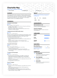
- Treat your header as a personal logo that must match your resume’s accent color and font for a cohesive brand.
- Use these three pillars of design—visual hierarchy, alignment, and micro-contrast—to guide the reader's eye.
- Avoid design red flags like tiny margins or inconsistent bullet styles.
The psychology of visual trust
Even for people who love a bit of creative chaos, cluttered documents are a no-no. Hiring managers simply don’t have the time to navigate a visual maze to understand your qualifications. A clean and structured document isn’t boring—it actually signals you value the reader’s time.
It also makes you appear more genuine. We naturally perceive information that is easy to read as being more truthful and accurate. Conversely, a design that is messy or overly intricate can raise a subconscious alarm, suggesting you might be trying to distract from a lack of experience or conceal a weakness.
How to design a cover letter: breaking the wall of text
A cover letter consists of just two main elements: the cover letter header and the body content. On the surface, this might make it seem like there’s not much to do in terms of design, but that’s simply not true.
Even in a text-heavy document, you can leverage tools like spacing, margins, and alignment to create visual variety rather than just a wall of words.
The biggest design mistake candidates make is creating a “Wall of Text”—three or four long, dense paragraphs that look exhausting to read. Even if the content is excellent, a dense layout pushes the reader away.

How to design your cover letter for skimmability
- Always align your text to the left: While “Justified” text (straight edges on both sides) looks neat in a printed book, on a digital screen it creates uneven gaps between words that tire the eye. Left-aligned text creates a consistent anchor on the left side, making it easier for the reader to track the start of the next line.
- Use bullet points for visual breaks: Cover letters are narratives, but that doesn't mean you can't use lists. A short bulleted section in the middle of your letter can break the monotony of paragraph blocks. It also acts as a “speed bump,” forcing the scanner’s eye to stop and pay attention to your achievements.
- Keep your paragraphs short: Use a maximum of three to four lines. Visually, shorter blocks of text feel less like a lecture and more like a conversation.
The 3 elements of modern cover letter design
Once you have structured your text for readability, you need to refine the visual details so they don't distract the reader.
You don't need a degree in graphic design to get this right. You just need to master three variables that control the look and feel of your document.
Let’s see the three pillars of effective cover letter design.
Visual hierarchy
What the eye notices first matters more than people think. Before the recruiter reads a single sentence, their eyes decide where to land—that’s visual hierarchy.
A modern cover letter uses hierarchy intentionally: your name should stand out more than your job title, your header should feel distinct from your body text, and any key details (like contact info) should be immediately scannable. These subtle differences signal confidence and structure, creating the impression that your letter is easy to navigate.

PRO TIP
As distinct as your header should be from the rest of your cover letter, it’s best if it looks similar or identical to your resume header. That ensures the cohesiveness of your entire application.
Typography
If layout is the body of your cover letter, typography is the voice. The font you choose sets the subconscious tone of the conversation before a word is read. Design operates on "mood."
A serif font (with small decorative feet, like Garamond, Bitter, Volkhov) whispers "tradition, reliability, and authority," making it perfect for law or finance. A sans-serif font (clean and geometric, like Rubik, Animo, Roboto) speaks with a "modern, efficient, and approachable" tone, ideal for tech and startups.
Apart from legibility, a good choice of font can match your voice to the company culture.
Micro-contrast
Micro-contrast is created through small, controlled visual differences that help the reader understand your document instantly.
In the header, this usually means giving each piece of information its own subtle “weight”: your name might be slightly larger or bolder, your job title a touch lighter, and your contact details the smallest or softest. These quiet distinctions create a natural hierarchy, making the top of your cover letter feel organized without any decorative elements.
In the body, micro-contrast shows up in even subtler ways. Since a cover letter is mostly paragraphs, the contrast comes from minimal cues—like using bold for a key metric, italics to emphasize a phrase, or a short bullet list to spotlight accomplishments.
These touches break visual sameness just enough to guide the reader’s eye, without disrupting the overall clean, professional look.
As a Certified Professional Résumé Writer, I’ve seen thousands of cover letters. It makes perfect sense to try and show personality through design, but keep in mind that you can make the biggest impression through the text itself.
Remember not to repeat your resume: your cover letter is a separate document and a separate chance to prove how fit you are for the role.
Author’s take
Choosing the right cover letter design template
If you’re still wondering what a winning cover letter design looks like, take a look at the design principles we discussed applied strategically.
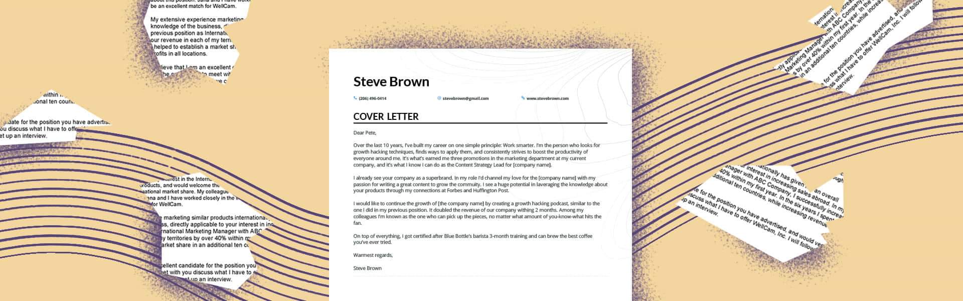
Traditional
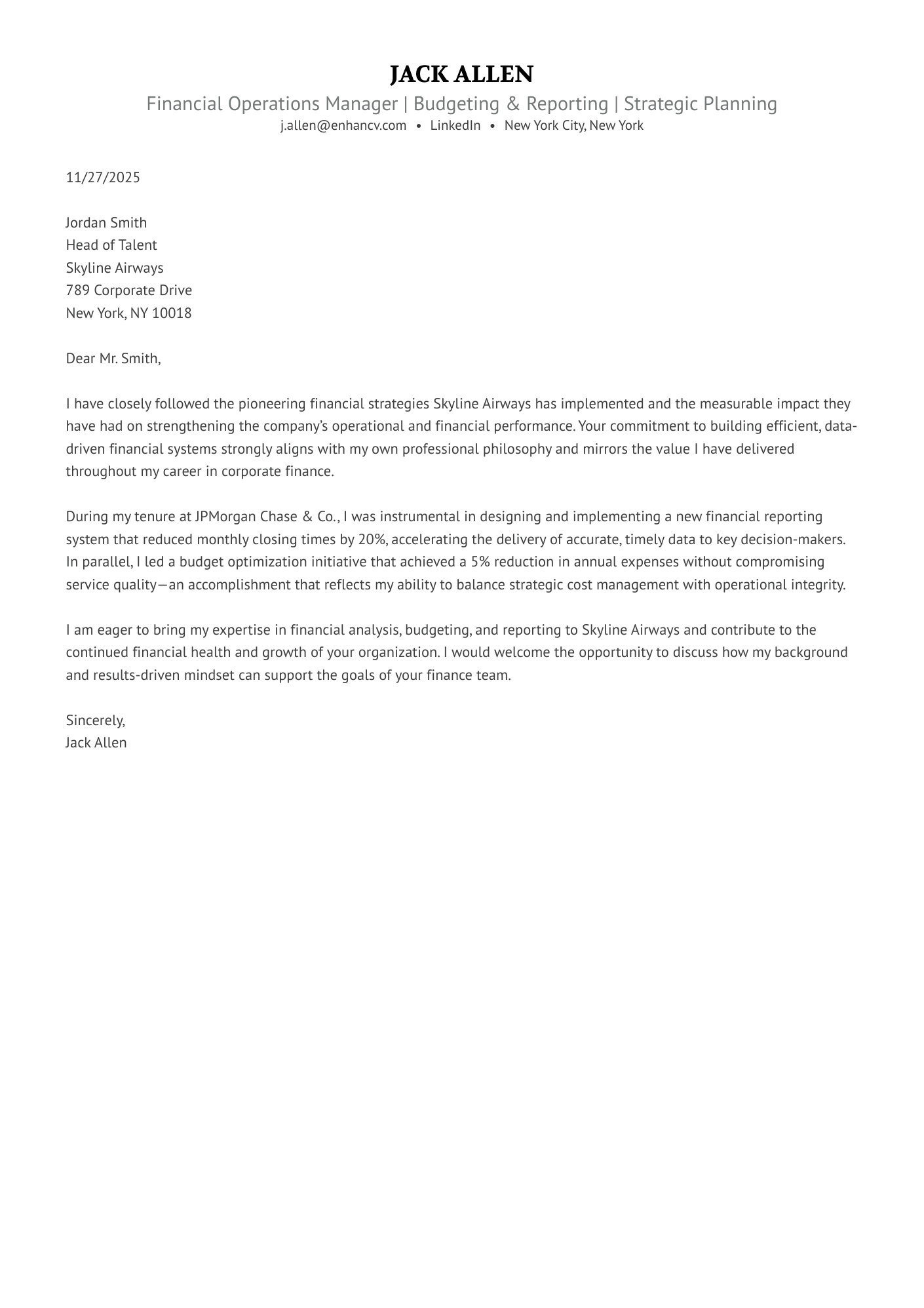
A risk-free, substance-first layout designed for conservative industries—making it the ideal choice for a finance operations cover letter where clarity is king.
Modern
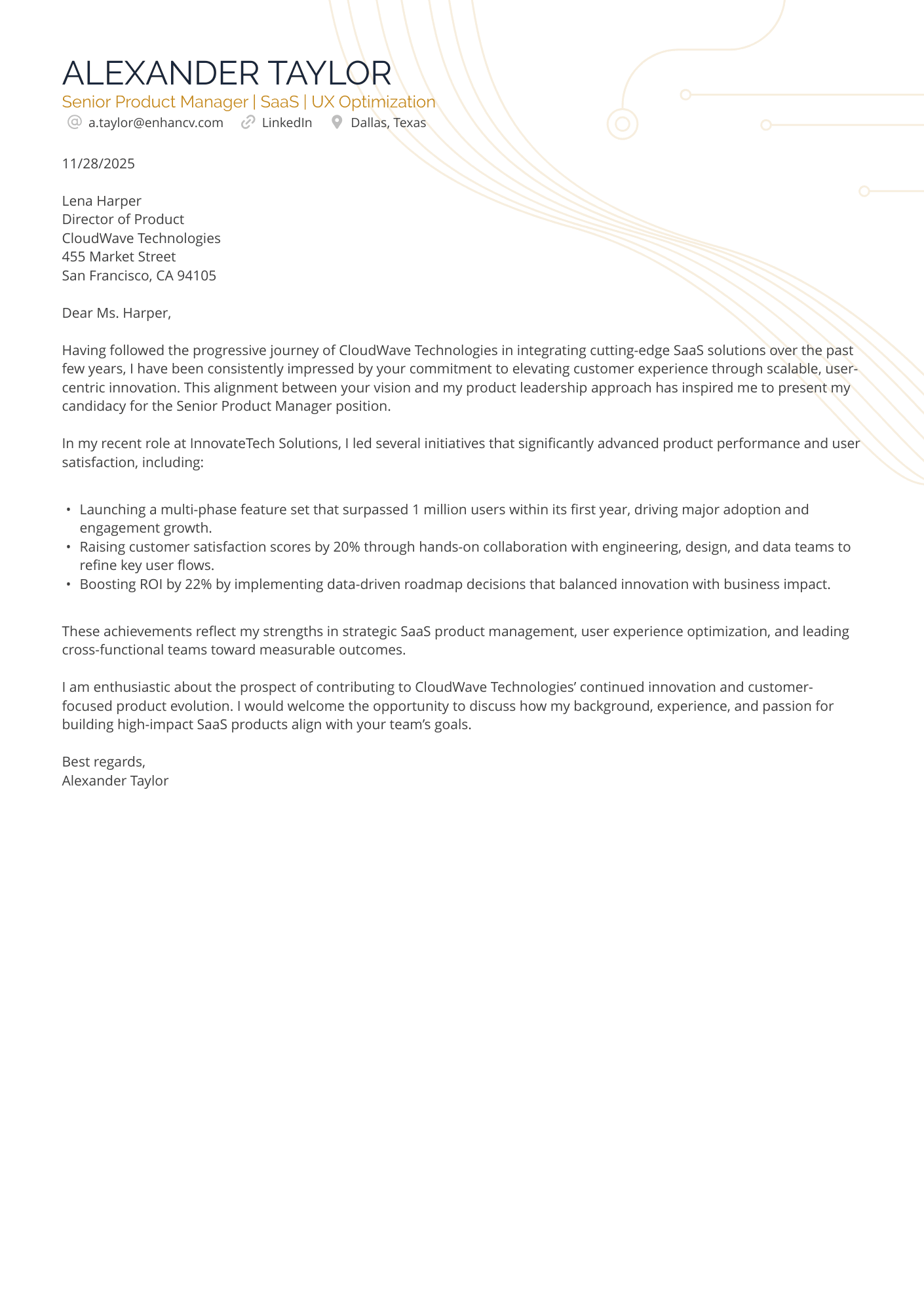
The bullets in this SaaS cover letter provide structure, and the subtle use of color and a tech-related background align with the role. This example balances professionalism with personality—the perfect choice for an application to a forward-thinking startup.
Creative
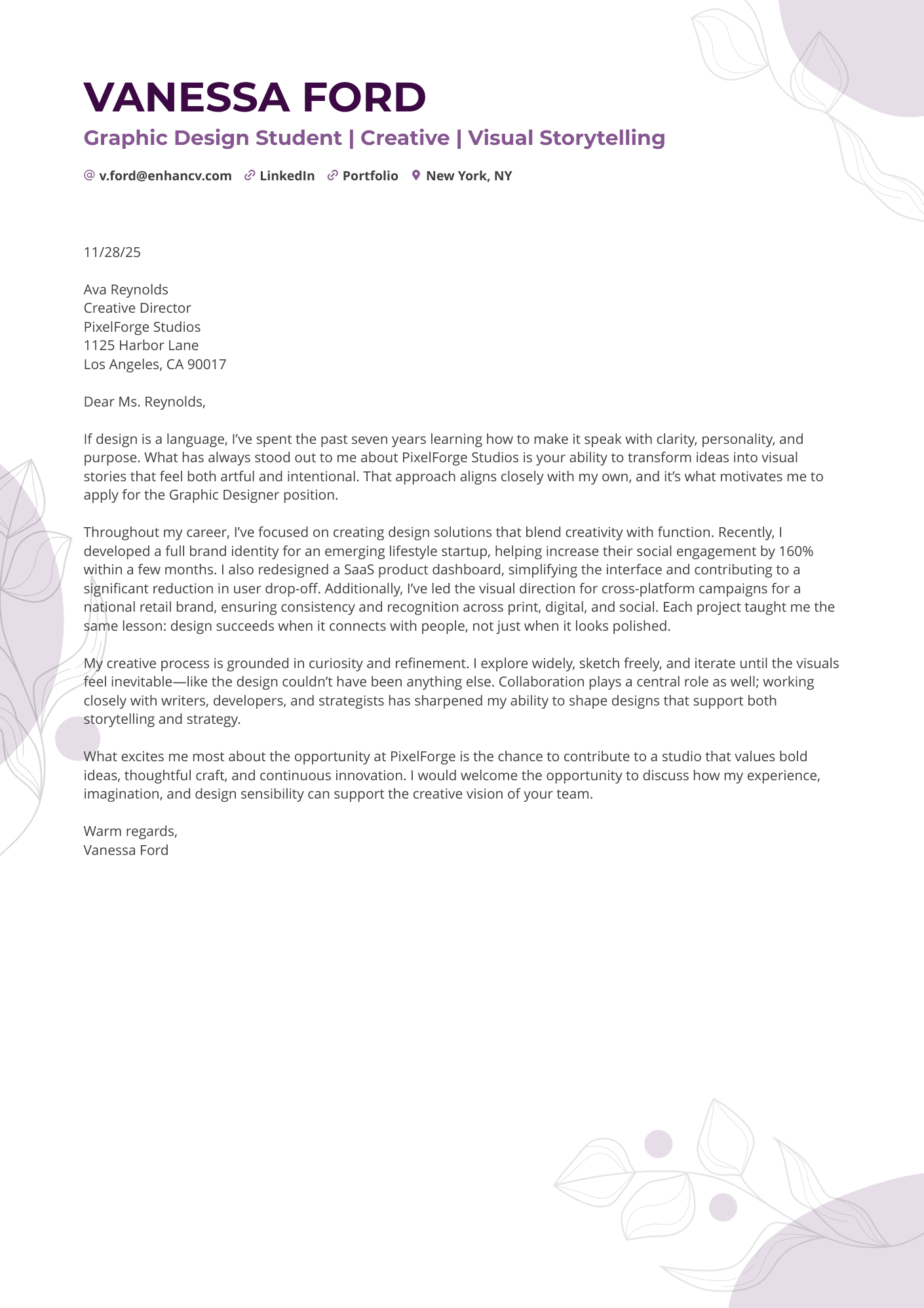
A high-impact format that perfectly complements your graphic design cover letter, turning your entire application into a cohesive mini-portfolio.
What to avoid in your cover letter design
A recruiter won’t reject you simply because they don't share your aesthetic taste. They will reject you because of what a sloppy design signals about your work ethic and attention to detail.
The "cramped canvas" effect
Trying to squeeze every detail of your career onto one page by shrinking margins to 0.5 inches or reducing font size to 9pt is a major design error. This creates a dense, claustrophobic look that signals you lack the ability to prioritize information or edit your own thoughts.
If you can’t fit your message comfortably with standard spacing, the solution isn't to break the design—it's to edit the content.
Widows and orphans
In typography, a "widow" or "orphan" is a single word left dangling on a line by itself at the end of a paragraph. While it might seem like a minor detail, to a recruiter with a keen eye, it looks messy and unfinished.
Leaving these stragglers signals that you didn’t review the final layout before hitting send. Always adjust your tracking slightly or rewrite the sentence to tuck that lonely word back onto the previous line. The Enhancv app ensures no words hang alone in a row.
Visual noise (overstyling)
It’s tempting to bold every achievement, italicize every company name, and underline every skill to ensure they are seen. But this backfires: when everything is emphasized, nothing is.
Stick to one method of emphasis and use it sparingly—only for the absolute most critical metrics you want to catch the recruiter's eye in a three-second scan.
How to “design” without being a designer
Let’s be honest: trying to align margins, match hex codes, and fix line spacing in a standard word processor is a nightmare. You move one bullet point, and suddenly your header jumps to the next page.
You don't need to fight with the software to get a professional result.
The easiest way to make good design easily is to use a dedicated tool like the Enhancv Cover Letter Builder. It handles the visual hierarchy, alignment, and ATS-friendliness automatically.
The Builder relies on our library of thousands of cover letter examples to give you a quick outline you can design and fill with content to your own preference.
Alternatively, you can use the Cover Letter Generator—just feed it your resume and it’ll quickly create a cover letter you can use.
Drop your resume here or choose a file.
PDF & DOCX only. Max 2MB file size.
And before you get started on that cover letter, make sure your resume is up to standard, too. Run it through Enhancv’s Resume Checker to find out its score.
Is your resume good enough?
Drop your resume here or choose a file. PDF & DOCX only. Max 2MB file size.
Final thoughts
Contrary to popular belief, design is about making things work, not making them pretty. Good design invites attention to your application.
So before you hit send, do the “Print Preview Test.”
Zoom out on your screen until the text is too small to read. Look at the shape of the document. Does it feel balanced? Is there enough white space to let the content breathe? Does the header anchor the page effectively?
If the answer is yes, your design has done its job. It has cleared the path for your words to shine. Now, let your qualifications do the rest.