Selecting the right font for your cover letter might seem like a minor detail, but it plays a crucial role in shaping a recruiter’s first impression. Just as professional attire can influence an interviewer's perception, your font choice affects how your application is received.
A well-chosen font improves readability and conveys a sense of competence, making it easier for hiring managers to understand your message. On the other hand, an inappropriate font can make your cover letter harder to read and distract from your qualifications.
In this guide, we’ll walk you through the best fonts to use, common mistakes to avoid, and formatting tips to help your cover letter appear polished and appropriate for your industry.

Key takeaways
- Match the cover letter font to the one on your resume.
- Best fonts: Times New Roman, Arial, Calibri, Garamond, Georgia, Helvetica, Rubik, and Lato.
- Recommended font size: 10.5–12 pt.
- Font choice should reflect industry standards, improve readability, and create a clean, professional look.
A great cover letter starts with a solid resume—so, you guessed it, that’s your first step. Run it through our ATS checker, and if it’s good to go, you’ll be ready to craft a cover letter that’s perfectly tailored to it
Drop your resume here or choose a file.
PDF & DOCX only. Max 2MB file size.
Key factors in choosing a font
Your font might seem like a small detail, but it plays a significant role in how your cover letter is perceived. Since recruiters scan through hundreds of applications, your font needs to be clear, readable, and appropriate for the role.
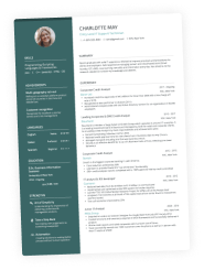
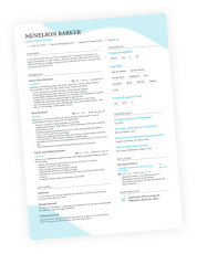
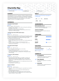
- Consistency with your resume: Your cover letter is never sent on its own—it should match your resume in font, size, and formatting. A cohesive design makes both documents easier to read and reflects your attention to detail.
- ATS compatibility: Many applicant tracking systems (ATS) struggle with overly decorative or unique fonts. To avoid formatting issues, choose a standard, widely accepted font that ensures your cover letter is processed correctly.
- Readability is crucial: A well-chosen font allows hiring managers to quickly absorb your content without unnecessary strain. Simple, clean fonts improve clarity and help your message stand out.
- Avoid overly stylized fonts: Decorative or informal typefaces can make your application look unprofessional. Stick to fonts that convey reliability and competence.
- Use a font that displays correctly everywhere: Choose a standard font that appears the same across different devices and software to prevent formatting inconsistencies.
Choosing the right font makes your cover letter visually appealing, easy to read, and aligned with industry expectations.
Best fonts for your cover letter (with examples)
Your font should enhance readability while maintaining a polished, cover letter structure appearance.
Here are eight recruiter-approved fonts that strike the perfect balance:
Cover letter fonts
- Times New Roman: A classic serif font widely accepted in corporate and academic settings. A reliable choice for traditional industries.
- Arial: A clean, modern sans-serif font known for its clarity in both print and digital formats.
- Calibri: The default Microsoft Office font, offering a contemporary, professional look.
- Garamond: An elegant serif font with a refined, sophisticated feel—ideal for formal industries.
- Georgia: A serif font designed for screen readability while maintaining a classic look.
- Helvetica: A sleek, neutral sans-serif font that’s frequently used in business documents.
- Rubik: A rounded sans-serif font with a modern touch, perfect for tech and creative fields.
- Lato: A contemporary, approachable sans-serif font that balances warmth with professionalism.
Each of these fonts guarantees that your cover letter is easy to read by both employers and ATS systems. While a great font can elevate your application, choosing the wrong one—such as overly decorative or informal fonts—can undermine your credibility.
Avoid these common font mistakes
A well-formatted cover letter makes it easier for hiring managers to focus on your qualifications.
Here are a few common pitfalls to avoid:
- Mismatched fonts between your resume and cover letter: While not a strict rule, keeping your cover letter visually consistent with your resume is generally recommended. Your cover letter header is often a direct copy from your resume, so using different fonts across documents can create a disjointed look.
- Using multiple fonts: Stick to one typeface to maintain a clean, cohesive look.
- Choose a traditional typeface: Avoid fonts that look casual or outdated, such as:
- Comic Sans: Often seen as too informal.
- Courier: A monospaced font that can appear old-fashioned.
- Papyrus: Considered decorative and not suitable for professional documents.
- Inconsistent font sizing: Keep it between 10.5–12 pt. for a well-balanced layout. Your cover letter font size should match your resume’s for consistency.
- Poor contrast choices: Always use dark text (black or dark gray) for optimal readability on all screens.

PRO TIP
When to break the rule: If you’re using an infographic, video, or other creative resume format, use a traditional font in your cover letter for easier reading.
A clean, well-chosen font makes your cover letter easy to scan and leaves a strong impression.
How to choose the best font for your specific application
Generally, your font choice should align with the industry and culture of the company you're applying for. A well-matched font helps your application feel more tailored to the job and appropriate for the workplace environment.
Traditional and conservative industries
These fields, such as law, finance, academia, and government, favor classic fonts that convey reliability and formality. Serif fonts are the best choice for these industries.
- Times New Roman
- Garamond
- Georgia
Modern and creative industries
Industries like tech, marketing, design, and startups value a contemporary and innovative look. Sleek, sans-serif fonts work best for these roles.
- Arial
- Helvetica
- Calibri
- Rubik
- Lato
Regardless of industry, prioritize clarity and consistency in your font choice. A well-matched font makes your application feel tailored and visually appealing.
Formatting tips for optimal cover letter appearance
A well-formatted cover letter improves readability and presents your content in a clear and refined way.
- Font size: Stick to 10.5–12 pt., with 11 pt. being the sweet spot for most applications.
- Line spacing: Use 1.0–1.15line spacing to keep your text balanced—too tight can feel cramped and too loose can look awkward.
- Margins: Keep them at one inch, just like the margins on your resume,on all sides for a clean, structured layout.
- Bold and italics: Use them sparingly to emphasize key points but avoid overuse, as it can make your letter look cluttered.
- Final check: Carefully proofread your cover letter to catch any typos or inconsistencies with your resume—small mistakes can undermine an otherwise strong application.
By following these formatting rules, your cover letter will be well-organized and easy to read, leaving a positive impression on hiring managers.
Conclusion
Font choice plays a key role in how your cover letter is received. By selecting a clear typeface, you enhance readability and ensure your application looks professional. Coupled with strong content, the right font shapes you as someone who knows how to communicate their personal brand effectively in writing.
Use our cover letter generator to create an ATS-friendly document that catches recruiters' attention.