
Creative CV (Curriculum Vitae) Templates for UK Job Applicants
Creative CV templates don’t have to be out of the box to win your job. Instead, you can use our clean templates with unique sections to stand out from the pack.
Stylish
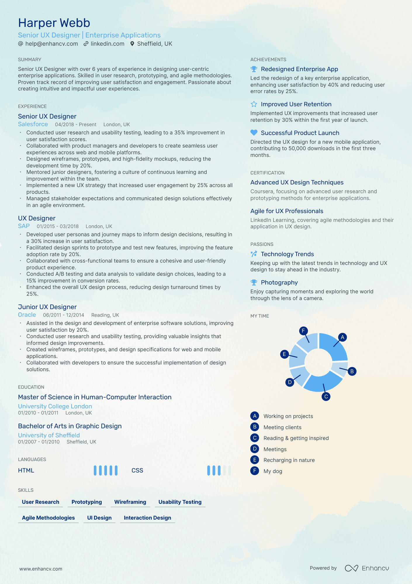
This template enables you to design a comprehensive one-page CV, ideal for listing your abundant skills and projects as a software engineer or data scientist.
Double Column
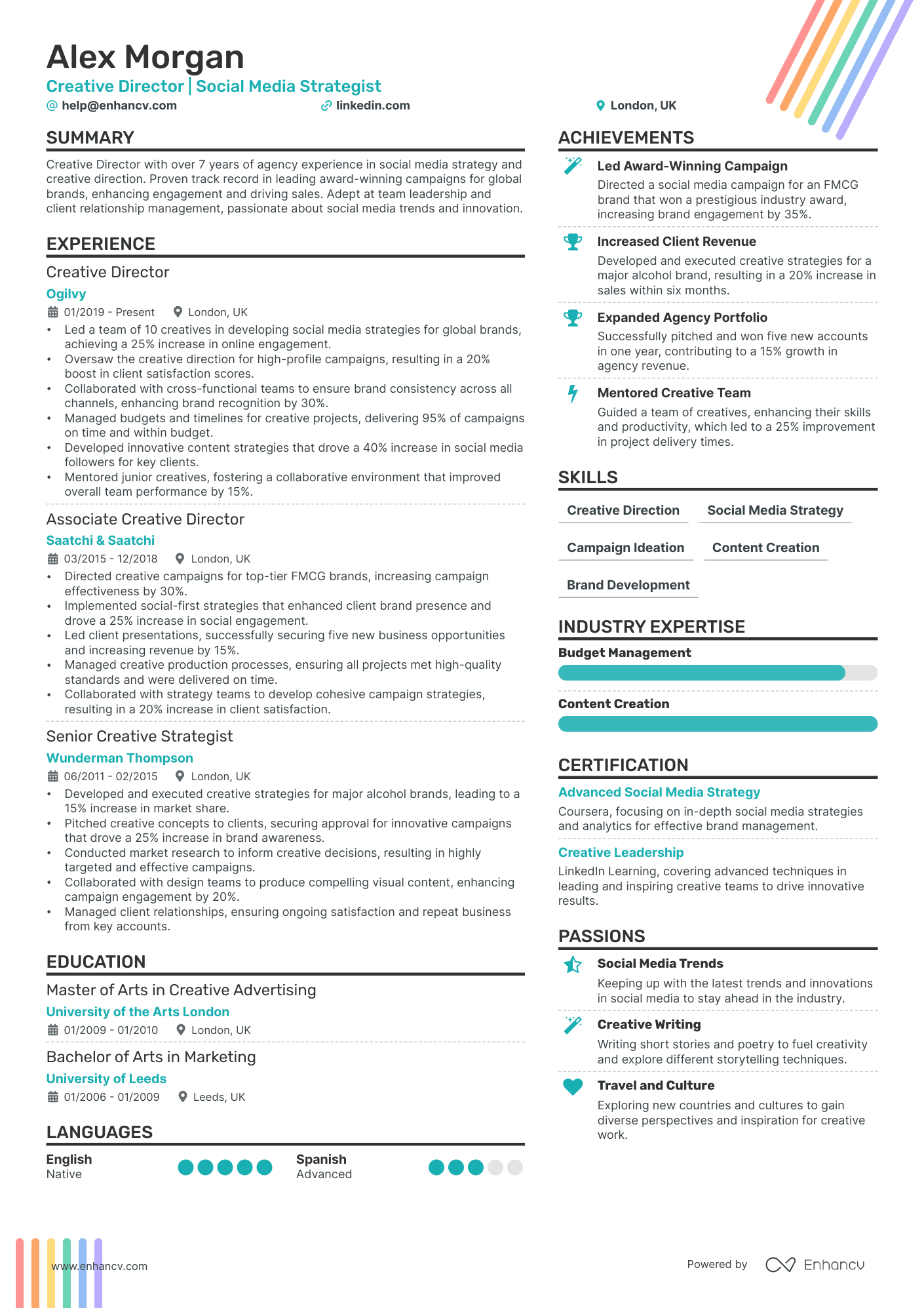
The free two-column CV template is a popular choice for various roles, including programming and marketing.

Compact
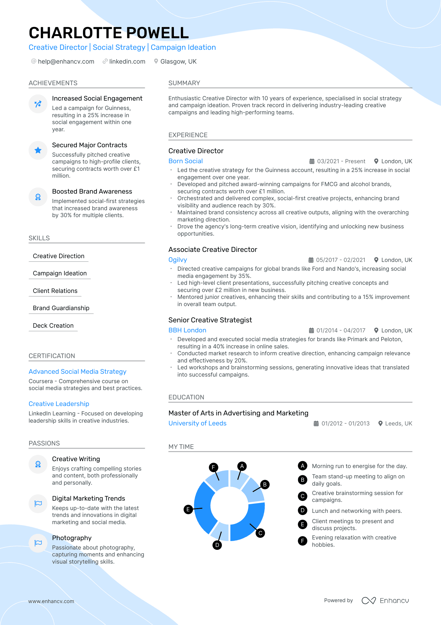
This one-page CV template is perfect for mid-level professionals with 3-10 years of experience and boasts a creative and colorful background design.
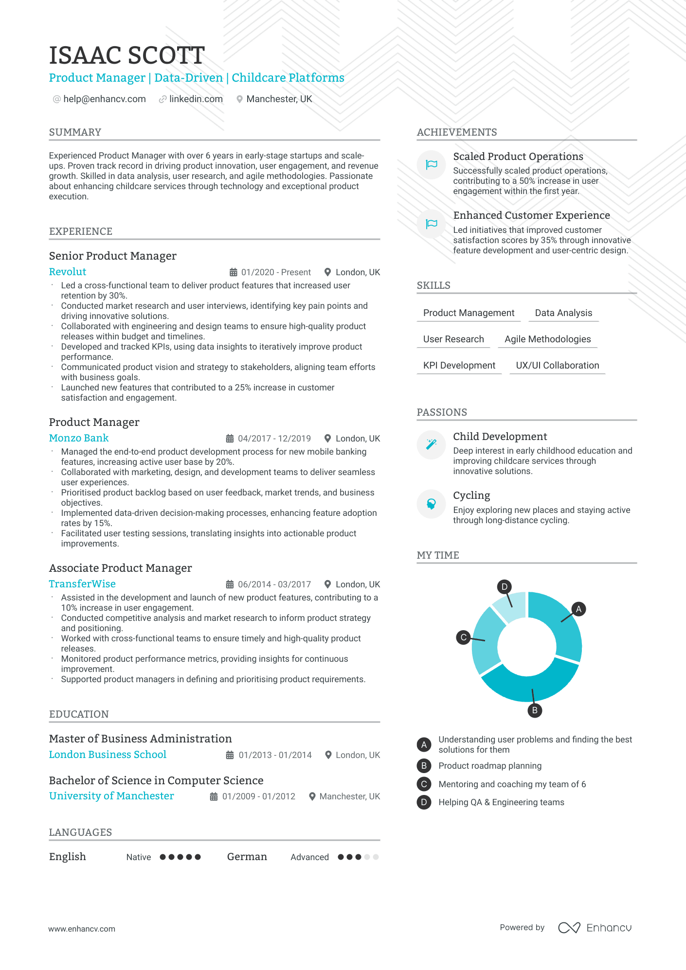
Modern
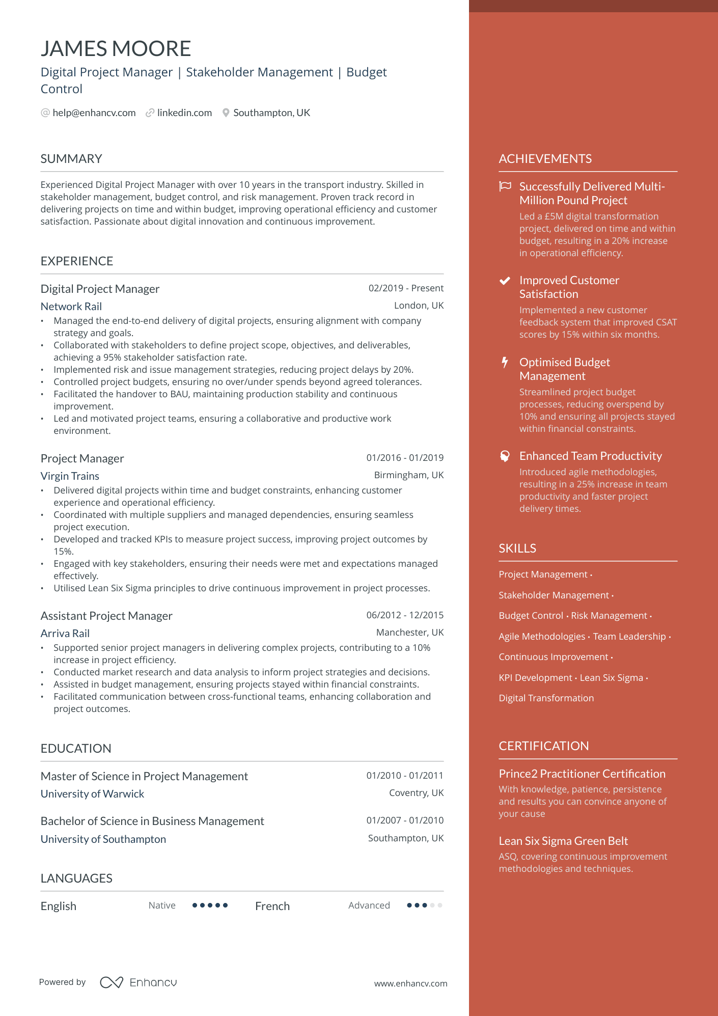
The top choice for 2024 among upper management, project managers, and product owners is this highly popular template.
Are you thinking about applying for a job in a creative sector? If you are, a creative CV template might be right for you. A creative CV is a great way to showcase your unique skills and differentiate you in a crowded job market. Creative CVs are usually imaginative, sometimes quirky, and are intended to engage a recruiter in ways regular CVs can’t. But there’s a lot to consider with a creative CV, and a poorly designed one can be dreadful. So if you’re applying for a job in advertising, design, technology, animation, or any other creative role, let’s learn how to use one properly!
In this article, we:
- Explain what a creative CV is and why they’re so popular
- Break down when you should and shouldn’t use a creative CV
- Demystify which Creative CV templates to use for different situations
- Reveal our best tips on how to choose a creative CV template
- And answer our most frequently asked questions about them
Is your resume good enough?
Drop your CV here or choose a file. PDF & DOCX only. Max 2MB file size.
What is a creative CV?
A creative CV is… well… a creative and non-traditional way of demonstrating your skills, qualifications, and experiences to an employer. In some of the most unique examples, a job seeker might design their CV onto a cereal or other packaging, use a quirky video, or create another elaborate piece of art to submit for a specific creative role.
But, in 99.9% of cases, we recommend using a creative CV template that deviates a bit less from the standard CV layout. You can make your mark and emphasise your personality equally well by incorporating unique layouts, typography, colours, and visual elements.
Staying with the standard one-page, one-or-two-column CV format and tweaking the headings and details gives you wider appeal. You’re more likely to capture the attention of potential employers in a range of job applications going this route than by trying to break the mould entirely.
Are creative CVs becoming more popular?
The number of applicants using creative CVs has surged in certain industries as candidates look for innovative ways to differentiate themselves. By breaking with convention, creative CV templates capture a recruiter’s attention, make a lasting impression, and can set you apart in a competitive job market.
Creative CV templates let you demonstrate your unique set of skills with different visual options. Instead of relying on text alone, you can use eye-catching design elements, infographics, or multimedia to highlight your abilities.
A creative CV template also lets you put your personality and personal brand front and centre. By incorporating your style in a unique layout or with personalised branding elements, you can showcase your authenticity and how you’d be a good cultural fit with a company.
Using novel design elements helps recruiters and hiring managers quickly grasp your strengths and potential contributions. And adding personal touches increases your chances of resonating with employers looking to build a team.
But this is a case of function over form where less can be more. Don’t make design choices that distract or detract from the information you want an employer to see.
When to use a creative CV template
Creative CV templates are a natural choice when applying for a job where creative approaches and innovative ideas are valued. For example, employers hiring for graphic design, marketing, or advertising roles would love a candidate to showcase their creativity and design skills through their CV.
You should also look at creative CV templates for roles that require strong personal branding, such as freelancers or entrepreneurs. In these cases, a creative CV will let you better convey who you are and what differentiates you in a crowded market.
It’s always a good idea to research the company you’re applying to in advance to tailor your application to the company culture there. Companies with a fresh, hip vibe will be more receptive to a creative CV than stodgy conservative ones.
But note that the role, not the sector, matters in your creative approach. For example, if you’re applying to be an Account Manager at an advertising agency, the company wouldn't expect to get a quirky cereal box CV. But, they might for a design role on their creative team.
Creative CV templates by Enhancv to copy and use
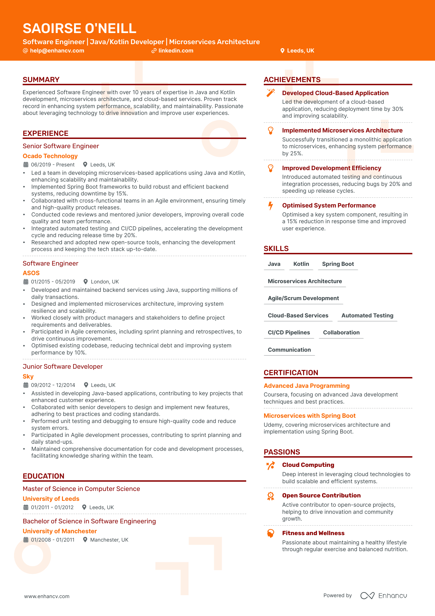
Creative CV template
This is our flagship creative CV template. It has a sleek and modern two-column design that’s amazing for CVs because you can include more information about your work and projects before it looks cluttered.
Use the left-hand column to write your summary and highlight your experience. Then, recruiters can scan the right-hand column for a snapshot of your achievements and education.
We combine fonts for a stylish and practical mix. Large serif headings grab attention, and sans serif body text improves on-screen readability.
And you’re good to go with this ATS-compatible template. In fact, all of our templates are ATS-friendly, so there’s no need to worry about compatibility with any of our templates.
Use this template to apply as an illustrator, architect, chef, or programmer.
Elegant creative CV template
This design is an instant creative CV classic. The two columns with subtle colour highlights and the tasteful colour background of the right-hand column hit all the right notes for a pitch-perfect creative CV application.
The sans serif font adds a refined touch, and the light font on the darker background adds visual dynamism that’s both pleasing and exciting for the eye. Plus, you can add a photo of yourself in the top right or opt instead to include a personal brand logo or a small image of your own work.
This is also an ATS-friendly creative CV template, so you can be sure to get through the initial screening.
The elegant creative CV template is perfect for applying as an event coordinator, yoga instructor, interior designer, or photographer.
Compact creative CV template
Our compact creative CV will help you summarise a long work history in a skimmable one-page design with slightly smaller margins to maximise space. We’ve also cut down on large headings but kept them distinct by changing their size and tonality so they still draw the reader's eye to key information.
Contrasting colour pops and smart icons are used sparingly to grab the recruiter's attention without taking any extra space. The same goes for the right column, where you can highlight your greatest hits in a few short lines.
Our Compact creative CV template lets you include as much info as possible without sacrificing valuable white space. It’s perfect if you have a long work history to describe or extensive credentials you want to highlight.
Use this template if you’re applying as a creative director, marketing director, bar manager, or freelance writer.
Tips for choosing the right creative CV template
Balance your creativity and professionalism
You should choose a creative CV template that highlights your unique personality while maintaining a professional image. To find this balance, consider the following guidelines:
Focus on visual appeal
Look for a template with a modern design that’s visually engaging but not overly distracting. Opt for clean lines, clear sections, and a balance between text and visual elements.
Include branding elements
A good template allows for personal branding while maintaining professionalism. Feel free to incorporate your logo and the colour palette and typography that reflects your personal brand, but be sure they’re tastefully worked in and don’t overshadow the content.
Don’t skip all the relevant sections
Choose a template that includes all the relevant sections for your industry and target role. While creativity is important, don’t let it come at the expense of leaving out essential information.
Pick a customizable CV template
A customisable template will give you the flexibility to showcase your personality and adjust your personal details to suit multiple positions. You can personalise the design to align with your style, make sure it stays polished and cohesive, and, most importantly, ensure the sections and info are tailored to the job.
Ask for feedback
Once you’ve designed your creative CV, reach out to your network for feedback. Get input from trusted peers, especially ones who work in the industry or role, to gauge the effectiveness of your design and find anything you overlooked.
And then, and this is key: incorporate the feedback.
The Enhancv CV templates are equipped with a link you can generate and get feedback from people. The best thing about it is that the person you’re sending it to can pinpoint the exact location they think you can improve, like a heatmap.
Creative CV template structure and formatting tips
A great creative CV highlights the info you want in a unique way that’s still clear and readable. Remember, it’s still function over form.
To find this harmony, consider the following factors:
Choose a professional font
Opt for fonts that are professional, legible, and easy on the eyes. If you want to use multiple fonts, choose one that’s bold and stands out for headings, and use a more neutral font for body text.
Avoid decorative or overly stylised fonts that could hurt readability. If you’re in doubt, choose a simpler font or ask a friend for their opinion.
Combine complimentary colors
Choose a colour scheme that’s visually appealing but doesn't compromise readability. Consider combining complementary colours, like blues and yellows, or balancing lighter and darker shades.
If you’re using background colours for some sections, ensure that the text colour contrasts and complements it. This will make reading easier than if the text clashes or gets lost in the background.
Pick a less busy CV layout
Look for a template with a well-organised layout that guides the reader's eye naturally so it’s easy to scan. Use clear section headings and subheadings to break up the content, and use bullet points or numbered lists to present information concisely.
Leave sufficient white space
White space lets the reader focus on the content and improves overall readability. Sufficient white space maintains clarity and keeps the document from feeling cluttered.
Be consistent with your CV design
Ensure consistency and restraint throughout your creative CV template in terms of font types, sizes, spacing, and alignment. Consistent formatting creates a cohesive and professional look that’s easier for a recruiter to navigate and understand than if you use different fonts and colours throughout.
Make sure your resume is accessible
Choose fonts and colours that are accessible to individuals with visual impairments. Consider using fonts and colour combinations that meet accessibility guidelines, and avoid using text that’s too small or lacks sufficient contrast.
At the end of the day, your CV represents your professional image, so take the time to choose a template that showcases your strengths and presents you in the best possible light.


