You wouldn’t turn up to an interview wearing a tracksuit. Why? Because you want to make the right first impression and you know that presentation matters. The same goes for your CV. The way you present this document directly shapes how the hiring manager sees you.
This trips many job-seekers up. Forget stressing about what to write, you may not know the basics of how to lay out a CV. Getting the look and structure right on the page doesn’t have to be the headache you think it is. Think of it as dressing to impress—on paper.
At Enhancv, our professionally designed CV templates make it easier to get the best CV layout for UK recruiters. In this guide, we’ll be covering the most effective CV layouts, the golden rules you need to follow, and how you can make your CV attractive and legible.

Key takeaways
- Your CV layout needs to be clear and readable above everything else.
- Start with a simple and scannable header.
- Place your personal statement near the top of the page where readers naturally look first.
- Present your work experience before education if you're an experienced professional. Students and recent graduates should reverse this order.
- Put job-specific technical skills in a prominent position, and integrate general ones throughout your CV.
- Only include optional sections—like languages and hobbies—if they add genuine value to your application.
- Avoid common CV layout mistakes like overly fancy designs, photos, decorative fonts, cluttered sections, and text boxes.
- Keep your margins between 0.5 and 1 inch and leave plenty of white space to make your CV easy to scan.
How does your CV measure up? Upload it now and learn how you can improve your CV.
Is your CV good enough?
Drop your CV here or choose a file. PDF & DOCX only. Max 2MB file size.
First up, let’s start with the basic question.
What is a CV layout?
Your CV layout is all about how your information sits on the page. It includes everything from the margins, the fonts, the headings, the spacing, and the section order.
Perfecting this art means that hiring managers can quickly scan your CV and get information about you as a candidate. The easier you make their job, the better your chances of success.

CV layouts aren’t the same as CV formats
The layout focuses on how your CV looks—its spacing, section placement, and overall readability. The format, on the other hand, determines how your information is structured: chronological, skills-based, or hybrid.
If you need help choosing the right structure, check out our complete guide on CV formats.
The truth is that many candidates don’t give a second thought to their CV layout, especially if they don’t have a design background. However, how you lay the content out matters more than you might imagine.
Why CV layout matters in the UK
Let’s break down why you should pay close attention to the layout:
First impressions count
In the UK, employers spend less than 20 seconds skimming each CV that comes their way. That means you have a matter of seconds to grab the reader’s attention and give them a reason to care about your application. If your CV is “busy” or hard to read, they’ll likely move on to the next.
Competition is fierce
When you’re up against a bunch of good CVs, you need to stand out from the crowd. Hiring managers tire of seeing disorganised layouts. So, if you manage to make yours easy to read and attractive, you already have the edge over the competition.

The mighty surge in British applicants
Statistics show a year-on-year increase in applications for all UK job roles.
In November 2024, for example, researchers found employers received an average of 48.7 applications per vacancy. That amount represented a 286% surge in applicants, when compared to the year before.
TL;DR: Employers are seeing more candidates applying for each role than ever before.
Your layout should be readable by ATS software
Many employers and recruiters use applicant tracking systems (ATS) to sort and rank incoming CVs. The software reviews your document to find relevant information. The layout should be clean, scannable, and consistent so that the system can parse it quickly.
Some older ATS versions can struggle to read CVs that use fancy fonts, symbols, or overly graphic templates, which means your details might not be parsed correctly.
It should fit British standards
In the UK, the standard paper size is A4 (210 x 297 mm) for most formal documents. Learning how to lay out your CV means aligning with this size. You can ensure that the sections and headings fit neatly within the parameters, and that your margins provide enough white space for a clean, balanced look.
Make your experience stand out
Above all else, your CV layout should make your biggest achievements and experiences stand out. That means drawing attention to the most important aspects of your application. So, when the hiring manager glances over it, they will quickly see you’re a prime candidate for the role.
The best CVs are the ones that make it effortless for us to understand who you are and what you’ve achieved. It’s not about having the flashiest layout, it’s about making the right details stand out.
Now that you understand this matters, it’s time to talk about what precisely makes a good CV layout.
What makes a good CV layout?
The best CV layouts do the heavy lifting for hiring managers by guiding their eyes to the right details in the right order. Neat hierarchy of information, well-defined headings and plenty of white spacemake your information easy to scan and understand quickly. Creating a logical flow helps you position your content well and make it the star of the show.
A good CV is simple, structured, and easy to navigate. Recruiters don’t want to hunt for information. We like clear headings, consistent formatting, and plenty of white space so the eye can rest. There’s no need for fancy graphics or colours, just a clean design that helps us find what we’re looking for fast.
Let’s kick things off by briefly covering the main things you need to consider when crafting a good CV layout for UK employers.
Elements of the best CV layouts
- Clear hierarchy of sections. Be sure to order your CV sections logically. The following works well: contact details, personal statement, work experience, skills, and education.
- Create a uniform approach. Consistency is key when you’re working on your CV layout. Work with the samefonts, margin sizes, and spacing throughout to create a coherent style.
- Use bullet points where possible. Blocks of text can be overwhelming for the reader. Break things down into bullet points to boost scanability.
- Make use of white space. Leave room around each section and use bullet points to break up text—this creates a cleaner layout and a natural visual rhythm.
- Choose one or two columns. In the UK, two columns tends to be the standard approach. However, in some cases, you might opt for one. If in doubt, use one of Enhancv’s tried and tested templates to get the design on point.
- Avoid imagery and graphics. There’s no need to include photos, headshots, graphics, or tables (unless it’s the norm in your industry). A good CV layout draws attention to the content rather than relying on gimmicks.
That’s the basics covered.
Next up, we will be looking at the specific steps you can take to create a good CV layout that will instantly increase your odds of landing an interview.
How to lay out a CV in 5 steps
Laying out a CV is all about making your content shine. You want to spotlight your biggest feats and make sure the reader doesn’t miss anything vital to your application. We’ve broken it down into actionable steps.
Step 1: Always start with the header
Your CV header should always be at the top of the page. There’s no flexibility here as this is what hiring managers expect and—put plainly—it’s the most logical position for it.
- This section includes: your name, job title, location, and contact information. You may also want to include a link to your LinkedIn, portfolio, or website here (as long as it’s relevant).
- For a two-page CV, the header should be duplicated on both pages.
- Don’t overcomplicate this section of your CV. Make sure it’s clear and concise, without adding any unnecessary details. Use line breaks between each piece of information.
- Avoid writing in full sentences at this point. The hiring manager (and the ATS) should be able to scan this section and get the details they need.
Step 2: Move on to the personal statement
The next key element in your CV layout is the personal statement. It usually sits just below your header—right at the top of the page—because that’s where hiring managers look first.
Most people read in an F-shaped pattern when reading documents, both on and off-screen. Since this statement is your pièce de résistance, it deserves a prime position.
We’ll glance across the top, down the left side to check structure and job dates, then across again to pick out details. No one reads a CV word for word at first, we scan to see if it’s worth a closer look.
Step 3: Arrange your work experience and education
Next up, let’s talk about where you put your work experience and education sections. There’s not one static rule for a good CV layout, and the answer depends on your career stage.
For experienced professionals, your work section should go first. The positions you've held tend to matter more than your education at this stage. They're more recent and have likely taught you more about the job you're applying for than your degree ever did.
If you’re a student, recent graduate, or anyone who lacks work experience, you might want to mix things up. Placing your education above your work experience is a smart move. It means the hiring manager will put more emphasis on your schooling than your experience.
Don't overlook the primacy effect
Hiring managers tend to remember the first thing they saw. What do you want that to be? Place your most important feats—whether it’s education or experience—towards the top of the page. Stick to that golden rule when it comes to how to lay out a CV, and you’ll go far.
If something happened more than 10 or 15 years ago, remember what Rafiki said in The Lion King. “It doesn’t matter. It’s in the past.” Position it lower on your CV as it’s less important.
Step 4: Select the right place for your skills
There’s a lot of flexibility on this section, so decide what works for you. Where you place your skills on your CV depends on how essential they are to the role.
If your skills are central to the role—say, technical abilities in IT, design, or engineering—place them near the top or in a left-hand column. This helps them stand out during that quick F-shaped scan recruiters naturally follow.
If your experience tells a stronger story, position your skills section below it to support your achievements without interrupting the reading flow. The key is visual balance: make it easy for hiring managers to spot your strongest assets at a glance, without breaking the structure of the page.
Step 5: Lay out your CV strategically
Once you’ve got the main content of your CV ready, it’s time to put it in the best shape for recruiters to scan quickly.
Follow these layout tips:
- Use A4 paper size: In the UK, that’s 210 x 297 mm. Always check your export settings before sending your CV.
- Set consistent margins: Aim for 0.5–1 inch (1.3–2.5 cm) on all sides to keep things readable. If you’re using Word, go to Layout→Margins→Custom Margins.
- Balance your columns: If you’re using a two-column layout, make the main column slightly wider to prioritise work experience.
- Use lines or dividers to separate sections—they guide the reader’s eye and create a sense of order.
- Leave enough white space: Don’t cram in extra sections. Let the layout breathe so recruiters can focus on key details.

How Enhancv’s CV Builder simplifies layout design
Enhancv’s AI CV Builder takes care of the visual details that make your CV easy to read and professional:
- Automatically applies correct margins and spacing for a polished look.
- Uses built-in A4 dimensions for all UK templates.
- Offers smart column alignment and section spacing for perfect balance.
- Lets you add or remove sections without breaking the formatting.
You get a well-structured, ATS- and recruiter-readable CV in minutes, without worrying about design inconsistencies or formatting errors.
Avoid the "too much information" trap
Too many candidates are scared of white space. If you cram every millimetre of your CV with information, it’s going to be hard to read. So, adding optional sections for the sake of filling space, is a huge no-no.
Before you include these extras, ask yourself one question: Does it add real, tangible value to my CV? If the answer is no, you’re better off giving it a miss.
Following the above steps is the easiest way to perfect your CV layout. But how will it look in the end?
Next, we’ll be sharing some of the best CV layout examples.
Best CV layout examples by career stage
You change throughout your career, and so does your CV. Hiring managers know what career stage a candidate is at by glancing at the page, and not necessarily because of the content.
In this section, we’re looking at some good CV layout examples based on different seniority levels.
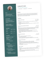
First job CV layout example
When you’re first starting your career, you won’t have much experience to speak of. That’s no bother. You should aim for a simple structure, ideally with one column rather than two.
Here’s an example of how your CV could look:
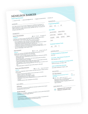
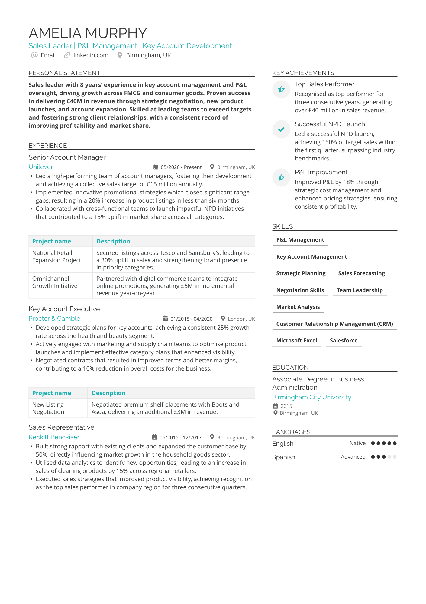
Mid-level CV layout example
Let’s say you’ve been in the same industry for a decent number of years. You likely have a wealth of experience and skills you want to share. Do so with a two-column layout. This works best when you place your experience in the main, right-hand column, and things like experience to the left.
Take a look at our example layout for some inspiration:
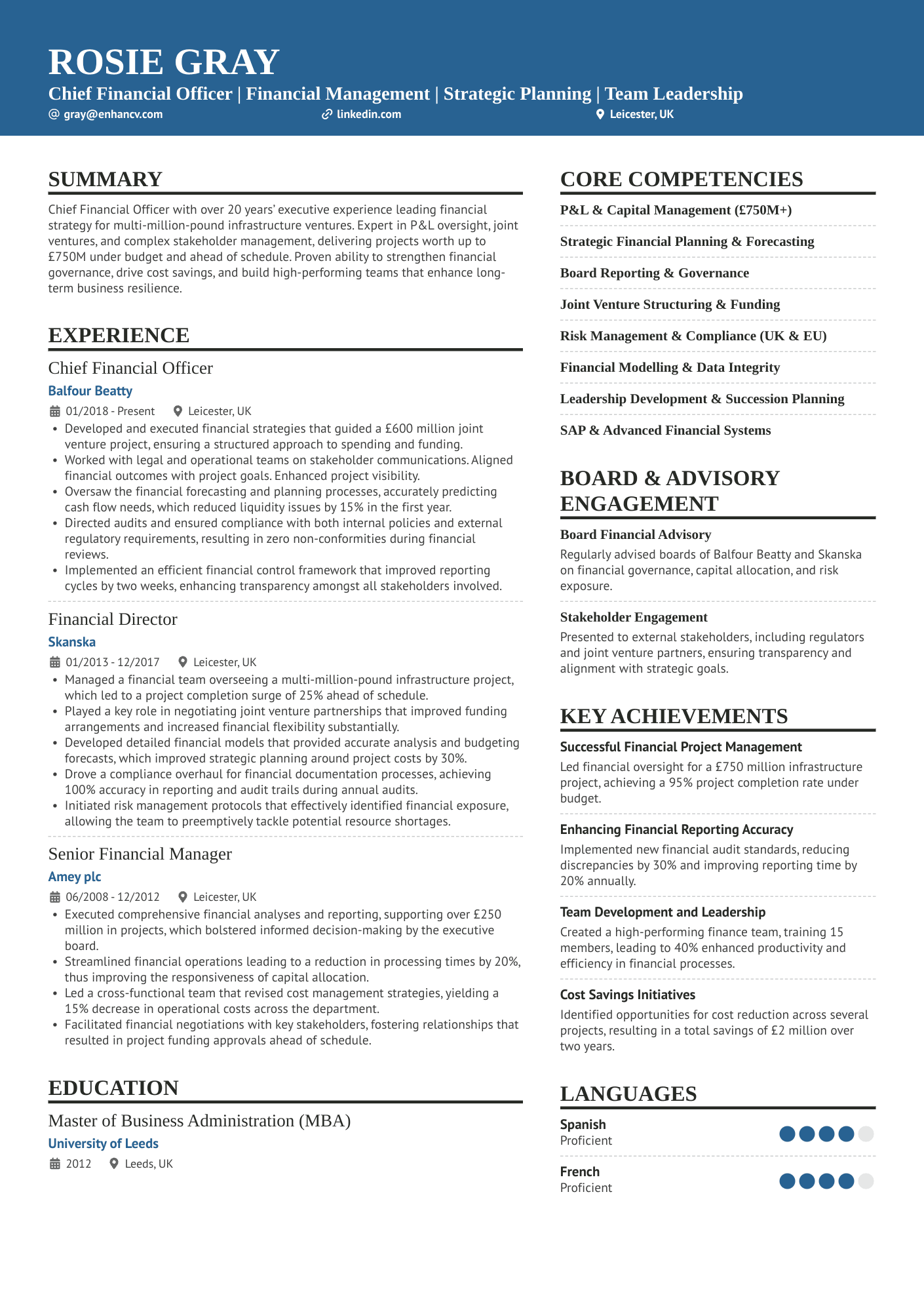
Executive-level CV layout example
When you’re at the top of your game, sometimes less is more. Your CV sections should be extremely clear with plenty of white space around them. You may include fewer bullet points than a typical applicant, but what you lose in quantity, you’ll make up in quality (plus killer metrics).
We’ve put together an example layout for this career level:
These CV layout examples give you an overview of what you’re aiming for, based on your career level. When you’re putting the document together, think about where you want to draw the reader’s eye.
CV layout examples for different industries
Different industries have different CV layout expectations. For most applications, you can go by career stage alone. However, in some niche fields, you might need to follow a whole new set of rules. Check out some of the different CV layout examples, listed by industry.
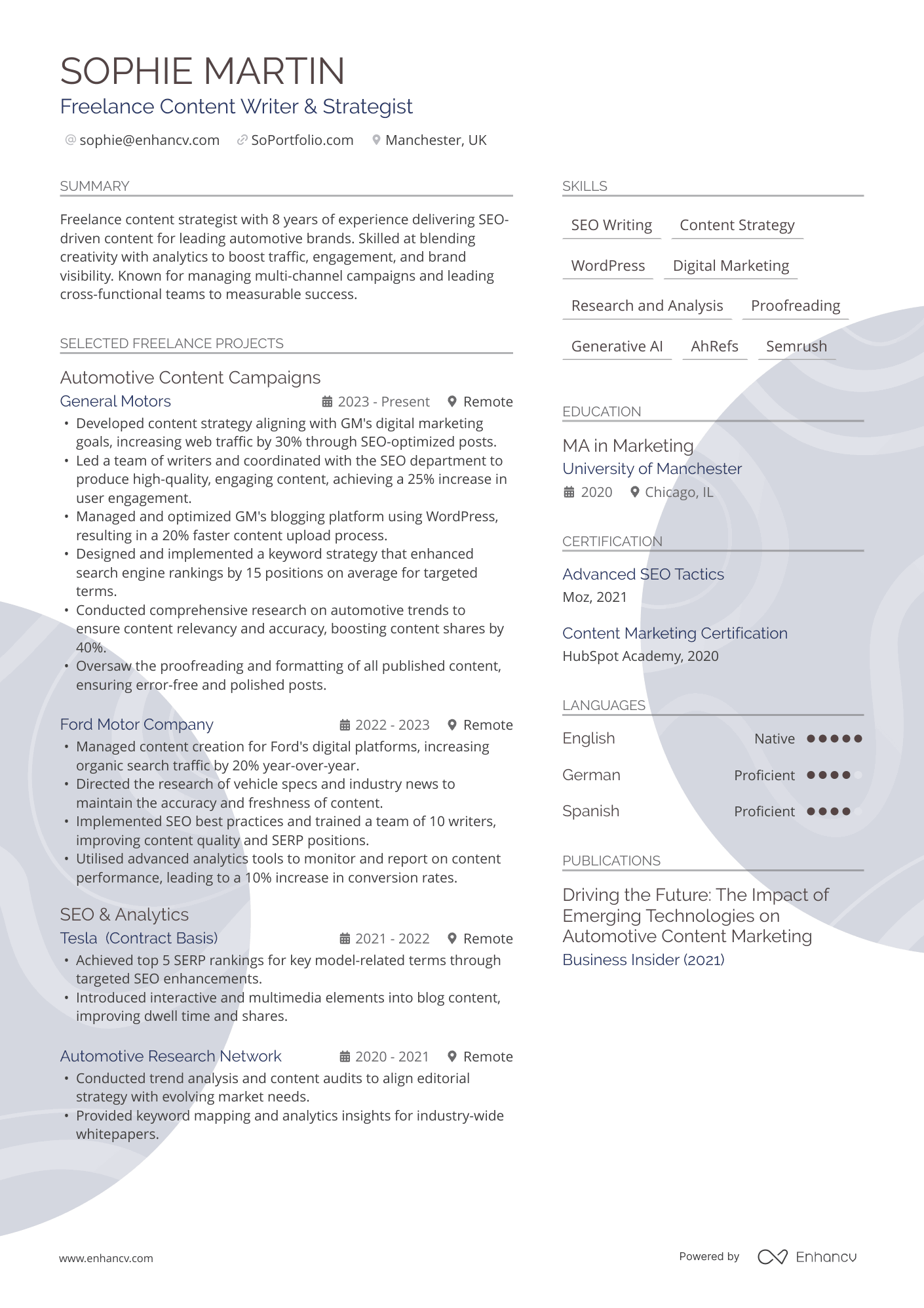
Freelancer
Freelance careers are rarely linear. Your experience spans gigs and client work, rather than formalised roles. For that reason, you’ll need to make it clear that your experience is project-based.
Here are some simple tips:
- Group similar work or projects together.
- Highlight repeat clients, as this shows consistency.
- Use layout elements like columns and dividers.
Take a look at our example below:
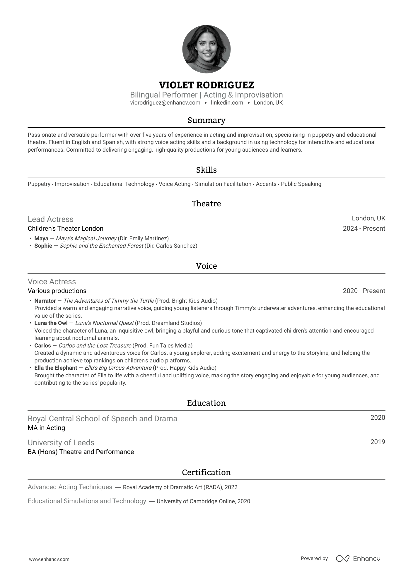
Actors and models
There are few careers where your looks matter just as much as your skills. Agents need to know whether actors and models fit the bill when they’re casting for certain roles. While you generally should not include headshots on CVs, you can make an exception in these cases.
Check out our example of a good CV layout that incorporates this here:
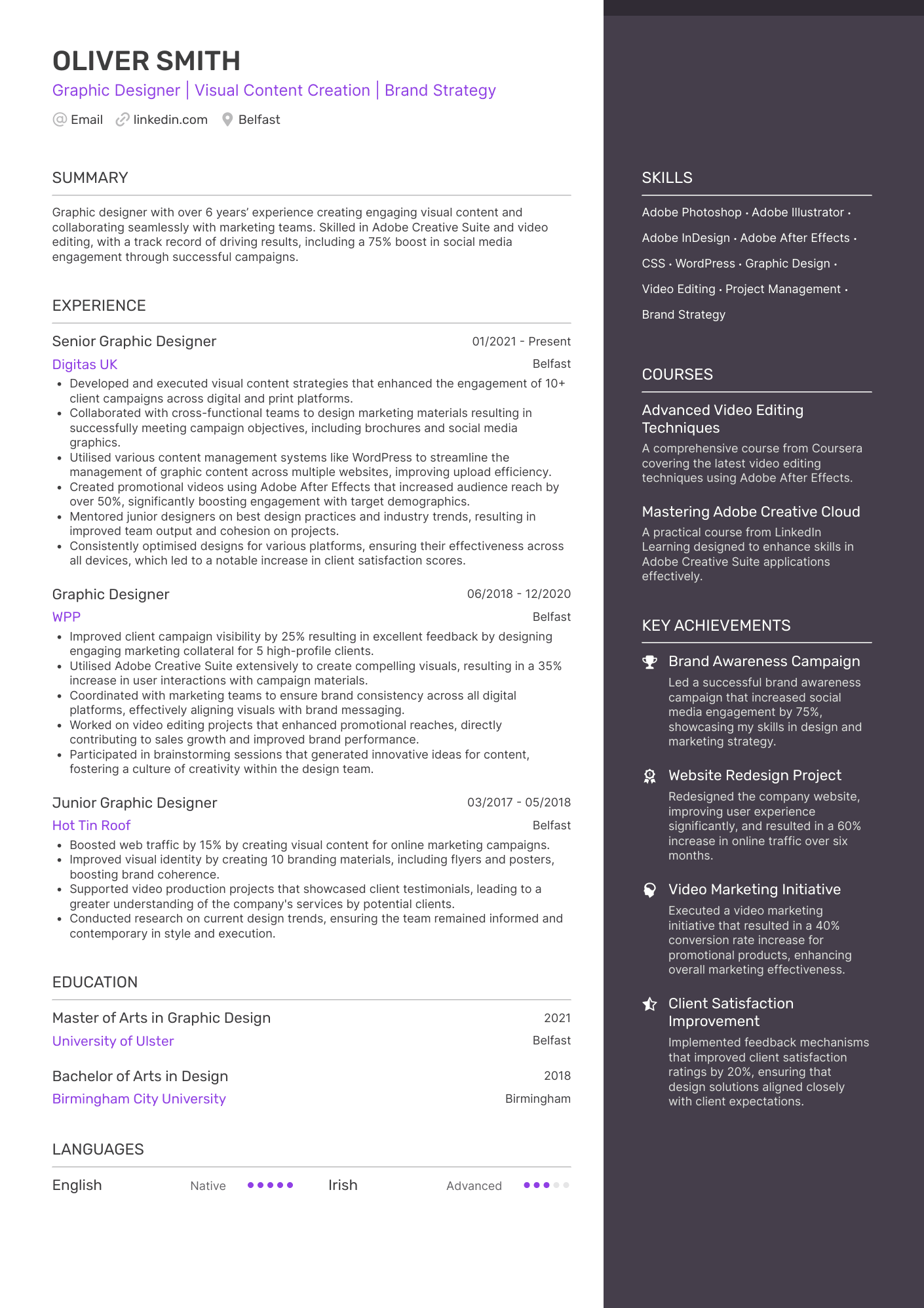
Graphic designer
Graphic designers face extra scrutiny when applying for jobs. However, resist the temptation to be overly creative. It’s far more important to keep the CV simple and readable. Custom fonts or bold graphics might not be the best decision. You can show off your creative flair in your portfolio, instead.
Use the below example to help you when creating your CV:
Long story short, your CV layout should reflect two things: your experience level, and what's normal in your field. If you’re not sure what’s expected, we have a library of CV examples, listed by industry.
Common CV layout mistakes to avoid
If you’ve got this far, you should be feeling confident about crafting an excellent CV layout. However, there are some common mistakes you should avoid, as follows:
Over the top designs
Think you can impress an employer with an overly extravagant design? Think again. Hiring managers are looking for clarity when they review CVs, and lavish design elements can get in the way of that.
Some people use overly designed templates that might look nice but don’t work well with applicant tracking systems. Others cram everything into long paragraphs, which makes it hard to scan.
Confusing designs can also hinder the ATS process, especially if they make your CV hard to read. A clear and straightforward design will always win over a clever and “busy” one.
Using photos or imagery
Most of the time, there’s no place for photos or imagery on your CV—unless you’re a model or an actor or it’s required by the job description. If you’re a graphic designer or illustrator, and want to show off your work, you can attach your portfolio or include a link to it. Hiring managers don’t need these visual elements on the page.
Small font and cluttered sections
The standard font size for British CVs is 12pt for the body copy. You can go down to 10pt if you’re in a pinch, or you’re dealing with bullet points. When it comes to section titles, you can go up to 14pt.
One of the biggest errors candidates make is using a tiny font size (i.e. less than 10pt) and cramming as much as they can in sections. This makes your CV look cluttered and unattractive to the reader.
Not including enough white space
White space makes your CV accessible. If you don’t have enough of it on the page, it will look messy and the hiring manager may skip over it.
As a general rule, your margins should be between 0.5 and 1 inch (1.3-2.5 cm). Choose a size that suits your CV's style, but keep all four margins the same. Uneven margins make your CV look unprofessional. Even if the hiring manager doesn’t know why, something will look off.
Featuring text boxes and tables
Text boxes and tables won’t make your CV look any clearer. In fact, they could have the opposite effect. Adding these elements to your page is likely to overcrowd it, which will make it look too technical or even hard to read.
Instead, let the sections do the hard work. You already have defined CV sections and places to put each piece of information. Follow the structure on your template to create a beautiful CV design.
Key takeaways
The best CV layout for UK recruiters is clean, parsable, and tailored to an A4 size. You should adapt the layout to your career stage or, in some cases, the standards of your field. The golden rule is to place the most important information at the top of the page, and work your way down.
Luckily, you don’t need any design skills to get this right. Use our drag-and-drop CV Builder to test the best CV layouts for you now.
