You’ve aced your CV writing, and now for the fun part: choosing the best CV font. With hundreds of options available—from Arial to Dingbat—this decision matters more than you think.
Simply choosing a “nice-looking” font can accidentally harm readability and ATS scanning. And, if either a human or a bot can’t read your CV, it may end up in the “reject” pile.
Picking the right CV font and size, however, makes your application easy to read, clear, and professional. But how can you get it right?
Enhancv’s CV Builder features recruiter-approved, ATS-readable fonts automatically. In this guide, we cover the best CV fonts and sizes, along with some copyable examples for inspiration.

Key takeaways
- The best CV fonts balance readability, professionalism, and ATS compatibility—avoid decorative or overly stylised typefaces.
- Stick to one or two fonts maximum: use one for headings and another for body text to keep your CV clean and consistent.
- Body text should be 10-12 pt, while headings should be 12-14 pt. Never go below 10 pt or hiring managers may struggle to read your CV.
- Serif fonts (like Times New Roman and Garamond) suit traditional industries.
- Sans-serif fonts, like Rubik and Arimo, work well for modern or tech fields.
- Always test your CV as a PDF on both mobile and desktop to ensure the font displays correctly across all devices.
- Avoid fonts like Comic Sans, Papyrus, and Courier—these look unprofessional and can trigger negative bias from hiring managers.
- Use Enhancv's CV Builder to access recruiter-approved, ATS-friendly fonts that are automatically formatted to industry standards.
Make sure your CV passes ATS and recruiter checks. Upload it to Enhancv’s CV Checker below:
Is your CV good enough?
Drop your CV here or choose a file. PDF & DOCX only. Max 2MB file size.
First things first, let’s take a look at the best fonts to use for a CV.
What are the best CV fonts?
The best font for your CV should be readable, professional, and ATS-compatible. While it should look nice, it also needs to be clean, simple, and modern while displaying consistently on all device types.
The best approach is to keep things simple. Avoid overly decorative, unusual, or “quirky” fonts in favour of simplicity. Later in this guide, we’ll be ranking the best CV fonts you can use.
Explained: Why CV fonts matter
Enhancv’s latest research shows that, in general, ATS systems don’t reject CVs purely because of formatting. However, three of the 25 recruiters we interviewed noted that older software can struggle to read certain fonts—especially when CVs are sent as Word documents.
Similarly, hiring managers don’t have long to review CVs. They usually scan documents quickly, picking out the most relevant parts. If your CV is difficult to read, you’re making their job harder than it needs to be. While some will persevere—or, at least, you’d hope so—most will pass over your application.

Why most CV fonts miss the mark
- Style over substance. Many people choose creative CV style fonts that look cool, but are actually pretty hard to read. Your font should be functional above all else.
- Inconsistent font types. Consistency is key when it comes to your CV. Using an array of different typefaces for different sections will make it look chaotic. Instead, you should choose one or two types to use throughout the document.
- Teeny-tiny font sizes. Are you trying to squeeze too much onto the page? Making your CV font size tiny is not the answer. If the type is too small, the hiring manager will struggle to read your CV.
- Outdated font styles. Some traditional fonts have become outdated. For example, Papyrus is overly stylised and not suitable for modern applications. It’s likely to stand out for all the wrong reasons, making your CV look old-fashioned.
The best CV fonts to use in the UK
Which fonts perfectly balance reliability, professionalism, and ATS safety? We’ve ranked the very best CV fonts you can use and grouped them by serif or sans-serif.
Let’s take a look.
Thinking of mixing things up? Don’t use more than two CV fonts on your document.
You can use one type for headings and another for the body content. Just make sure that the typefaces you pick complement one another.
Best serif CV fonts
Serif fonts are classic—the type you might have seen in a newspaper back in the day. These have small decorative “feet” that extend off the letters. A popular serif font is Times New Roman.
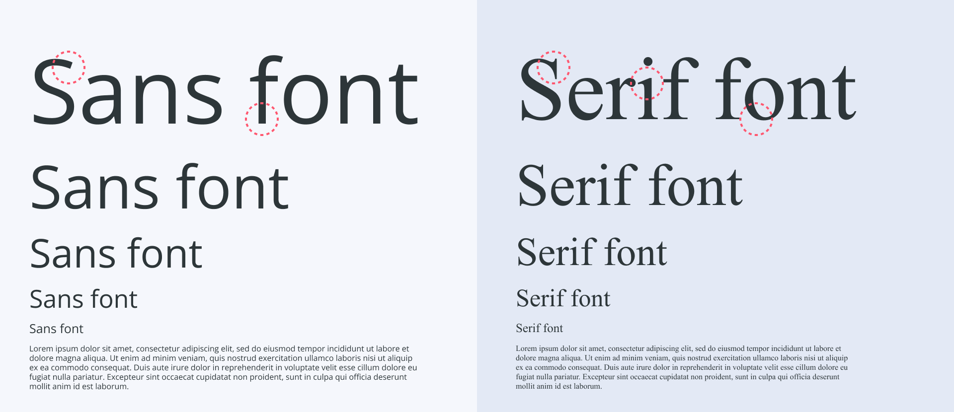
If you’re looking to give your CV a more elegant, traditional feel, choosing a serif font is a great place to start. Some industries actively favour this look. In sectors like law, academia, and finance, serif fonts are often seen as more formal, authoritative, and in keeping with long-standing professional standards.
Because these fields rely heavily on dense written documents—contracts, research papers, reports—a serif typeface can also feel more familiar and comfortable to read, which subtly reinforces your credibility.
Here are the top ten serif fonts you could consider for your CV:
10 best serif CV fonts
| Font | Why choose it |
|---|---|
| Cambria | Cambria is a relatively modern typeface, only introduced in 2004. It’s ideal for on-screen reading while keeping a traditional serif style. The openly spaced lettering offers plenty of white space, which means that your document doesn’t look overcrowded. |
| Volkhov | Volkhov was designed for strong digital legibility, which makes it easy to read on screens. Its low-contrast strokes and slightly asymmetric serifs give it a stable, clear feel, helping it remain readable even at smaller sizes. A good serif option for job seekers who want something professional but a bit more modern. |
| Times New Roman | As the name suggests, this one dates back to The Times newspaper and was introduced way back in 1931. It was created to make it easy to read, even when you bring the font size right down to 10 pt. |
| Roboto Serif | Roboto Serif is a “screen-native” font, meaning that it was created for on-screen reading. Unlike the other serif fonts we’ve covered, it’s a variable font, and so it adjusts automatically to suit the design. Blending a friendly aesthetic with a simple traditional serif style, it’s the best of both worlds. |
| Merriweather | Sturdy and elegant, Merriweather consists of slightly condensed letter forms. It’s easy to read while keeping the traditional style that many modern industries expect on CVs. |
| Gelasio | Gelasio is a beautifully modern, highly legible typeface that works well across most devices. Its classic, Georgia-like serif shapes give it a familiar, traditional feel, while the slightly lighter lines keep it looking elegant rather than heavy or old-fashioned. |
| PT Serif | Thicker and slightly more robust, this font is lesser known than the others on this list, but it can work wonders on a modern CV. The font features wedge-like serifs and triangular terminals, which give it an overall contemporary feel. |
| Garamond | Mimicking 16th-century writing, Garamond is the most traditional CV font on our list. While it’s not the best match for modern or tech-driven industries, it works well for classic, formal sectors such as law, academia, publishing, and the civil service. Its fine serifs and balanced proportions make it especially pleasant to read in print, though it can appear slightly lighter on some screens. |
| Constantia | Designed with LCD monitors in mind, Constantia is one of the best CV fonts for online applications. It features the same wedge-like serifs we’ve seen in other typefaces on this list, but has a triangular or “spiky” look that works well on-screen. |
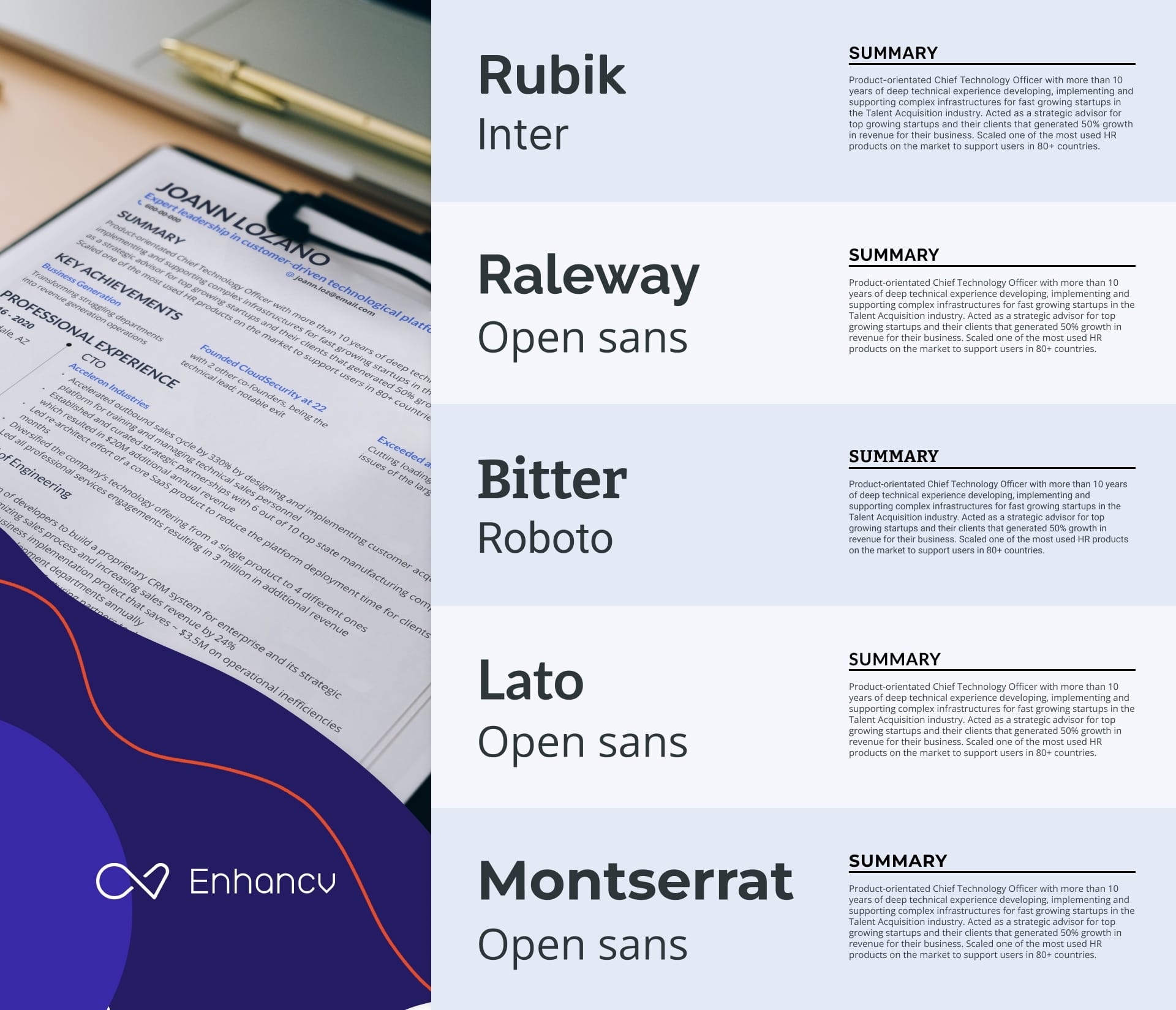
| Bitter | Bitter is the preferred serif font among Enhancv users. It’s a contemporary slab serif typeface designed for comfortable reading on screens, with sturdy block-like serifs and generous spacing that keep it highly legible at smaller sizes—ideal for CV body text or subheadings. |
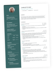
Here’s an HR CV that uses a serif and a sans-serif typeface to create a look that feels both expert and senior:

Best sans-serif fonts for a CV
“Sans” comes from the French, meaning “without”. So, sans-serif simply means “without serifs”.
On a CV, that usually translates into a cleaner, more modern look. Sans-serif fonts tend to be easier to skim on screens, hold up better at smaller sizes, and are less likely to cause issues with older ATS software.
Because of that, they’ve become the default choice for most modern CVs—not just in creative fields like marketing, design, and tech, but also in many corporate roles where clarity and speed matter more than tradition.
Still, not every sans-serif font is a winner. Some feel too playful, others too cramped. Choosing the right one for your CV is a bit of an art, so we’ve rounded up our top ten picks to give you a solid starting point.
10 best serif CV fonts
| Font | Why choose it |
|---|---|
| Arimo | Similar to Arial, Arimo is a sans-serif font that’s easy to read both in hard copy form and on a screen. It has that classic style that hiring managers tend to love while also feeling modern. |
| Exo 2 | Exo 2 is a geometric sans-serif font that gives applications a dynamic and professional feel. This one suits the tech world as it has a futuristic vibe, which works well for recruiters in that industry. |
| Chivo | Chivo is a strong, contemporary sans-serif with a bold, confident presence, making it ideal for candidates in tech, product, or data-driven roles. Its clean shapes and clear hierarchy work especially well for CVs that need to highlight structure and impact at a glance. |
| Rubik | Rubik, Enhancv’s default font, was inspired by the Rubik’s Cube (yes, really) and is great for modern, digital-first applications. Its rounded corners and minimal, open shapes make it highly legible in longer passages of text, so it works especially well for CV body copy—particularly if you’ve got a lot of experience and need everything to stay clear and easy to skim. |
| Lato | Looking for something that balances being both serious and friendly? Look no further than Lato. The sans-serif font is known for having a classic style that blends in modern features. The name comes from the Polish word “summer,” which makes sense given its light and breezy vibe. |
| Raleway | Characterised for having long thin strokes and geometric influences, Raleway is by far one of the most elegant sans-serif fonts. This one tends to look great when you use it for headings and titles. It has a strong impact on the reader while never being anything less than sophisticated. |
| Montserrat | Based on geometric shapes, Montserrat is another great choice when you’re looking for a good CV font for your headings. It’s slightly larger and more spacious than other fonts, making it ideal for entry-level CVs. If your content is limited but you want the page to look well-balanced, give this a go. |
| Oswald | Oswald is a condensed sans-serif typeface based on the classic Alternate Gothic style, redesigned to work cleanly on modern screens. Its structured, upright look gives your CV a polished, organised feel, making it a solid choice for headings or job titles. |
| Roboto | It’s a tall font that has become the default for some of the best-known Android and web services. Since it doesn’t look overly rigid, it has a friendly and approachable style. |
| Helvetica | Helvetica is one of the most recognisable sans-serif fonts in the world, known for its clean, balanced letterforms and exceptional readability. Its neutral look makes it a safe choice for almost any CV, particularly in corporate, design, or tech-focused roles. |
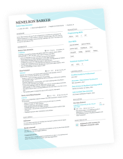
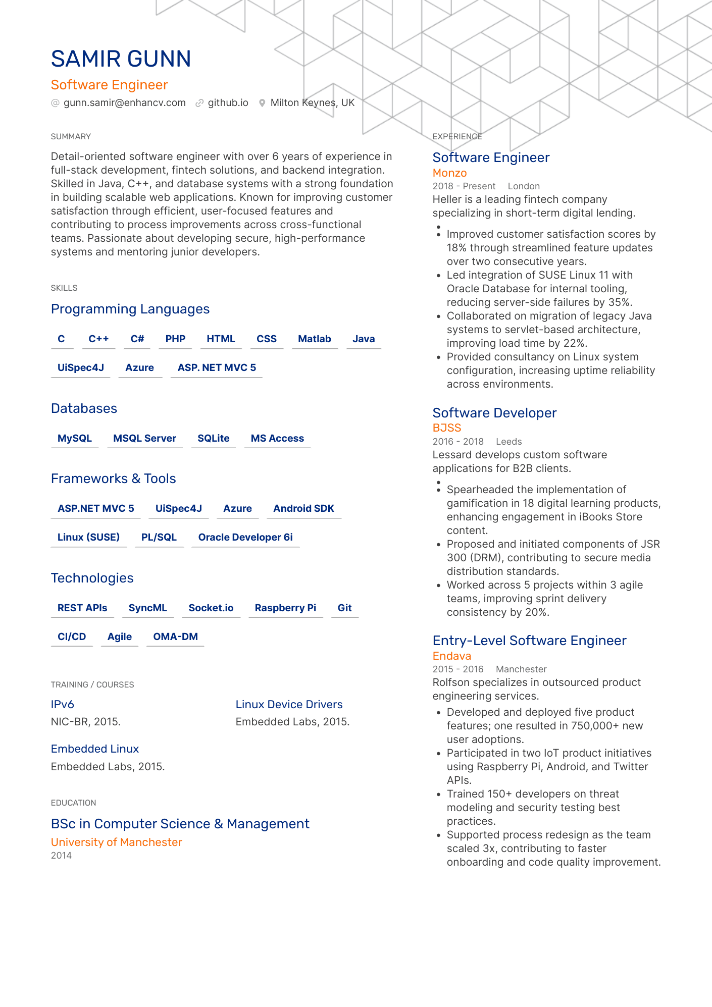
Look at a software engineer CV example using a sans-serif font.
The typefaces that suit your CV will depend on its design and the industry you work in. To help you make the choice, take a look at our table summarising the best fonts for your field:
The best CV font based on your industry
| Career sector | Best CV fonts |
|---|---|
| NHS, civil service, or education | Times New Roman, Garamond, Arimo, Chivo, Raleway |
| Creative industries | Gelasio, Constantia, Didot, Exo 2, Lato, Oswald |
| Art and design | PT Serif, Constantia, Bitter, Rubik, Lato |
| Hospitality, leisure, and retail | Cambria, Constantia, Arimo, Chivo,Oswald |
| Nonprofits and voluntary | Garamond, Arimo, Bitter, Exo 2, Chivo, Oswald |
| Manufacturing | Roboto Serif, Arimo, Rubik, Montserrat, Roboto |
| Law and legal services | Merriweather, Times New Roman, Raleway |
While there are no hard and fast rules when it comes to the best CV fonts, some do work better than others. Use our advice to choose the perfect typefaces for your next application.

Serif vs. sans-serif
When choosing two fonts for your CV, consider picking one serif and one sans-serif. This can offer a balanced look that works when you use one as the heading and the other as the body. Enhancv’s AI CV Builder takes the stress out of pairing fonts by automatically matching the secondary font to whichever main one you choose.
What CV font sizes should you use in the UK?
When you’ve nailed down which CV font to use, the next step is choosing the size. Too big, and your CV will look unprofessional and juvenile. Too small, and the hiring manager may not be able to read it. So, how can you make sure you get it just right?
Follow the golden rules:
Main text
The body content of your CV should be between 10 and 12 pt. This will ensure that the hiring manager can clearly read the information you share on the pages.
You shouldn’t go below 10 pt on your CV. If you’re struggling to fit everything on the page, adjust your margins and section spacing instead of shrinking the font, so you don’t compromise readability.
With Enhancv, the layout adjusts automatically, keeping your content clear and easy to scan without you having to wrestle with formatting.
Heading text
Your section headings should be around two points larger than your body text, usually between 12 and 14 pt. Pick one size and make sure you stick with it throughout the whole of your CV. You don’t want to switch things up, or something will look “off”.
Name text
Your name is the largest thing on your CV. However, it should be no more than 2 pt bigger than your headings text. So if your section titles are 12 pt, your name should be 14 pt.
Reduce the spacing instead of the font size!
Trying to fit more on the page? One of the biggest mistakes that people make is lowering the font size too much. Another way to go is to reduce the line spacing.
Keeping your font size ATS-friendly doesn’t have to be a challenge. Enhancv’s CV Builder locks in the default sizes so that you never go below the threshold. That means you can focus on the content.
What makes a good CV font?
By this point, you should be feeling pretty confident about choosing your CV fonts. But let’s take a moment to recap. Whatever typeface you choose, it should have some key elements.
Here’s a list of what makes a good CV font to help guide the way:
- High on-screen readability. The vast majority of applications are now processed online. That means the chance of your CV being read on a screen is extremely high. Opting for one of the typefaces that was created for on-screen reading could be the answer.
- Works well on A4. A4 is the standard paper size in the UK, and your CV should fit this size. You can try printing out your CV to see how it looks on paper.
- ATS-friendly style. Make sure you go with a classic look that the software will recognise. That means no unusual characters—sorry, Dingbat—and no custom fonts.
- Available on most devices. Go for one of the CV fonts that we’ve highlighted in this guide, which will be supported by all devices.
- Works well in PDF exports. When attaching your CV to an email or application system, you should typically use a PDF format. Check your CV font works well in these exports.
Before choosing a font, ask yourself…
- Does this font look crisp at 11 pt?
- Would I trust a legal document using this font?
- Could someone skim this quickly on mobile?
- Does this look dated or overly trendy?
- Can I read an entire page without eye strain?
- Am I choosing this because it's different or because it works?
- Does this font remain clear when printed in black and white?
Doing those final checks could make all the difference to the look of your CV. Since you’re clear on what fonts you should use, you also need to know what not to use.
The fonts you should avoid on a CV
Want to avoid a serious faux pas? There are some fonts that are serious no-nos on your CV.
Overly decorative or narrow typefaces are likely to get you rejected fast. Cursive or handwriting styles may look cute when you’re designing your CV, but they are almost impossible to read.
Similarly, some “funny” fonts will trigger a bias in most hiring managers. Think about it—would you hire someone who used Comic Sans on their CV?
Let’s break it down by taking a look at some of the fonts you should ditch:
8 of the worst CV fonts
- Caveat Brush
- Courier
- Brush Script
- Comic Sans
- Lobster
- Pacifico
- Papyrus
- Permanent Marker
The above list is by no means exhaustive, but it’s a good place to start. Don’t use any font that has a playful or gimmicky style, as it’s likely to alienate the reader.
How to choose the right font for your CV
Ready to get moving and choose the best CV font for your next application? Use our actionable advice below to ensure that you hit the mark.
#1 Match the tone of your industry
The font you choose needs to align with the vibe of your industry. Some fonts—such as Times New Roman—work for corporate fields, while others—like Rubik—are better suited to creative roles. If in doubt, use the table we shared earlier in this guide to get it right.
#2 Prioritise readability over individuality
Standing out isn’t always a good thing. If you’re picking a font based on it looking “original,” you might want to think twice. It’s better to go for one of the most readable typefaces than to try and make a statement. Making the hiring manager’s job easy gives you an edge on the competition.
#3 Use bold sparingly while avoiding italics and underlining
When you want to draw attention to something on your CV, you may bold it. However, you shouldn’t use bold too much, or the design can look too busy. Similarly, you need to avoid using italics and underlining. Let the content of your CV speak for itself instead.

What real recruiters say
In Enhancv’s latest survey, 20% of recruiters said they’re put off by overly designed, Canva-style CVs—with heavy graphics, fancy fonts, and photos—because they’re harder to scan quickly.
#4 Ensure consistency across sections
Using too many different font styles and sizes will make your CV look messy. You need to make sure that the design is uniform. Choose one size for the body text and one size for the heading text—and stick to it. You can pick up to two typefaces to use across your CV, assuming they go together.
#5 Test your PDF on mobile and desktop
When you’ve chosen a font, the next step is to test how it looks. You can export it as a PDF and see whether it is legible on a mobile or desktop. This extra level of attention to detail makes a big difference and could be the thing that differentiates you from other candidates.
PRO TIP
Let Enhancv do the hard work for you!
The tried and tested CV templates in Enhancv’s builder make the whole thing a cinch. You don’t have to worry about perfecting the font choice—everything is preset and ready to go.
Ensuring your CV has the best font is the only way to go. It’s all about making sure you set the right tone for your application and make a good impression on the reader.
Beyond fonts: How to format your CV text
- Get the line spacing right. When setting the space, opt for either 1.15 or 1.2. This allows a little extra room between lines, making your text clear and legible.
- Don’t forget the margins. Your CV should fit an A4 size. Make sure that the margins are between 1.3 cm and 2.5 cm to add extra white space.
- Use bullet points. Long paragraphs can look intimidating to readers. Since hiring managers tend to skim CVs, use bullet points to get your key information across.
- Don’t use colourful text. When it comes to the text, go for black, dark grey, or (at a pinch) navy. Colourful text can look immature and unprofessional.
- Keep section headings clean and easy to read for both ATS and hiring managers. Avoid extra decorative elements, like lines or visual flourishes, that could make them harder to scan.
All of the above make up the overall look of your CV. Visuals matter more than most people realise. The hiring manager will judge the way that your CV looks before they even start reading it.
Frequently asked questions about CV fonts
Do you still have a burning CV font question in your mind? Check out our frequently asked questions section below:
What is the most professional CV font?
There’s a selection of CV fonts that are professional. Some of the best choices include Times New Roman, Roboto, Gelasio, and Bitter.
What fonts are ATS-friendly?
Most standardised fonts are fully compatible with applicant tracking systems. Avoid any that have unusual characters or styles. Stick to the best CV fonts we’ve listed in this guide.
Should I use different fonts for headings?
You can, but you don’t have to. Sometimes, having a different font for your CV headings and body text works well. However, you should ensure the two fonts suit each other in tone and style.
What font do UK employers prefer?
That depends largely on the industry you work in. Within this guide, we’ve shared a handy table to help you decide which is the best CV font for your field of work. Some popular choices include Arimo, Times New Roman, Gelasio, and Lato.
Should I use the same font on my cover letter?
If you want to make your cover letter and CV look uniform, using the same font is a great way to do so. You can even include the same design elements so that the two documents work together.
Conclusion
The best CV fonts are simple, modern, and ATS-friendly. Since your font choice impacts both the first impression and your CV’s readability, it shouldn’t be taken lightly. Luckily, Enhancv’s builder takes care of everything—including sizing, hierarchy, and ATS formatting—so you can focus on content.
