
Simple UK CV Templates
Use a foolproof, simple CV template that focuses on your skills and strengths. To begin, select a CV design, type over the text, and replace it with your own.

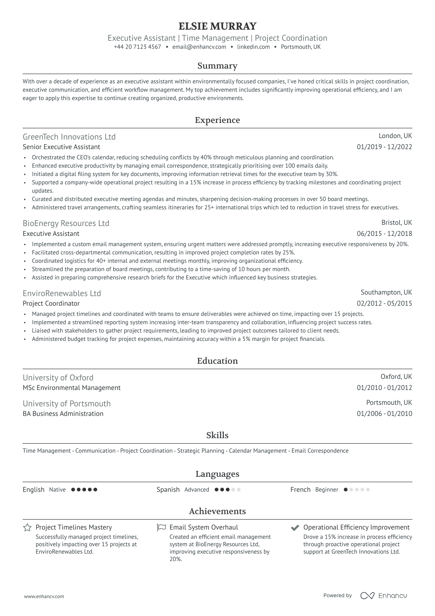
Ivy League
A modernized Harvard template featuring a sleek design favored by recruiters and an optimized structure for enhanced ATS performance.
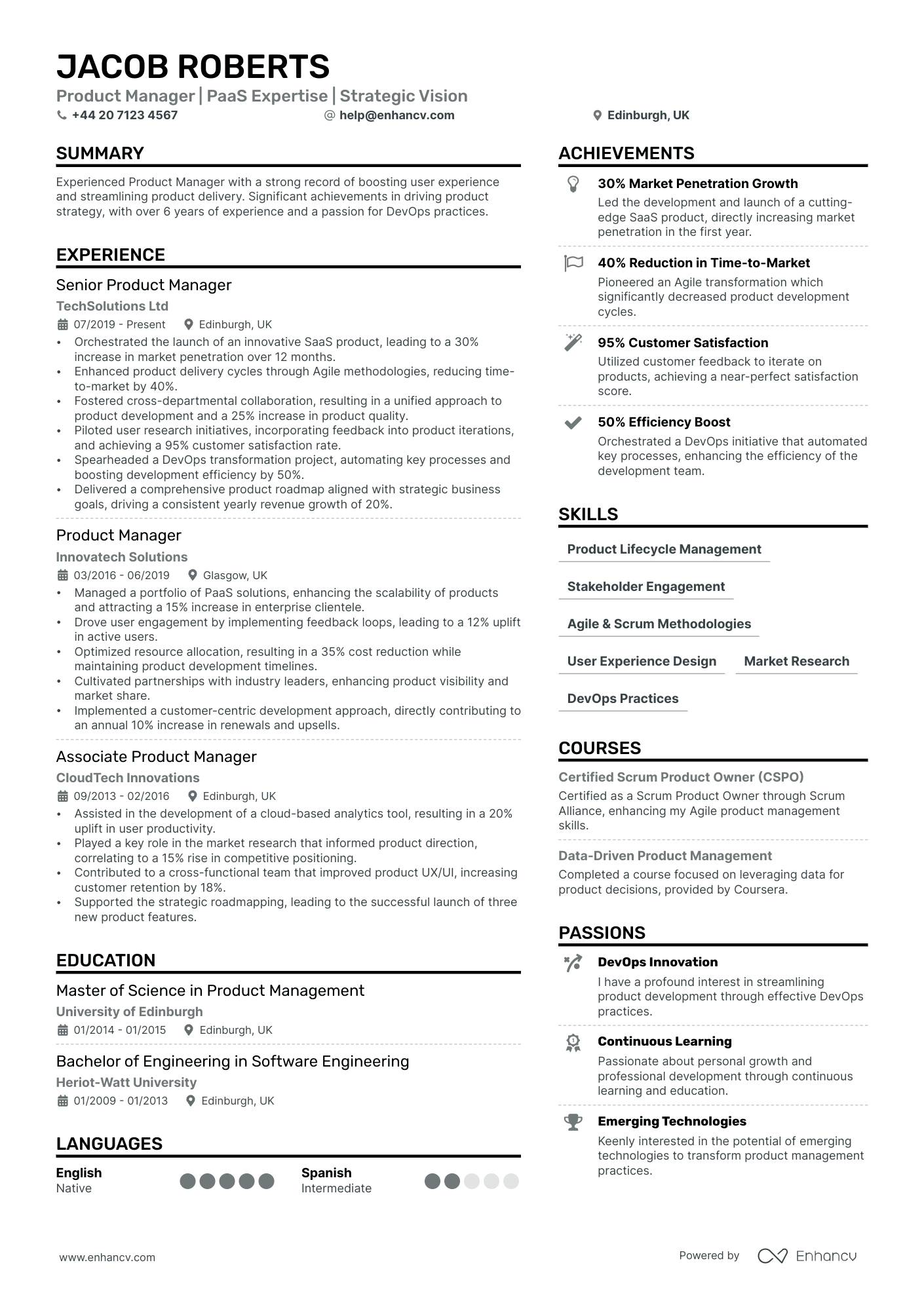
Double Column
A popular two-column resume template, free of charge, ideal for various roles, such as programming and marketing.
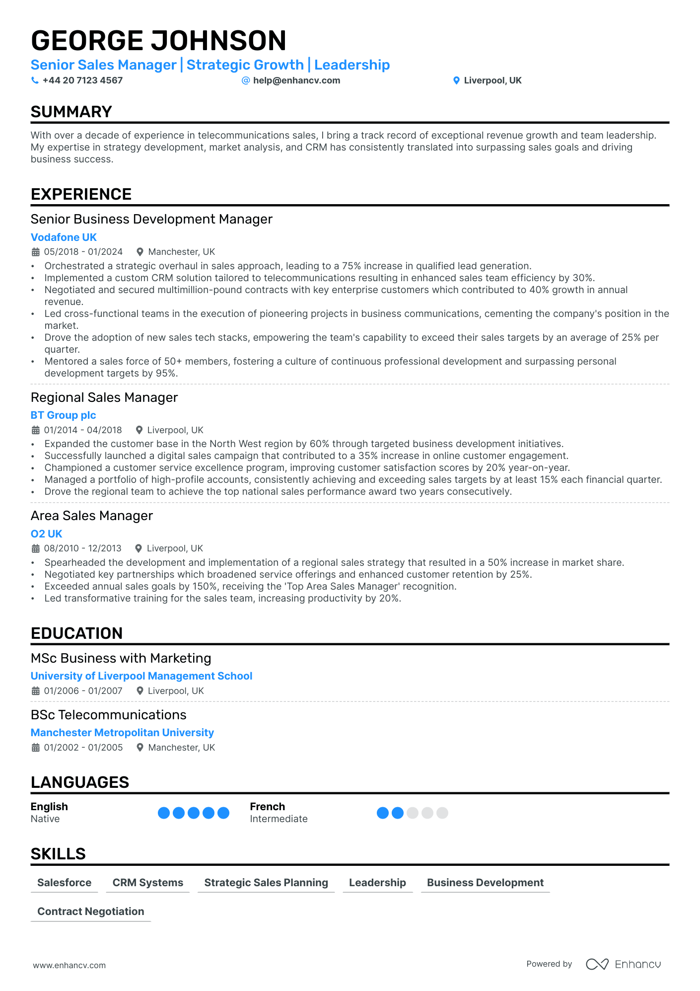
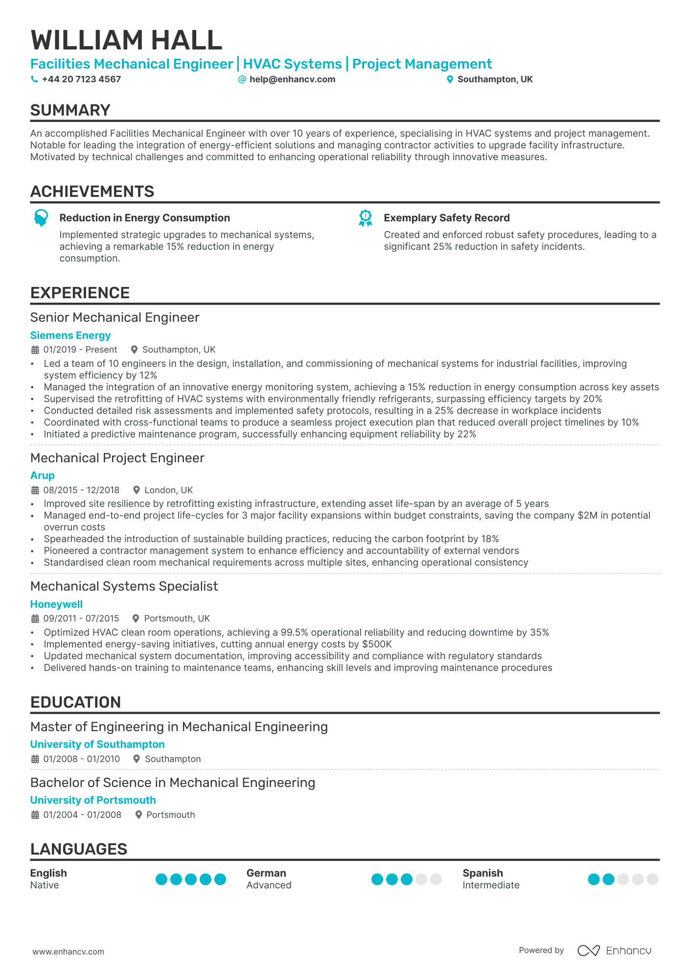
Single Column Refined
A traditional, simple CV template perfect for someone who's just starting out their professional career.

Single Column
The well-known single-column template with a traditional, yet time-tested layout. Perfect for conservative industries.
Have you ever found yourself sitting in front of your computer, staring at a blank document, not knowing where to begin?
Sometimes starting something is the hardest part, and writing a CV is no different!
Writing a simple CV might sound easy enough, but it can be surprisingly challenging.
There is so much to say in a small space. How do I choose what to include? What sections do I need? What about formatting?
Don’t worry, we’ll answer all those questions and more in this comprehensive guide.
Read below for tips and ready-to-use templates for crafting a simple CV. Then head over to our CV builder and start creating your own!
Is your resume good enough?
Drop your CV here or choose a file. PDF & DOCX only. Max 2MB file size.
Why and when is a simple CV important for your job application
A great CV is simple, concise, and captures employers’ attention right away.
Hiring managers may receive dozens, if not hundreds, of CVs for an open position. Their goal is to find the best candidate as efficiently as possible.
They are not going to want to read through a stack of disorganised, wordy, and poorly formatted CVs. They want the most important information possible as quickly as possible.
A simple and concise CV does exactly this and will improve your chances of being shortlisted.
Don’t confuse simple CVs with boring CVs
A CV should be simple and concise yet still convey all the necessary information to potential employers.
A key element to accomplishing this is to only include what’s relevant to your target job.
You may have years of experience and a wide variety of skills, but if they’re irrelevant to the job you’re applying for it’s better not to include them.
An employer looking to hire a software developer doesn’t care that you spent two years working at a pet store.
Another important element of a simple CV is having the right layout.
Choosing a chaotic layout with loud colours and hard-to-read fonts can be overwhelming for the reader. If a recruiter can’t stand to look at your CV, don’t expect a callback.
How to choose the best design and layout for your simple CV
Use a clean and minimalist design
Employers start to get an idea about you before even reading a word on your CV. Your design should catch their attention - in a good way!
The right CV design ensures readability and maintains a professional appearance. A clean, minimalist appearance is easy on the eyes and keeps the focus on the content.
Busy designs with too many different fonts and crowded sections draw attention away from what you really want employers to see.
Maybe you don’t have the best eye for design, but don’t let that discourage you. Our large collection of CV templates will do the work for you.
Make an effective use of white space
The use of white space on your CV is just as important as the use of text. The key is finding the right balance.
Too much white space and your CV will look blank. Too much text and your CV will look crowded.
The proper use of white space improves your CV's visual appeal and enhances readability. It should make your CV easy on the eyes and pleasant to look at.
5 simple CV templates to use
Templates are a helpful tool when creating a CV. The structure is done for you. All you have to do is fill in your information.
The right layout for you will vary based on industry, role, and experience.
Here are 5 simple CV templates that you can edit in our CV builder. Read below to find out which one is the right fit for you.
Ivy league
This template is sleek in design and optimised for ATS performance. It follows a natural downward eye flow and a simple design.
The presentation of information is direct and concise. The layout is not crowded with fonts or covered in overwhelming colours.
This template is great for positions in big corporate offices or large organisations. Hiring managers for major companies appreciate a no-nonsense approach. They want to get the information they need as quickly and efficiently as possible.
Double column
The double column layout is a popular CV template for a large variety of roles. The design is more fun and modern looking than the classic single column, but still clean and professional.
This format fits a lot of different sections on one page without looking crowded. It’s great for candidates with complex backgrounds who want to include experience outside of the usual work history.
The double column template is suitable for a range of jobs like programming, marketing, management, and many others.
Single column
This simple CV template has a traditional look that is time-tested. The clean and straightforward single column design is straightforward and easy to read.
The distribution of sections and space on this CV make it a great template for someone just starting out their career. Students and entry-level candidates with minimal experience can add their short work history without the CV looking blank.
This template is a great fit for conservative industries that aren’t looking for creative or out-of-the-box traits in their candidates.
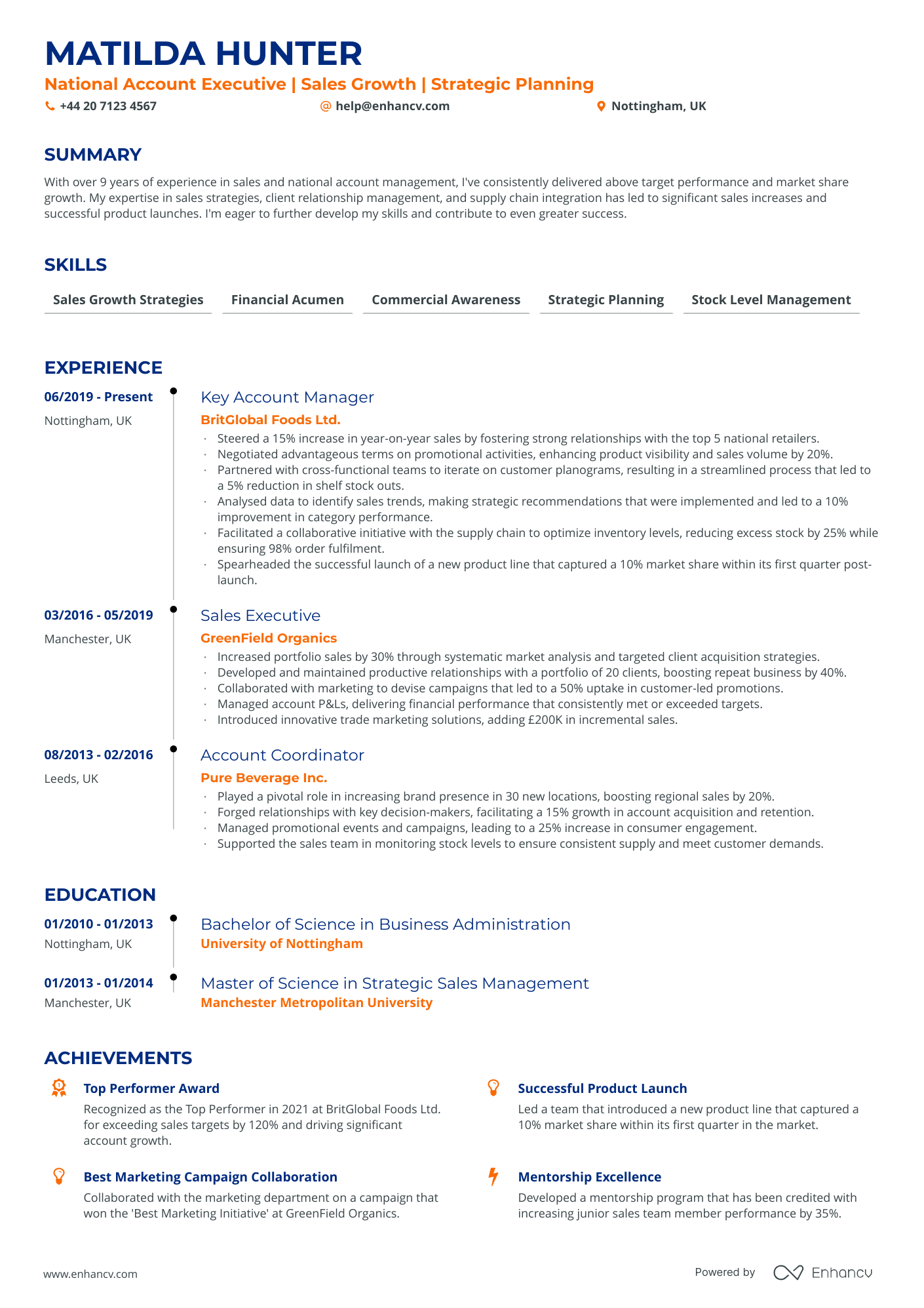
Timeline
This template does exactly what the title suggests. The simple design shows your experience and education in a timeline fashion.
This template highlights your most recent and important experience, making it the perfect CV for candidates with long careers. If you have a complicated work history and want to focus only on your most relevant experience, this template helps to achieve that.
This layout is a great choice for candidates in upper management, C-suite, and leadership roles.
Classic
Finally, we have the classic CV layout that everyone knows and loves. This simple design is recognizable and easy to understand.
Due to its ATS-friendly format, this template is great for roles in big companies or more traditional industries.
Big companies are more likely to use ATS for the first round of CVs than smaller ones. They receive a high volume of CVs and a person can’t realistically read through every single one. Having a strong ATS-friendly CV will help you get past the first scan and in front of a hiring manager.
What sections to include on a simple CV
Personal information
Of all the sections in a simple CV, personal information might be the simplest. A good personal information section is concise, clear, and professional.
Your personal information section should include the following:
- Name
- Title
- Phone number
- Email address
- Town and county
- Website
Don’t worry about getting creative yet. The information should be clear and easy to understand.
Use a professional email domain like Gmail. You don’t want to use outdated or student email addresses, and definitely don’t use your email address for your current job.
The website should be professional as well. Stick with LinkedIn, a personal website, or an online portfolio. If you don’t have any of these, you can always leave it out.
Including your full address on your CV is no longer necessary. In fact, it is discouraged. It is an outdated practice and can be a potential security concern. Including just the town and county is fine.
Here is an example of a strong, simple personal information section.
Professional summary
The summary is your first opportunity to show hiring managers who you are. Here is where you should highlight your most relevant skills and achievements.
Make sure your summary is succinct and professional. It’s easy to get carried away here and get off track when introducing yourself. Keep it at 3-5 sentences and relevant information only.

Pro tip
When choosing an achievement, be specific and share measurable results. Saying you have “great relationships with clients” won’t be very convincing to hiring managers. Saying that you “earned £1.2M in the first quarter” will.
Here is an example of a direct and concise summary.
Employment history
When writing your employment history, don’t make the mistake of giving a basic job description for every job you’ve ever had.
Hiring managers don’t just want to know what you did every day. They want to know what you achieved.
Your work history is an opportunity for you to share career highlights and for hiring managers to see what kind of impact you’ll have at their company.
Under each of your previous roles, write 3-5 bullets stating your accomplishments at that job. This is also an opportunity to showcase industry-specific skills or software knowledge.
Don’t make general statements. Be specific, concise, and relevant. Use real numbers and data to show evidence of your success.
If you’ve had a wide range of previous roles, leave out anything irrelevant. Writing about your summer as a bartender won’t help you get a job as a graphic designer.
Here is an example of a simple employment history section with informative accomplishments.
- •Trained 15 employees in JavaScript and Python-based programs
- •Provided solutions for software error, increased revenue by 30%
- •Developed internal automated messaging system, increased productivity by 15%
Education and qualifications
The education and qualification section on your simple CV is, as you may have guessed, quite simple.
The only education information you need to include on most CVs is the name of the school, degree, location, and year completed. If you have any additional licences or certificates, those can be added as well.
If you are a recent graduate without much employment history, you can use this section to show achievements from school. Relevant courses, projects, and student groups can all be opportunities to show accomplishments.
If some time has passed since you graduated, keep it to the basic information only. At that point, your career highlights will matter more.
Here is an example of a simple education section.
Skills and abilities
The best approach to showcasing your skills and abilities on a simple CV is to separate them into hard skills and soft skills.
Every job requires some combination of both, though some require more of one than the other.
Hard skills like technical abilities, software, office tools, and industry-specific knowledge can simply be listed. For many of these skills, you either have them or you don’t.
Soft skills often need a bit more explaining. Terms like “time management” and “communication” are open to interpretation and can mean different things depending on the industry.
First, let’s take a look at a hard skills list example.
The above example is simple, concise, and straightforward. It lists all the necessary technologies and skills the candidate needs for their target job.
For soft skills, choose a few that are most relevant to the job and share a specific example for each one. Hiring managers won’t need to take your word for it if you provide evidence.
Here is an example of soft skills on a simple CV.
Optional sections to include on your CV: awards, achievements, and interests
Depending on your role, experience, and industry there may be other sections you wish to include on your CV.
As with all other sections, only include these if they are relevant to your target job and highlight past achievements. Volunteer work and hobbies are great, but will only clutter your CV if they aren’t important.
You may have received awards outside of your employment history. Maybe you were recognized in a local publication or at a conference for outstanding work in your field. Adding an awards section is a great way to highlight this.
Passions, interests, and hobbies have the ability to showcase your personality in addition to your industry experience. Depending on the role, hiring managers will want to know that you fit into their company culture in addition to being able to do the job.
Writing tips for a simple CV
Use of action verbs and concise language
Every word counts on a simple CV. You want recruiters to be interested and engaged. But you also want to be concise and effective.
When describing past accomplishments and skills, always use action verbs. These emphasize your strengths and show why you’re not just an average candidate.
It’s important to steer clear of overused or outdated language on your CV. Terms like “team player” and “go-getter” aren’t as impressive as they once were. They also don’t really mean anything.
“Collaborative,” “analytic,” and “outperformed” are linked to specific skills and tell a better story about the candidate.
Be careful not to unnecessarily repeat words. Using different verbs and adjectives to describe your achievements show good communication and range.
Tailoring your CV for each job application
Always, always, always tailor your CV to your target job!
Creating a blanket version of your CV so that you can mass-apply to a lot of jobs at once won’t be as effective as you think. Recruiters can spot this and will move on to the next CV quickly.
Companies want to know that you’ve done your research and are interested in their specific role. The best way to achieve this is with a targeted CV.
Study the job description for the role you’re applying for. Notice the language, keywords, and phrases the company uses. Do some additional research on the company as a whole and trends in your industry.
This may seem like a lot of work, but applying to a small number of jobs with targeted CVs is more effective than a large number of jobs with boring, generic CVs.
Customise each section of your CV using what you learned in your research. Focus on highlights that match the job description. Show that you will provide solutions to the company’s problems.
Maintain simplicity by keeping everything concise and relevant, regardless of the job. Be mindful of every section on the page.
Also, don’t just copy and paste information straight from the company website into your CV. Hiring managers will notice right away!
Formatting and proofreading your simple CV
Font and font size consistency
Maintain consistent font styles and sizes to ensure a polished and professional appearance. Using a little bit of creativity can help, but don’t get too carried away!
Simplicity is key when it comes to formatting.
Use the templates above to create a CV that is easy on the eyes.
Proofreading for spelling and grammar errors
This may seem like stating the obvious, but a startling amount of spelling and grammar errors fall through the cracks on CVs.
Thoroughly proofread your CV several times. Then have a trusted friend or colleague review it for you.
Be sure to not ask anyone at your current job. You don’t want word getting out that you’re applying elsewhere.
Errors show carelessness and could be enough to get your CV tossed out. You don’t want to hurt your chances of being shortlisted because of a basic spelling mistake.
Key takeaways for crafting a simple CV
Having a simple CV can have a big impact on your job search. A sleek, simple design improves your chances of standing out in the competitive job market.
Easy to read layouts with concise and relevant information will help your CV get shortlisted. A clear and organized design will pass the ATS test and get your CV in front of hiring managers.
Choose a simple template to help get you started and fill in each section with your CV information. Keep every section succinct and always tailor your CV to your target job!
Regularly review your CV and update it to ensure it remains simple, relevant, and effective.
It’s important to keep up with trends and make sure your CV is up-to-date so you have the best chances possible of getting shortlisted.
Frequently asked questions about simple CVs
How do I write a simple CV?
What is the most simple CV format?
Do employers prefer simple CVs?
How should a basic CV look?
How far back should a CV go?
Which of the following should not be on your CV to keep it simple?
We advise you to keep some things off your CV to make it simple:
- Adopt a reverse-chronological order of your experience section, rather than going the functional or hybrid way
- Exclude extravagant colors and fonts for your CV. More importantly, your CV should be accessible and readable by everyone, so take this into account when designing yours.
- While we are fans of charts and visuals, they might not be appropriate for a simple CV. You can instead use color, spacing, font size and section headings to accent important parts of your resume.


