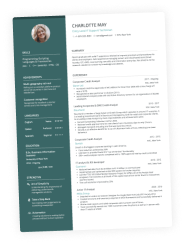
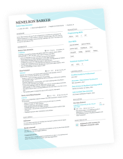
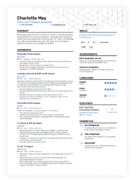
Your CV is often your only chance to make a good first impression on potential employers. While its content is crucial, your CV’s formatting also works to grab a recruiter’s attention and highlight your professionalism.
Getting your CV’s margins right ensures it has a clean, professional look that helps you secure an interview. So we’ve dived deep into CV margins to help you understand their importance, how to use them effectively, and how to avoid any mistakes.
In this article, we:
- Explain what margins are and why they’re important
- Cover standard margin expectations and offer advice on customising them
- See how margins work with other formatting considerations to improve the look of your CV
Your CV should highlight your professionalism and wow a recruiter at first glance - formatting is key to making that happen. If you’re unsure of your CV layout or how to improve it, contact our career counselling service for feedback or any other career-related questions.
We’ve helped thousands of people succeed in their job search and are here to help you. Contact us about anything from CV writing and design to interview prep, contract negotiations, and any other questions you have about reaching your career goals.
What are margins?
Margins on a CV refer to the blank spaces surrounding the document's text and content on all four sides—top, bottom, left, and right. These margins determine the distance between the text and the edges of the page.
Margins are a crucial CV design consideration because they affect the overall appearance, readability, and professionalism of your CV. Too narrow margins can make your document look cluttered, while excessively wide margins may waste valuable space.
Margins have a huge impact on whitespace - the empty or blank space between different sections, paragraphs, and document elements. Whitespace is crucial to your CV because it enhances readability, organizes information, and contributes to the document's overall visual appeal.
Striking the right balance with your margin settings creates an appealing and well-structured CV, making it easier for potential employers to navigate and understand your qualifications and experiences.
Standard margins
The standard margins for a CV are typically 2.5 cm (25 mm) all around. The margins balance white space and content at this width, making your document easy to read and visually appealing.
Employers and Applicant Tracking Systems (ATS) often expect and prefer this format since it complies with standard UK paper sizes, such as A4 (210 x 297 millimetres). It’s not an exciting reason, but the predictability ensures uniformity in printing and scanning, which gives you the best chance of making a good impression.
Custom margins
In some cases, you might want to break free from the standard. Custom margins can be your friend if you're in a creative field or want to draw attention to specific sections.
That being said, while you can experiment, keep professionalism in mind. Extreme custom margins might make your CV or resume look unorthodox and potentially off-putting to some employers.
As usual, it comes down to tailoring your CV for the specific position you’re applying to. Consider the role, who may be reviewing your resume, and their expectations of you, and decide whether standard or custom margins are best.
Page Orientation
Far and away, portrait orientation is what employers and recruitment agencies will expect to see for your CV. A portrait orientation means that the longer sides of the page run vertically, and the shorter sides run horizontally.
While portrait orientation is the norm, there can be exceptions for creative CVs or specific job applications that call for landscape orientation (horizontal layout). For example, you might consider it when you need to present images for a portfolio of creative work or for an extensive list, like a list of publications.
Alignment
Alignment describes how the text within the document is positioned relative to the left and right margins. There are two primary types of alignment commonly used in CVs:
Left alignment
In left-aligned text, the left edge of each line of text is aligned along the left margin. This is the most common alignment used in CVs, providing a straightforward and easy-to-read layout.
Justified alignment
In justified alignment, the left and right edges of each line of text are aligned with the respective margins, creating an even-sided text block. While justified text can look neat, it sometimes requires irregular spacing between words and letters, which can affect readability and isn’t suitable for all CVs.
Left alignment is recommended in most cases for its simplicity and readability. Use justified alignment sparingly for a more formal or structured appearance.
Consistency
Consistency in margin settings is crucial for creating a visually appealing and professional CV. It ensures that all sections and elements maintain a uniform appearance.
Consistent margins contribute to a polished and organized-looking CV – characteristics that will reflect well on you. They will reinforce the impression of attention to detail and professionalism in your job application, helping you catch the recruiter’s eye.
Inconsistent margins can leave your CV looking disjointed or haphazardly designed – characteristics employers won’t think highly of you for. Inconsistent margins also reduce readability, which will further lessen your chances of impressing a recruiter.
Fonts
Font choice and size work in tandem with your CV's margin settings to establish the professional look of your CV. In most cases, choose a font like Arial, Calibri, or Times New Roman.
These fonts are known for their readability, and again, they’re the choices employers and an ATS will expect to see. But again, in some industries or for creative roles, more unusual or specific fonts might be suitable or even preferable. Unless you’re certain otherwise, though, stick with the standards.
Typically, the font size for the main body should range from 10 to 12 points. Fonts that are too small strain the reader's eyes, while overly large fonts lead to inefficient use of space.
Line spacing
Line spacing also works along with your margin settings to impact the look of your CV. Setting your line spacing to 1.15 or 1.5 ensures your text has sufficient breathing room.
The important thing to bear in mind is that your line spacing choice should allow good whitespace and enhance readability without causing excessive page space wastage.
Margins for different resume sections
Different sections of your CV or resume may benefit from slight margin adjustments. Done well, you can enhance clarity and create a visual hierarchy within your document.
One effective technique is to use a slightly wider left margin for section headings, like "Work Experience," "Education," or "Skills." This helps distinguish the headings, guiding the reader's eye to the start of each section and improving the readability of your CV.
Restraint is critical here because too much margin variation can disrupt the overall cohesion and balance of your CV. The goal is to create a subtle but noticeable distinction that enhances readability and aesthetics without compromising the overall professional appearance of your CV.
Practically, this means increasing your heading margins by just a few millimetres. This small adjustment ensures your CV maintains a cohesive look while effectively guiding the reader's attention to the key sections.
Online considerations
The popularity of online job posting sites and application options means it's crucial to consider online CV formats. You have more creative freedom for online CVs, but similar considerations to your print CV stand.
Ensure that your margins, font, line spacing, and other layout considerations are readable and visually appealing. An important difference is that you also ensure the layout is consistent and the file format is readable across platforms.
Saving as a .pdf is a safe option since the formatting won’t shift across screens or when printed. On the other hand, documents saved in the .doc format tend to shift, especially when printed through different systems.
Proofreading and testing
There’s intense competition for the best and most desirable jobs today, so every aspect of your CV makes a difference in whether you’ll get a call back for an interview. Before sending out your CV, proofread diligently to be sure you’ve corrected all mistakes – including formatting your margins properly.
Margins are part of the overall presentation of your CV, and even the smallest errors can detract from a recruiter’s impression of your professionalism. Put in the extra few minutes of work to wow them.
Takeaways
- Optimizing your CV margins can improve your chances of landing your next job.
- Adjust your margins to strike the right visual balance – usually 25mm all around.
- Left justification and portrait orientation are the best choices in most cases.
- Fonts like Arial or Times New Roman and 1.15 or 1.5 line spacing are the norm.
- Consistency is key to a clean, professional CV that makes a positive impression.
Ensure your CV is perfect to make the best possible impression on recruiters. If you have doubts or questions about your CV, contact our career counselling service before submitting it for an application.
We’ve helped thousands of people succeed in their job search, and we can help you. Contact us about anything from CV writing and design to interview prep, contract negotiations, and any other questions you have about reaching your career goals.


