You’ve poured your time and effort into writing a great CV.
It has an excellent layout, tailored content, and thoughtful sections. There’s just one detail you may have overlooked.
The font!
This may seem like a small unimportant detail, but choosing the right font for your CV actually matters a lot.
Typography plays a crucial role in the presentation and readability of your CV.
It can mean the difference between a professional CV that is clear and easy to read, or a sloppy CV that is confusing and hard to understand.
A bad font choice can get your CV tossed out before a potential employer has even read it. You don’t want to miss out on an opportunity over a detail with an easy fix.
Read our guide below for more tips on choosing the best font for your CV. Then head over to our CV builder to get started on yours today.
Is your resume good enough?
Drop your CV here or choose a file. PDF & DOCX only. Max 2MB file size.
Criteria for an effective CV font
There are a few key factors to consider when selecting the right font for your CV. You want your CV to be clear, professional, and easy to read.
This means choosing standard fonts that are clearly legible. You might be tempted to go with a font that is creative and original, especially if you want to stand out in a creative field.
You don’t want to stand out for the wrong reasons. Industry standards exist for a reason. If potential employers will struggle to read your CV, choose a more straightforward font.
Choosing the appropriate size is also crucial. People often make the mistake of leaning on font size to accommodate content, i.e., larger font to make up for lack of content or smaller font to squeeze in as much content as possible.
There are plenty of ways to customise the format of your CV to your advantage. Don’t rely on font size to fill space. Instead choose a size that is natural and clear.
Another element in this category is colour. The use of colour on your CV can be a great way to stand out from other candidates and show a bit of your personality.
As with all visual elements, choose colours that are pleasant and not distracting. You want font colours that make your CV easier to read, not more difficult.
A closer look at CV fonts
If you don’t have a strong working knowledge of the wide world of fonts, sorting through them might be overwhelming.
Sometimes after scrolling through font after font after font, everything can start to blend together. Here are a few font basics to help you navigate and narrow down your options.
1. Serif vs. sans serif fonts: The difference and where to use each
If you’re not a font expert, you might be unfamiliar with the difference between serif and sans serif fonts. Or maybe you’re hearing the terms for the first time today.
That’s okay!
Think of fonts as being divided into two major categories: serif and sans serif.
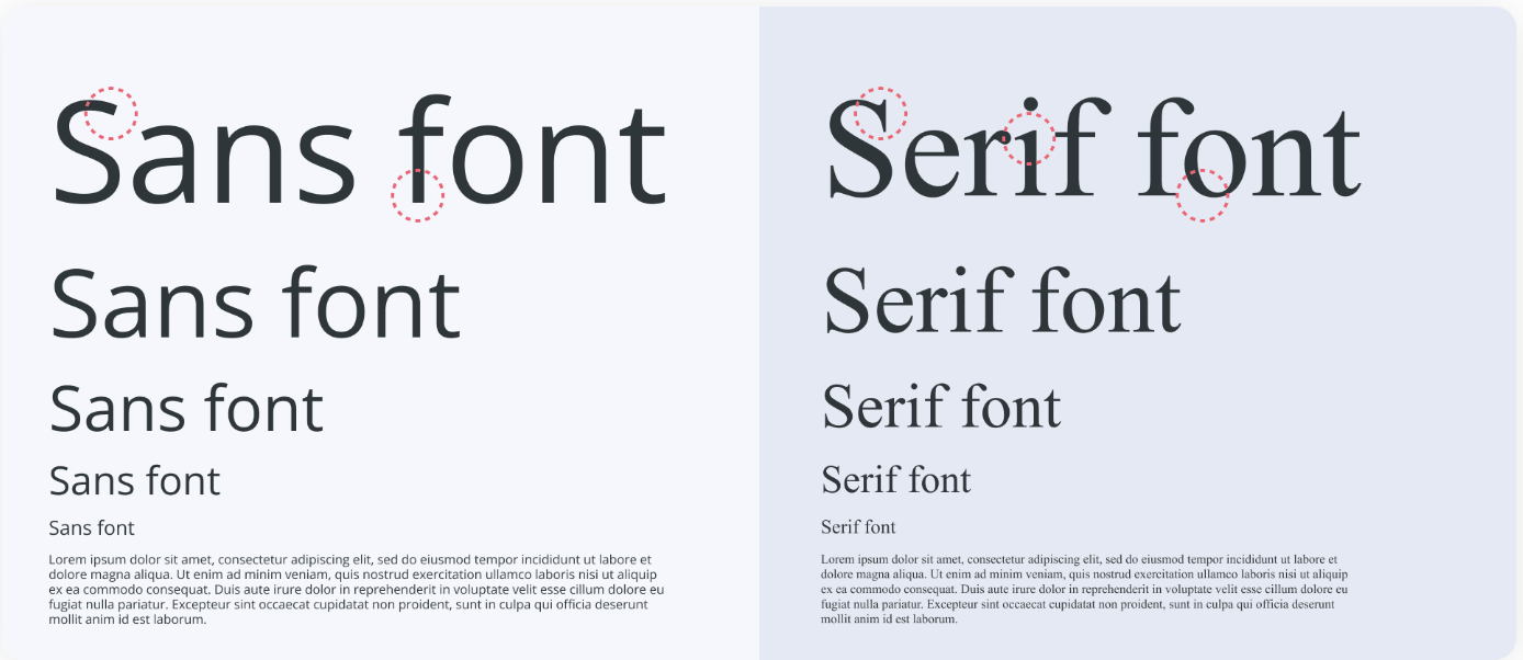
Serif fonts have small decorative “feet” that extend off the letters. A classic serif font is Times New Roman.
As you may have guessed, sans serif fonts are typefaces without the extending feet. A popular example of a sans serif font is Helvetica.
While there’s no one perfect font for all CVs, some are more popular than others in different industries.
Serif fonts are generally considered more formal and have a classic, elegant look. These typefaces are good choices on CVs for corporate positions and traditional office jobs.
Sans serif typefaces are seen as more modern and casual. These will be more common on CVs in creative and modern fields.
An effective CV will usually combine the use of both serif and sans serif fonts. Choose fonts that complement each other to differentiate aspects of your CV like headlines and longer text.
Serif fonts are sometimes more difficult to read in digital form and are more popular in print publications and documents. Sans serif fonts are often easier to read on digital platforms like web publications and website design.
Keep this in mind when determining if your CV is going to be submitted in print or digital form.
2. Deciphering the most popular CV fonts
Now that you know the basics of serif and sans serif fonts, there are a few more attributes to consider.
Some of the most popular CV fonts are recognizable classics like Times New Roman, Arial, Calibri, and Helvetica. These are widely used and common in most word processing software.
These classics remain timeless for a reason. They have a professional, clean design and are easy to read. They work in a wide range of industries and roles.
There are some modern fonts that are becoming more and more prevalent on CVs as well as other uses.
These fonts - such as Rubik, Montserrat, and Volkhov - have the same professionalism and readability as classic fonts with a modern update.
Use the fonts available in our CV builder to create structured sections and sleek headlines. Your CV will have a modern look that stands out from other candidates while remaining professional.
3. Understanding the appropriate font size and spacing in a CV
As mentioned above, size is an important factor to consider when choosing a font for your CV. You want to utilise space on your CV, but don’t rely solely on font size to do the job.
Fonts that are too big will be distracting and overwhelming. You don’t want potential employers to think you’re filling space with giant headlines because you lack experience.
Cramming a ton of information on your CV with a tiny font is equally distracting. It’s difficult to read and confusing for the reader to process.
Info dumping on your CV can also give the impression that you don’t know how to present ideas clearly and directly. Hiring managers don’t want to waste time sorting through irrelevant information.
The best font size and line spacing for your CV optimises readability and aesthetics. The standard font size for CVs is 12pt. You can drop it down to 10pt for bulleted sections or go up to 14pt for headlines.
Straying outside those guidelines will make it too difficult or distracting to read.
Recommendations: 26 of the best fonts to use on your CV in 2023
Now you know some of the features to look out for, but there are still so many fonts to choose from!
Here is a collection of top CV fonts to help make your decision process easier.
12 top serif fonts for your CV in 2023
Serif fonts create an elegant and traditional feel for your CV. The fonts listed below are great for positions at traditional corporations and classic CVs.

12 of the best serif fonts for your CV
- Times New Roman
- Bitter
- Volkhov
- Cambria
- Roboto Serif
- Merriweather
- Georgia
- PT Serif
- Garamond
- Constantia
- Didot
- Book Antiqua
14 top sans serif fonts for your CV in 2023
Sans serif fonts are easy on the eyes and great for creative and design roles. Use the fonts below for large sections of text on sleek and modern CVs.
14 of the best sans serif fonts for your CV
- Arial
- Calibri
- Verdana
- Helvetica
- Rubik
- Lato
- Raleway
- Exo 2
- Chivo
- Montserrat
- Oswald
- Open Sans
- Roboto
- Trebuchet MS
8 fonts to avoid on your CV in 2023
There are countless styles and categories of fonts beyond just serif and sans serif. Typefaces in the styles of script, handwriting, and symbols should be avoided.
The fonts below make a CV appear unprofessional, childish, and even outright comical. If your font is impossible to read or looks like it belongs in a cartoon, go with a different choice.
8 fonts to avoid on your CV
- Caveat Brush
- Courier
- Brush Script
- Comic Sans
- Lobster
- Pacifico
- Papyrus
- Permanent Marker
Key takeaways for choosing the best font for your CV
Make a strong impression with your CV font choice. Choose an effective font that is the appropriate size, style, and colour.
Understand the difference between serif and sans serif fonts. Determine which style is the best for your industry and role.
Choose a font that emphasises readability and professionalism. The right font choice will have a big impact on potential employers.